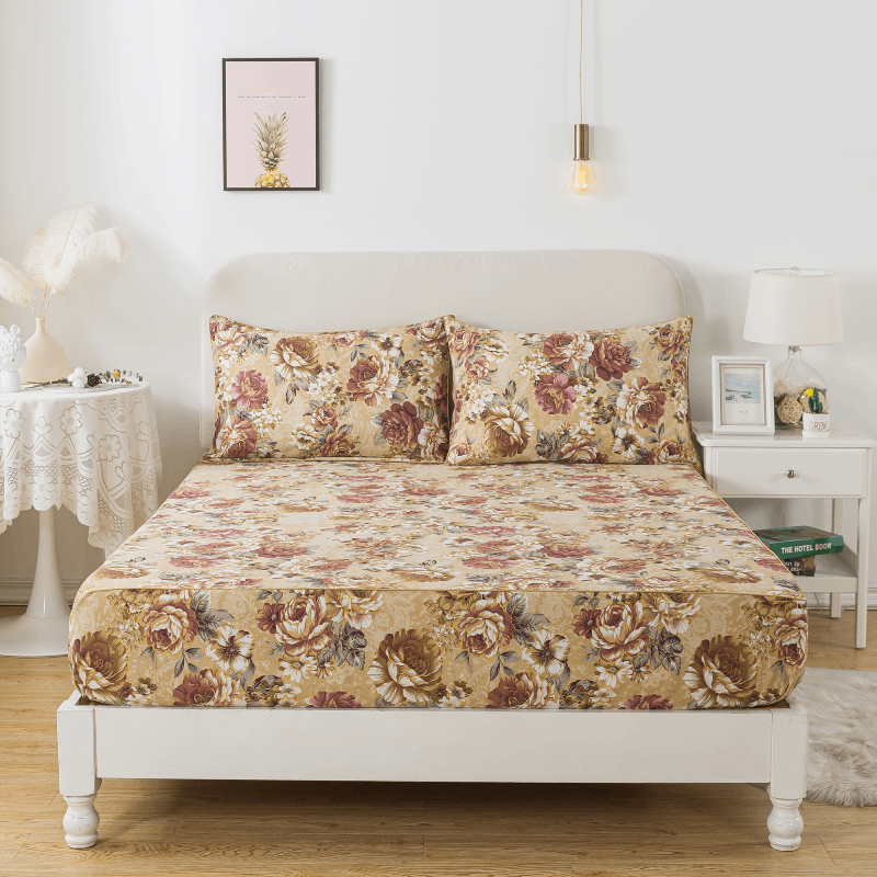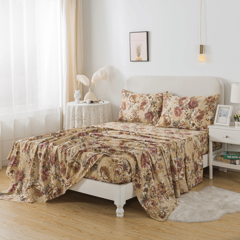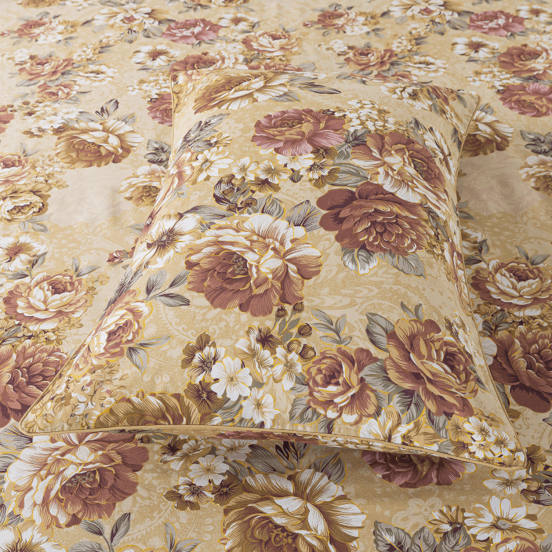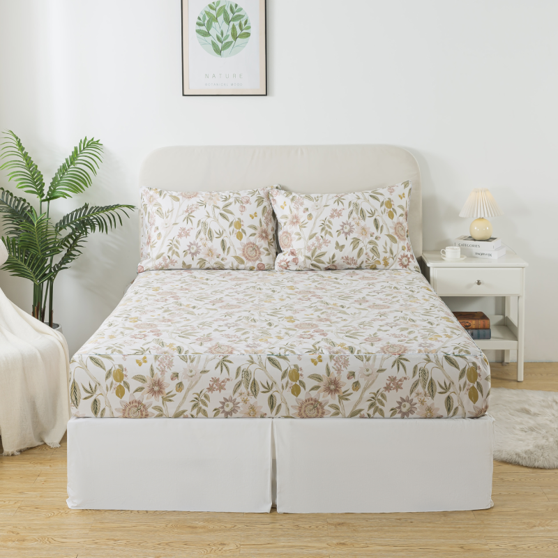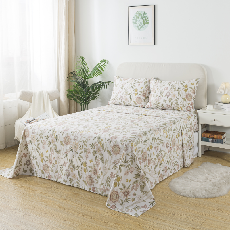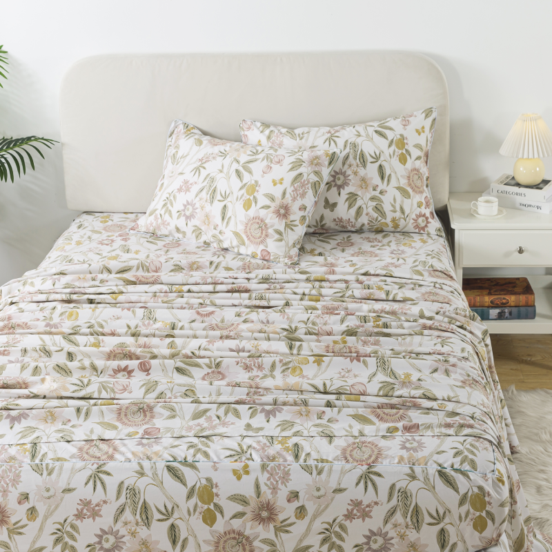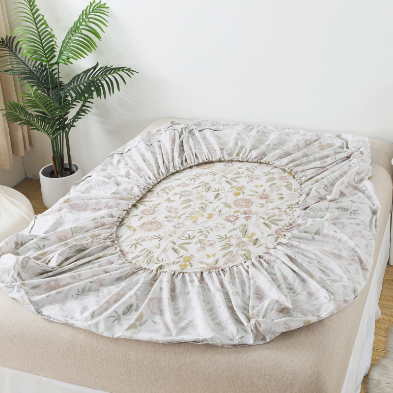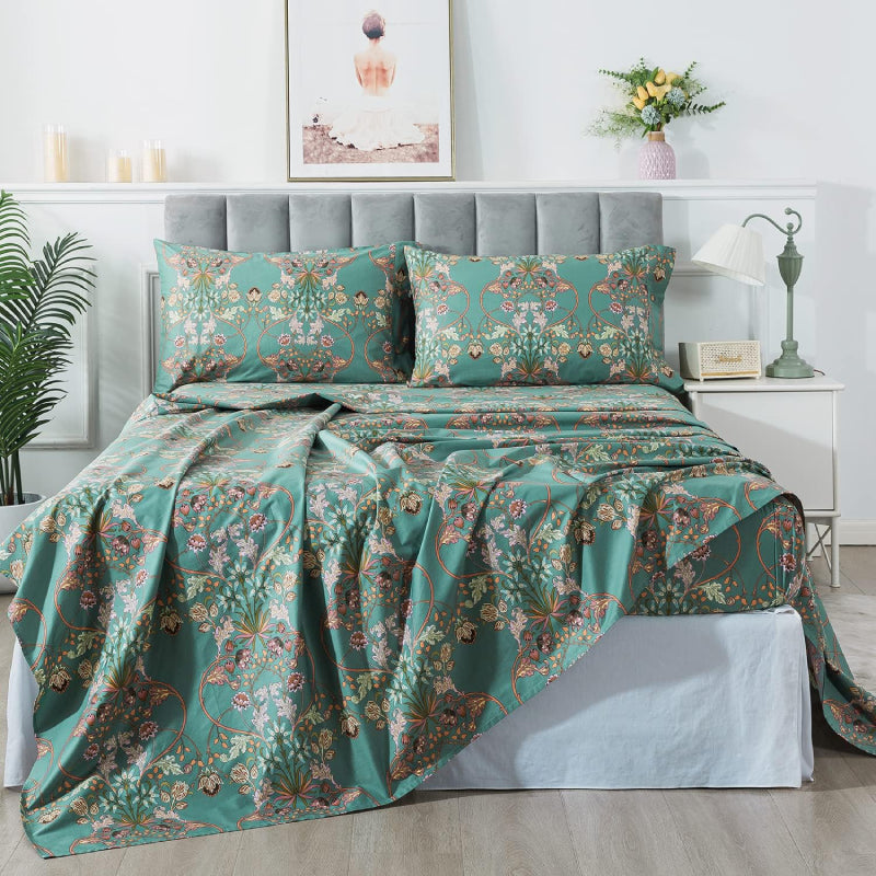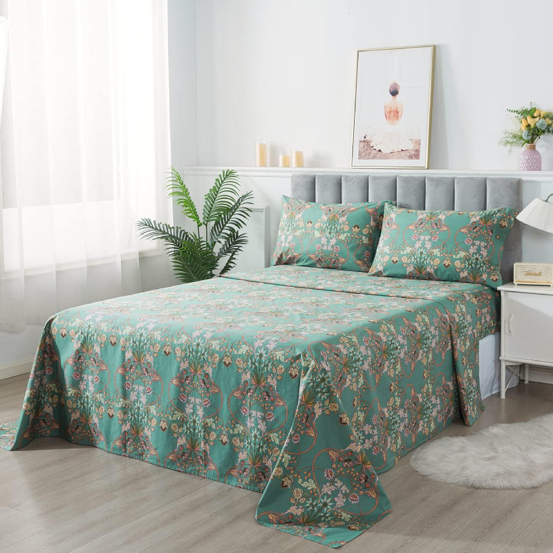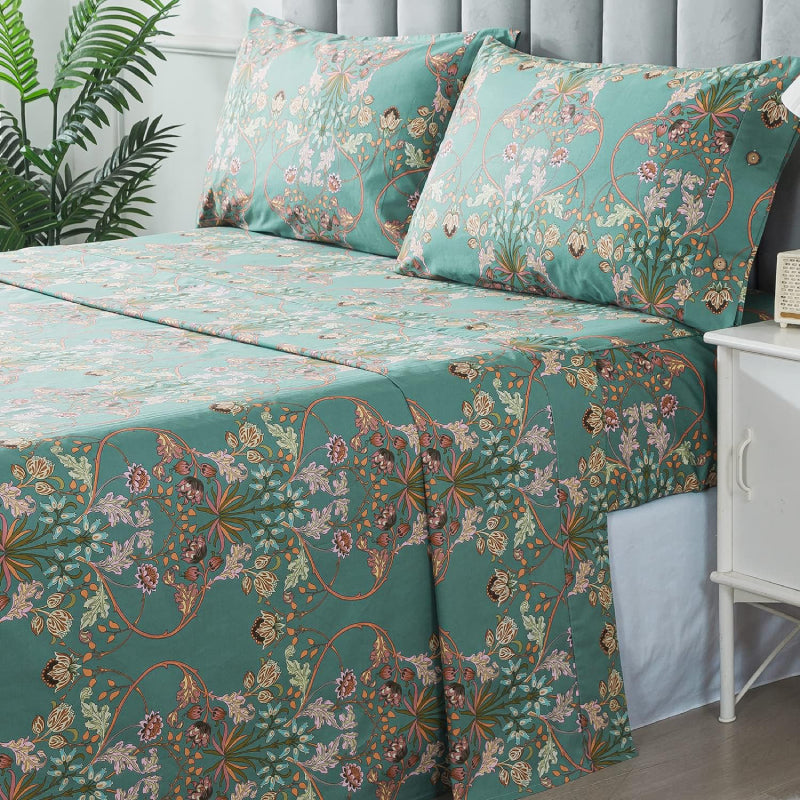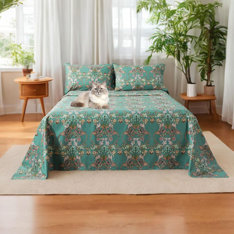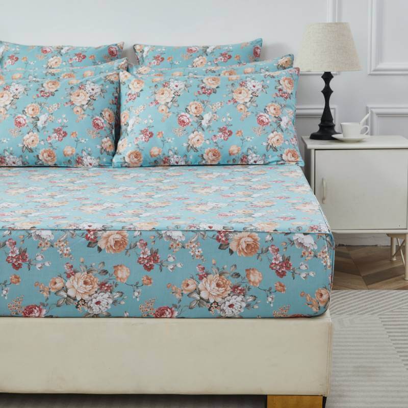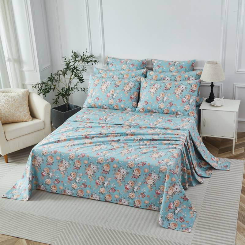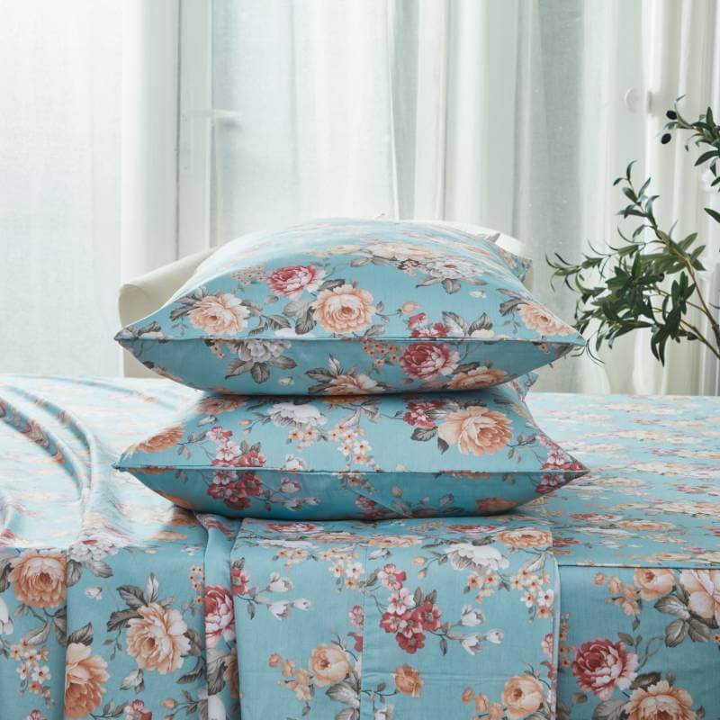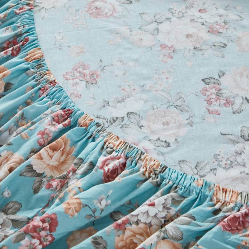


In printed bedding design, background color is not a passive choice—it is a structural decision that determines visual hierarchy, emotional tone, and long-term usability. For brands like FADFAY that emphasize refined florals and quiet luxury, background color functions as the canvas that either elevates or diminishes the perceived value of the entire product.
1. Background Color as Visual Foundation
In textile design, the background (or “ground”) color establishes contrast relationships with the foreground pattern. A well-chosen background ensures that motifs—whether florals, paisleys, or geometric elements—are clearly legible without overwhelming the eye.
-
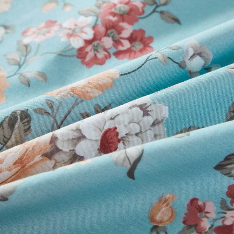
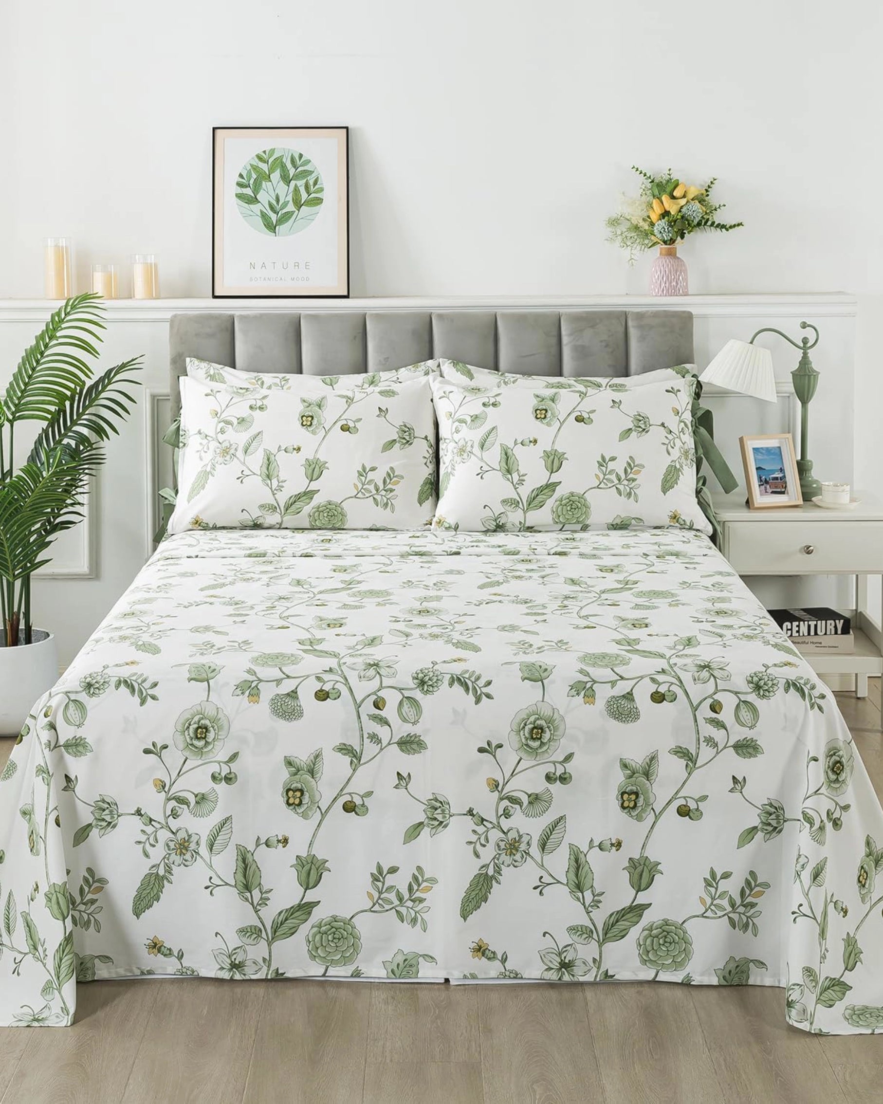
Light backgrounds (ivory, soft beige, pale blue):
These enhance pattern clarity and create a sense of airiness. They are particularly effective for intricate floral prints where detail matters. -
Dark backgrounds (charcoal, deep navy, forest green):
These compress visual space, making colors appear richer and more saturated. They are ideal for bold, statement bedding.
From a design systems perspective, background color directly impacts figure-ground separation, a key principle in visual cognition.
2. Emotional and Psychological Influence
Color psychology plays a central role in bedroom environments. Bedding is not just decorative—it contributes to rest quality and emotional comfort.
-
Warm neutrals (cream, sand, blush):
Promote relaxation and softness. These tones align with “slow living” aesthetics and are highly compatible with natural light environments. -
Cool tones (sage green, muted blue):
Associated with calmness and reduced visual stress. These are frequently used in wellness-oriented interiors. -
High-contrast palettes:
Energetic but less restful. Suitable for accent pieces rather than everyday bedding.
The key is alignment between color temperature and intended user experience. For premium bedding, overstimulation is typically avoided.
3. Interaction with Printed Patterns
Background color determines how a print behaves visually:
-
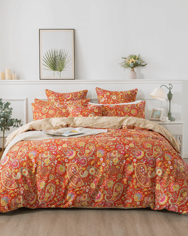
Dense floral prints:
Require subdued backgrounds to prevent visual clutter. A muted base allows the pattern to “breathe.” -
Minimal or spaced motifs:
Can tolerate stronger background colors since negative space is preserved. -
Multi-color compositions:
Neutral backgrounds act as stabilizers, preventing chromatic conflict.
Technically, this is about managing color harmony and visual load. Poor background selection leads to pattern noise, reducing perceived quality.

4. Material and Dyeing Considerations
In cotton bedding—especially double gauze—the interaction between dye and fabric structure affects how background color appears in real life.
-
100% cotton fibers:
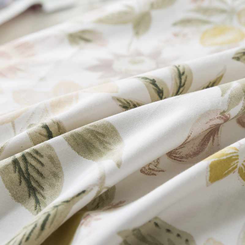
Absorb dye unevenly at micro-levels, creating a natural softness in color rendering. This is desirable for achieving a “lived-in luxury” look. -
Double gauze construction:
Adds depth and slight translucency, making background colors appear more dimensional rather than flat. -
Washing behavior:
Softer background colors age more gracefully. Over time, they develop a patina rather than visible fading.
From a production standpoint, lighter and mid-tone backgrounds are more forgiving in terms of color consistency across batches.
5. Practical Usability in Daily Life
Beyond aesthetics, background color affects maintenance perception:
-
Very light backgrounds:
Visually clean and premium, but may highlight stains more easily. -
Mid-tone backgrounds (dusty rose, muted green):
Offer the best balance between elegance and practicality. -
Dark backgrounds:
Conceal stains but may show lint, dust, or pet hair more clearly.
For pet-friendly bedding—a growing consumer demand—mid-tone and textured backgrounds are often optimal.
6. Alignment with Interior Design Trends
Background color should not be chosen in isolation—it must integrate with broader interior palettes.
Current bedding trends emphasize:
- Muted, desaturated tones
- Nature-inspired palettes
- Low-contrast layering for a cohesive look
Printed bedding is increasingly expected to function as part of a holistic bedroom system, not as a standalone decorative object.
7. Perceived Value and Brand Positioning
In premium segments, background color strongly influences perceived price point:
-
Soft neutrals and washed tones:
Signal understated luxury and craftsmanship. -
Highly saturated or overly bright backgrounds:
Risk appearing mass-market if not carefully balanced.
Luxury bedding brands tend to favor controlled palettes with subtle depth, rather than high chroma intensity.
Conclusion
Background color in printed bedding is a high-leverage design variable. It affects not only visual clarity and emotional tone but also material perception, usability, and brand positioning.
For brands aiming to deliver quiet luxury and long-term comfort, the optimal approach is deliberate restraint: choosing background colors that support the print, harmonize with the environment, and age gracefully over time.
In essence, the background is not the backdrop—it is the foundation upon which the entire bedding experience is built.