

In bedding design, contrast is not just a visual technique—it’s a strategic tool that shapes mood, spatial perception, and even how restful a bedroom feels. Whether you’re curating a calm, layered retreat or a bold, statement-driven space, understanding the difference between soft contrast and high contrast can help you make faster, more intentional design decisions.
What Is Soft Contrast?
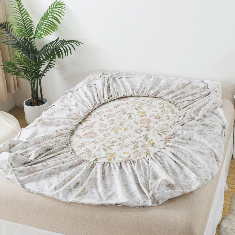
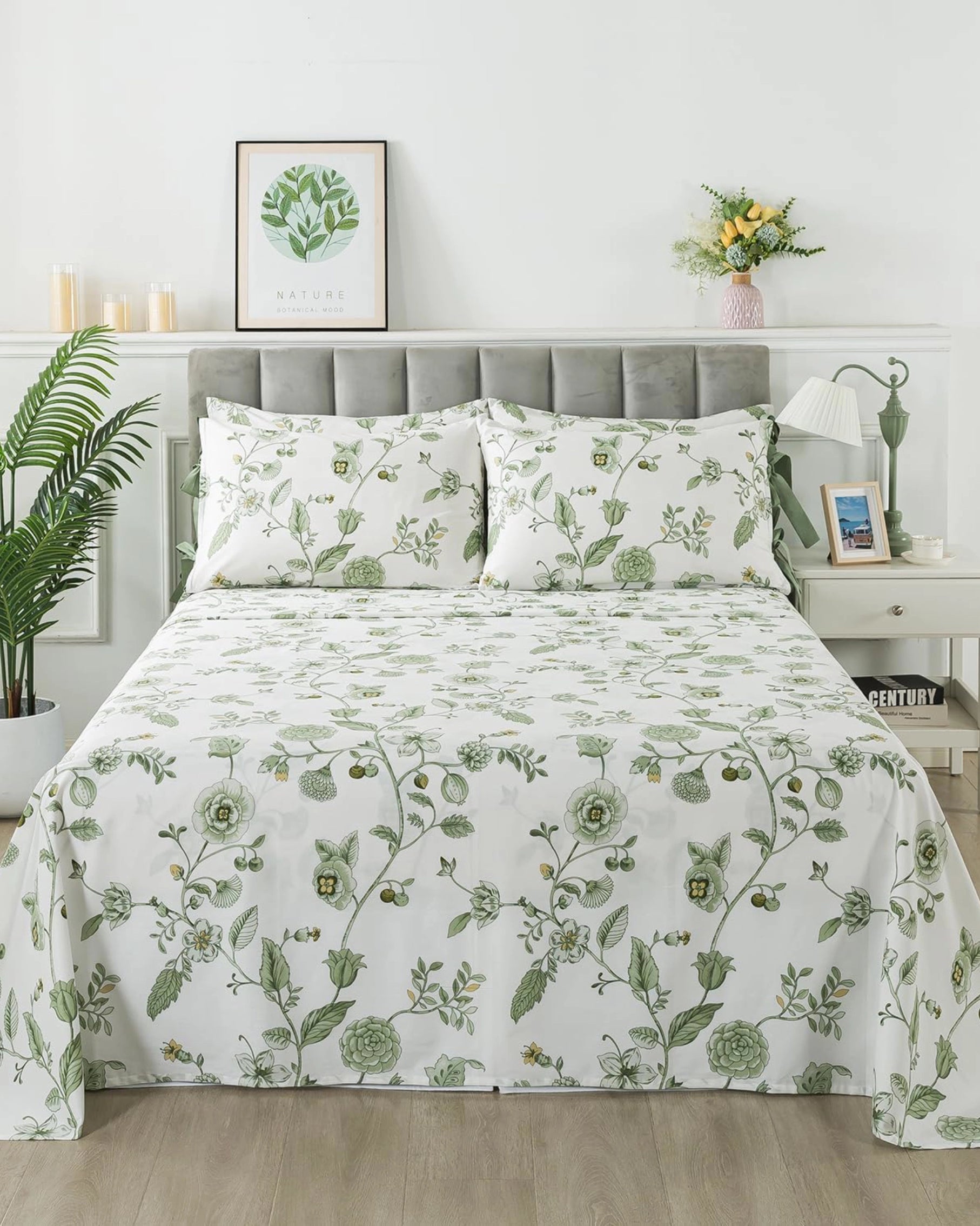
Soft contrast refers to subtle differences in color, tone, or texture within a similar palette. Instead of sharp distinctions, it relies on harmony and gradual transitions.
Think of:
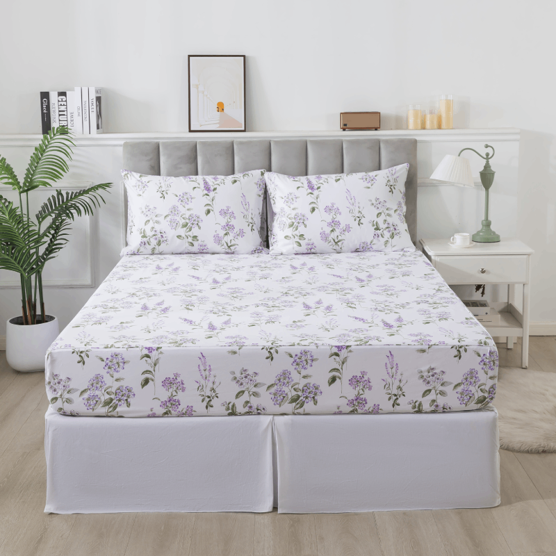
- Cream paired with warm beige
- Dusty pink with muted ivory
- Light sage green with soft gray
These combinations don’t compete for attention—they blend.
Design Impact:
Soft contrast creates a calming, cohesive environment. It reduces visual noise and encourages relaxation, making it ideal for bedrooms where rest is the primary goal.
Best Use Cases:
- Minimalist interiors
- Scandinavian or Japanese-inspired spaces
- Bedrooms with natural light and neutral furniture
- Luxury “quiet” aesthetics
Material Synergy:
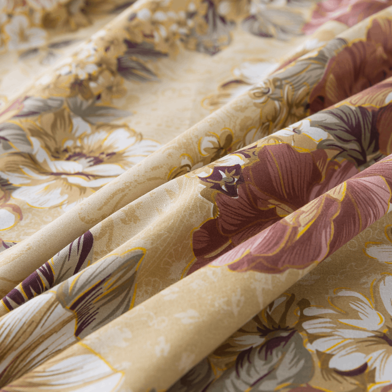
Soft contrast works especially well with natural fabrics like cotton or double gauze. The slight texture variation—wrinkles, weave density, layering—adds depth without relying on strong color differences.
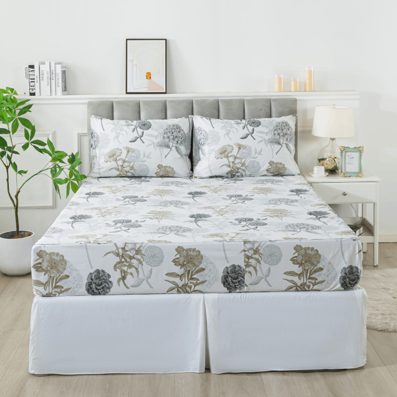
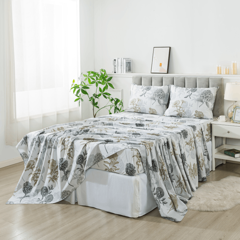
What Is High Contrast?
High contrast emphasizes strong visual differences between colors, tones, or patterns. It’s bold, defined, and immediately noticeable.
Common examples include:
- Black and white
- Navy and crisp white
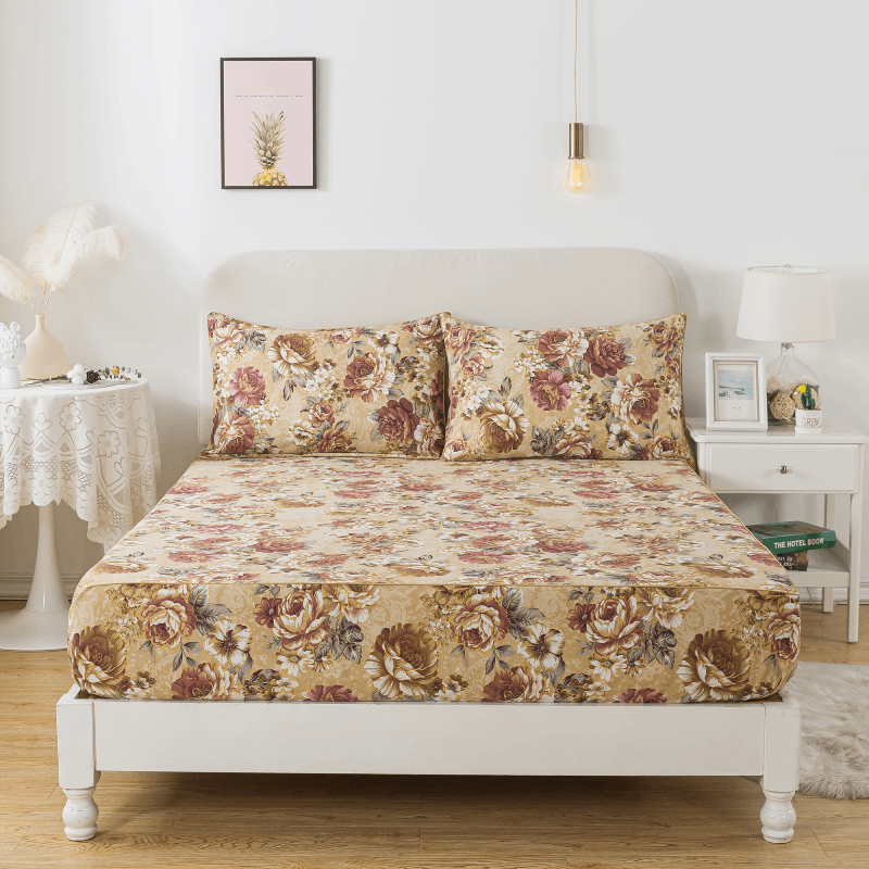
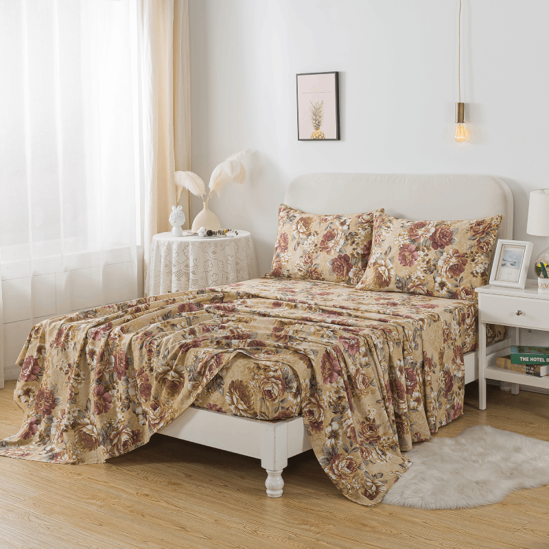
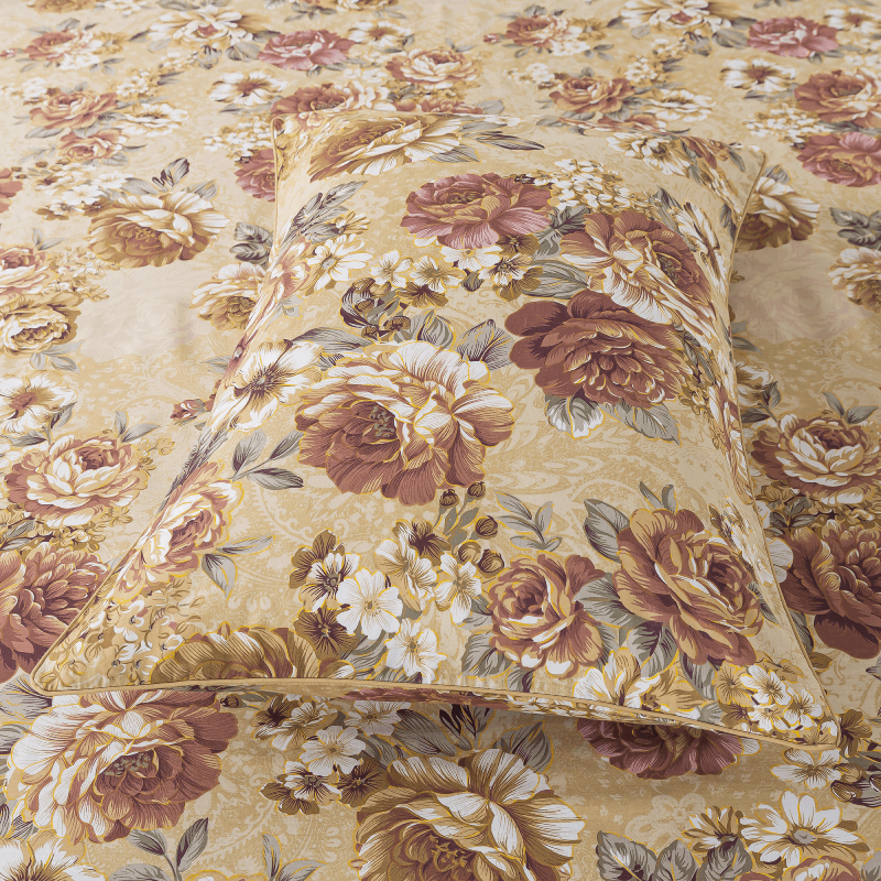
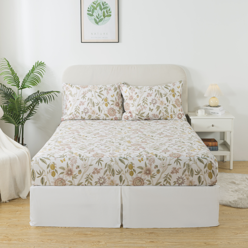
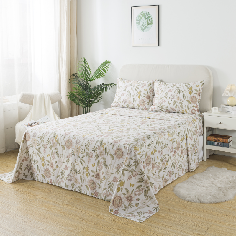
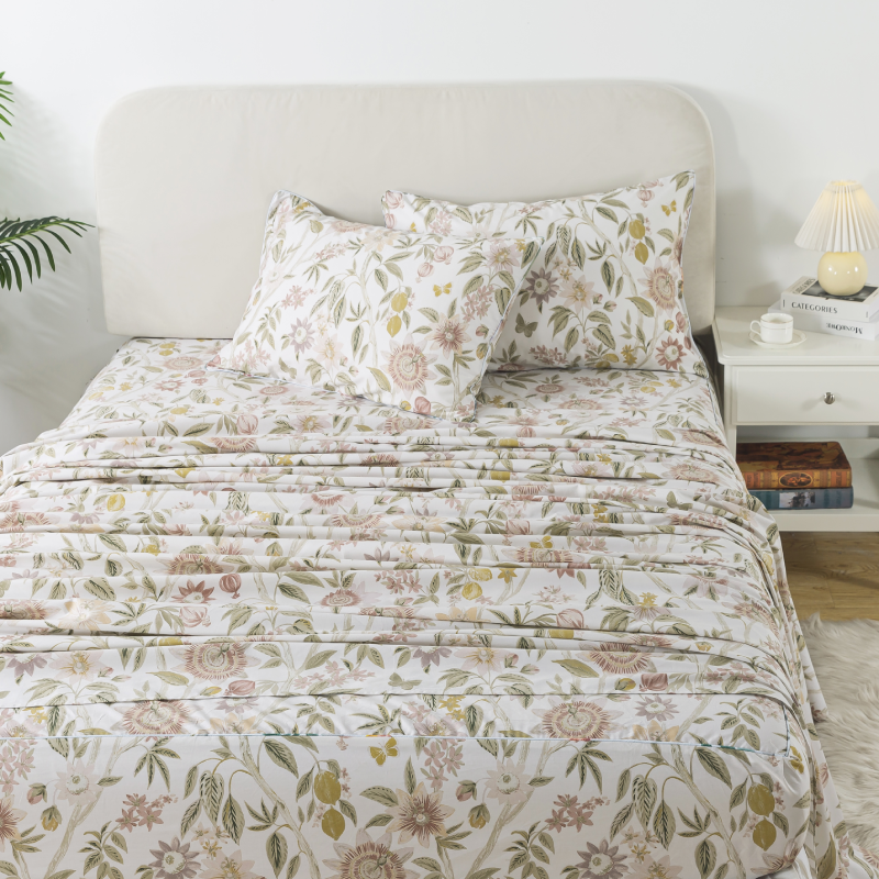
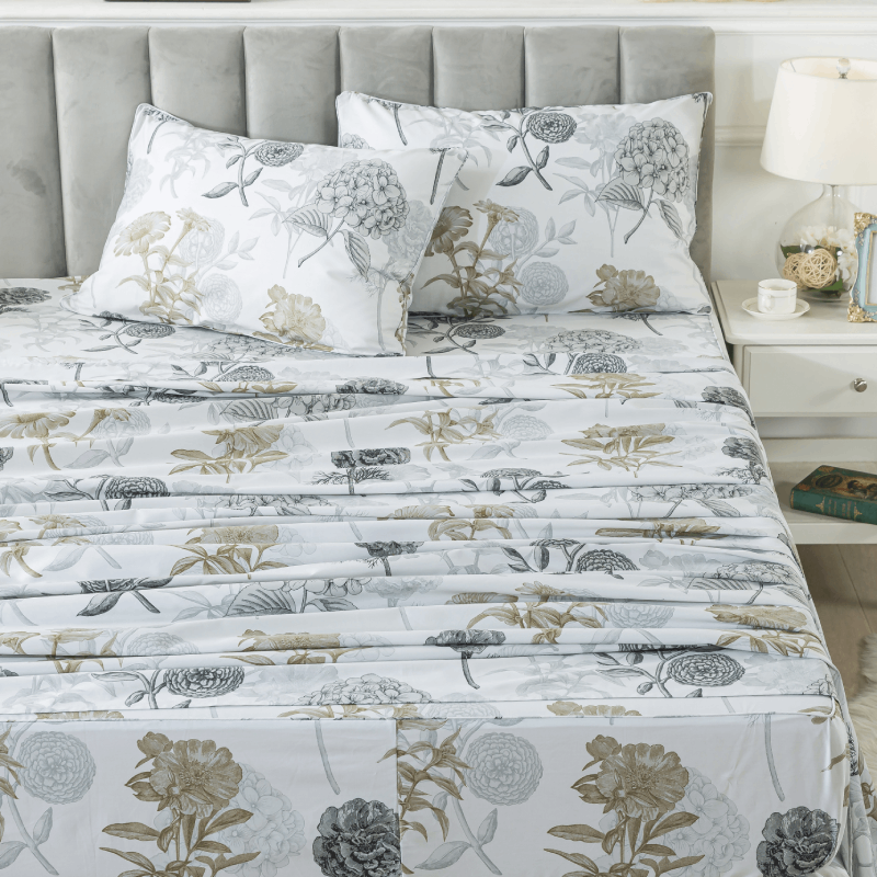
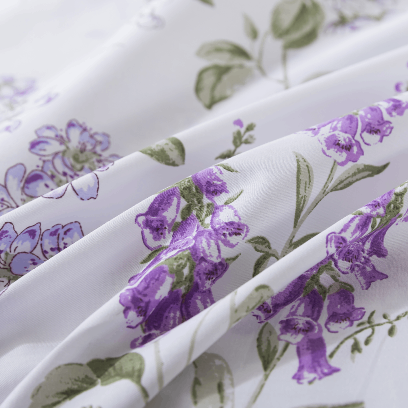
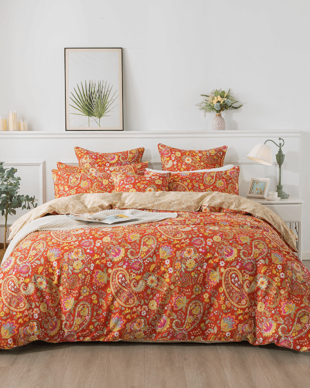
- Deep florals against a light background
- Dark green with gold or cream accents
Design Impact:
High contrast introduces energy, structure, and visual hierarchy. It draws the eye and creates focal points, making the bed a central feature in the room.
Best Use Cases:
- Statement bedrooms
- Modern or editorial-style interiors
- Rooms lacking architectural detail (contrast adds structure)
- Seasonal refreshes or bold design experiments
Pattern Amplification:
High contrast enhances patterns significantly. Floral prints, geometric shapes, and paisley designs become more defined and expressive when contrast is strong.

Emotional and Psychological Effects
The choice between soft and high contrast goes beyond aesthetics—it influences how a space feels.
-
Soft Contrast → Calm, gentle, restorative
Ideal for winding down, reducing stress, and promoting better sleep. -
High Contrast → Energetic, dramatic, stimulating
Better suited for visual impact, creativity, or daytime styling.
If your goal is a bedroom that feels like a retreat, soft contrast typically performs better. If you want a space that feels styled and expressive, high contrast delivers.
How to Choose Between Them
Instead of asking which is “better,” consider context and intent.
1. Room Size & Light
- Small or dim rooms benefit from soft contrast—it keeps the space open and airy.
- Large or bright rooms can handle high contrast without feeling overwhelming.
2. Existing Furniture
- If your furniture is already bold (dark wood, metal frames), soft bedding balances it.
- If your furniture is neutral, high-contrast bedding can add visual interest.
3. Lifestyle Needs
- For everyday comfort and long-term use, soft contrast is more forgiving and timeless.
- For photos, marketing visuals, or seasonal updates, high contrast stands out more.
Combining Both for a Balanced Look
The most refined bedding setups rarely rely on just one approach. Instead, they layer contrast intelligently.
A practical formula:
- Base layer (duvet or quilt): Soft contrast
- Accent layer (pillows, throws): High contrast
This creates depth without overwhelming the eye.
Example:
- Soft ivory floral bedding (low contrast)
- Paired with deep green or charcoal accent pillows (high contrast)
The result feels curated, not chaotic.
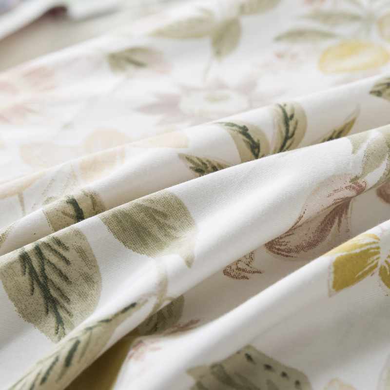
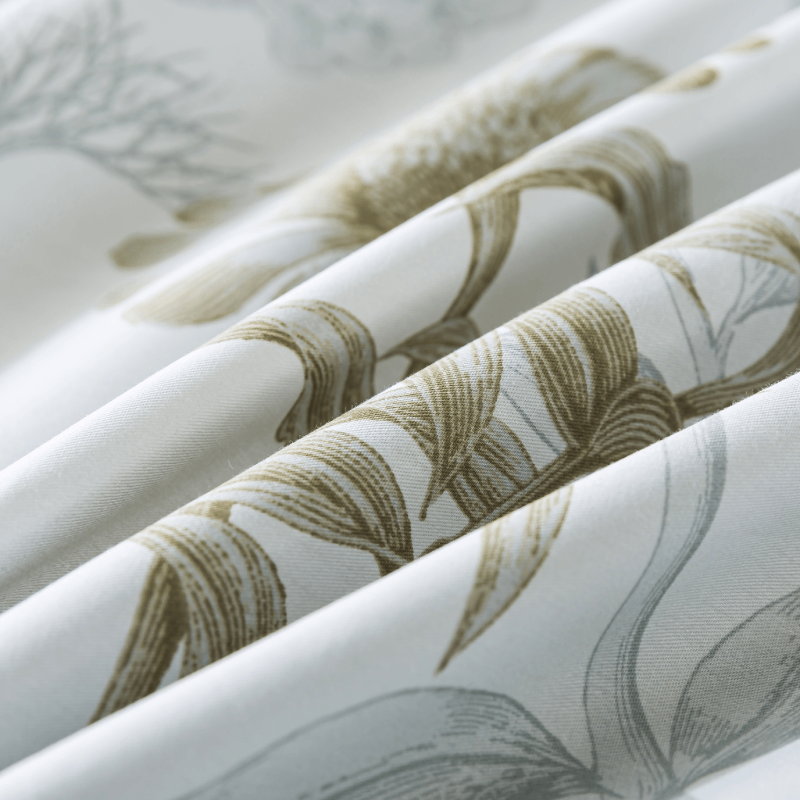
Fabric and Texture Considerations
Contrast isn’t only about color—it’s also about texture.
- In soft contrast designs, texture becomes the primary differentiator. Think wrinkled gauze vs. smooth cotton sateen.
- In high contrast designs, texture supports the visual structure but doesn’t need to carry it.
For premium bedding, combining subtle tonal shifts with tactile variation (like double-layer gauze) often achieves a more sophisticated result than relying on color contrast alone.
Final Thoughts
Soft contrast and high contrast serve different purposes, and neither is inherently superior. The decision should align with how you want your bedroom to feel and function.
- Choose soft contrast for longevity, calmness, and everyday comfort.
- Choose high contrast for impact, definition, and visual storytelling.
For most homes, the optimal approach lies in balance—using soft contrast as a foundation and introducing high contrast selectively to create interest without sacrificing comfort.
In the end, great bedding design isn’t about following rules—it’s about controlling contrast with intention.