

Modern life places constant demands on our eyes. Screens, signage, sharp contrasts, and crowded visuals fill our daily environments, often leaving us feeling mentally tired without realizing why. At home—especially in spaces meant for rest—visual fatigue can quietly undermine comfort and well-being.
One of the most effective ways to counter this is through gentle patterns. Subtle, balanced designs play a meaningful role in creating interiors that feel calm, restorative, and easy to live with. Rather than eliminating pattern altogether, the right approach is choosing patterns that support the eye instead of overstimulating it.
Understanding Visual Fatigue
Visual fatigue occurs when the eyes work too hard to process information. High contrast, excessive detail, and constant visual stimulation force the brain to stay alert, even in spaces designed for relaxation.
At home, visual fatigue can show up as:
-
Difficulty fully relaxing in a room
-
Feeling restless or distracted without a clear reason
-
Spaces that look “busy” even when they are clean and organized
Design choices, particularly patterns and color balance, strongly influence this experience.
Why Pattern Matters More Than We Think
Patterns are often misunderstood as purely decorative. In reality, they guide how the eye moves through a space.
Harsh, high-contrast patterns demand attention. They pull the eye in multiple directions at once, creating tension. Gentle patterns, by contrast, offer rhythm without pressure. They give the eye something to engage with, but do not insist on constant focus.
This balance is essential in living spaces where the goal is ease rather than stimulation.
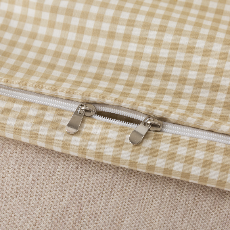
The Characteristics of Gentle Patterns
Not all patterns reduce visual fatigue. Gentle patterns share several defining traits:
-
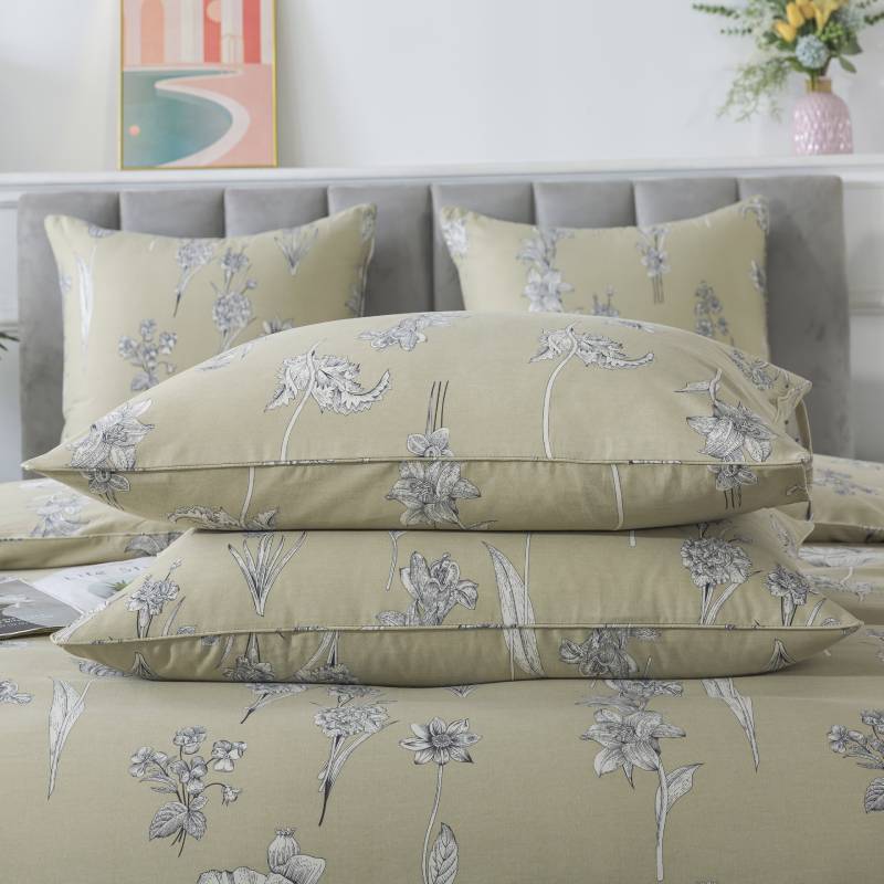
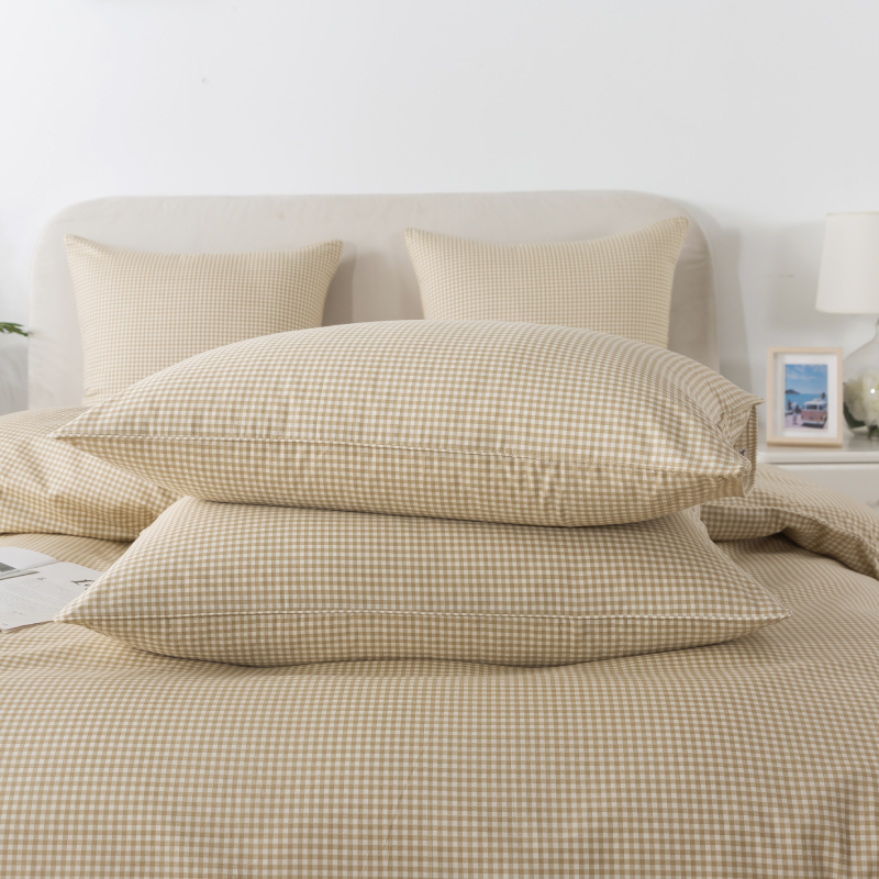
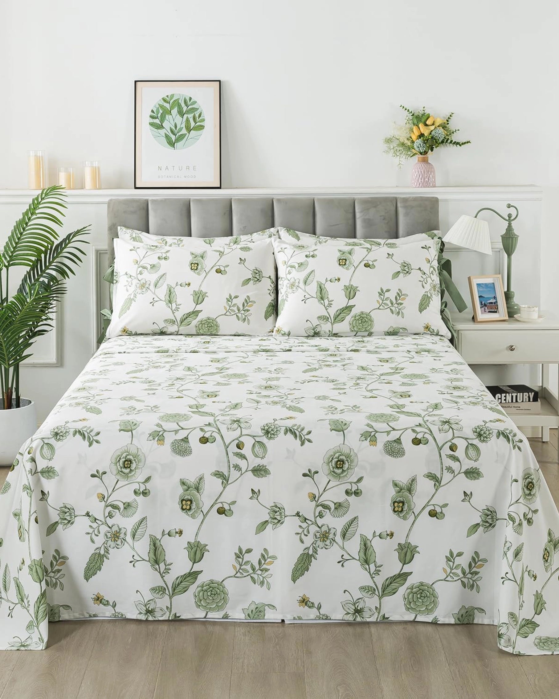
Soft contrast: Colors are closely related rather than sharply opposed
-
Balanced spacing: Motifs are evenly distributed, leaving room to breathe
-
Organic shapes: Natural curves feel more restful than rigid geometry
-
Consistent rhythm: Repetition feels predictable rather than chaotic
These elements work together to create visual harmony.

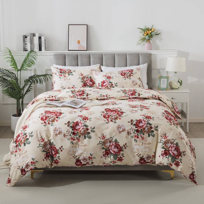
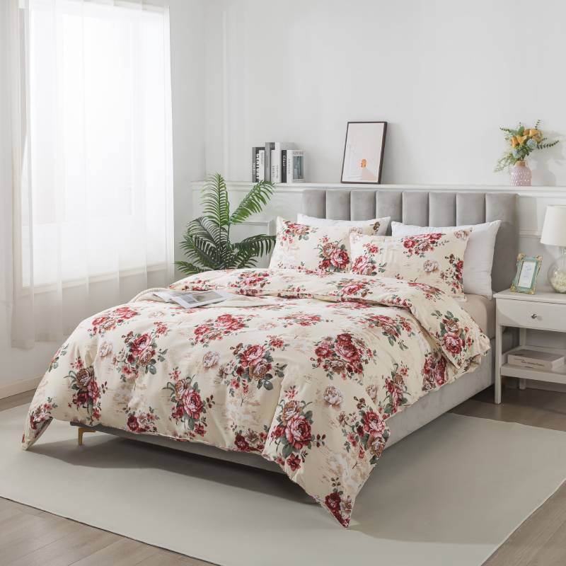
How Gentle Patterns Support Restful Spaces
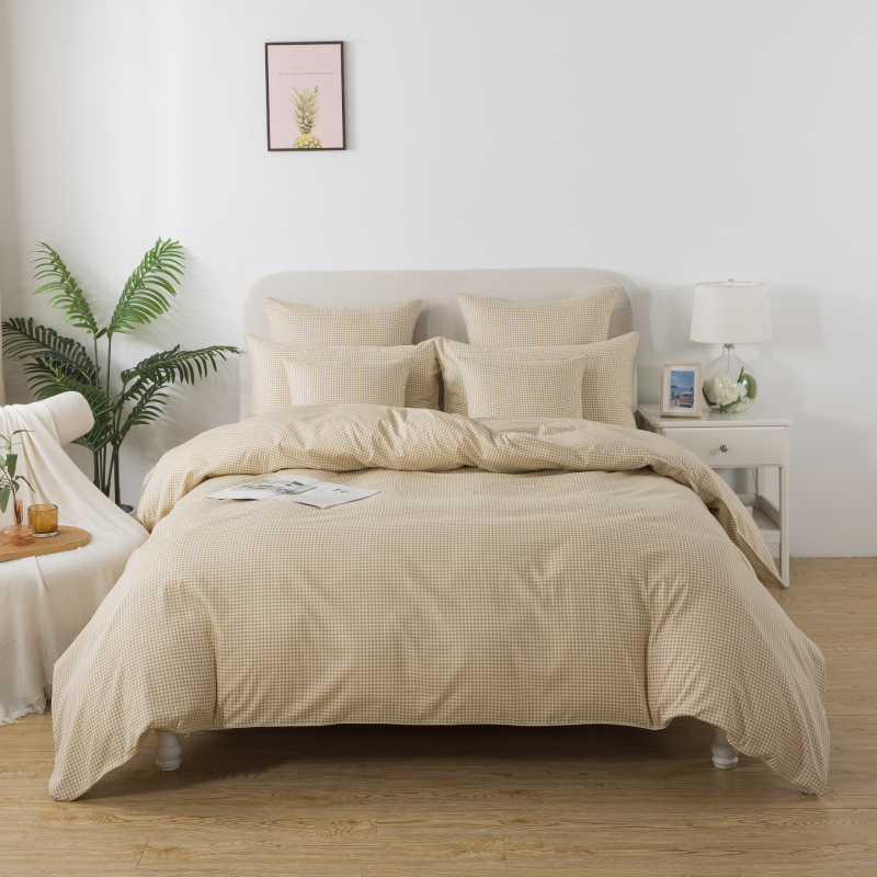
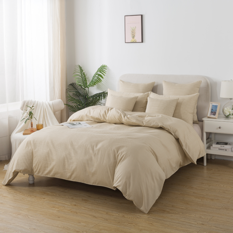
In rooms like bedrooms and living areas, gentle patterns help establish a sense of visual quiet. They soften hard architectural lines and neutral furniture without overwhelming the space.
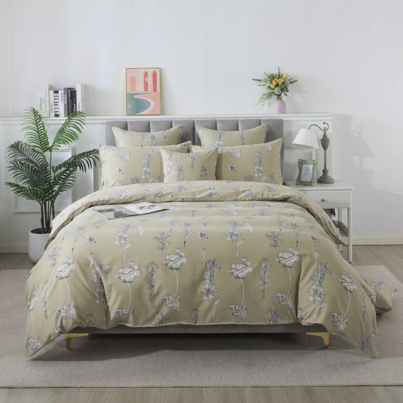
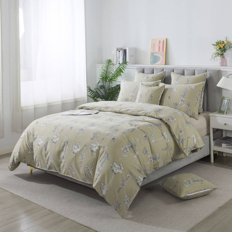
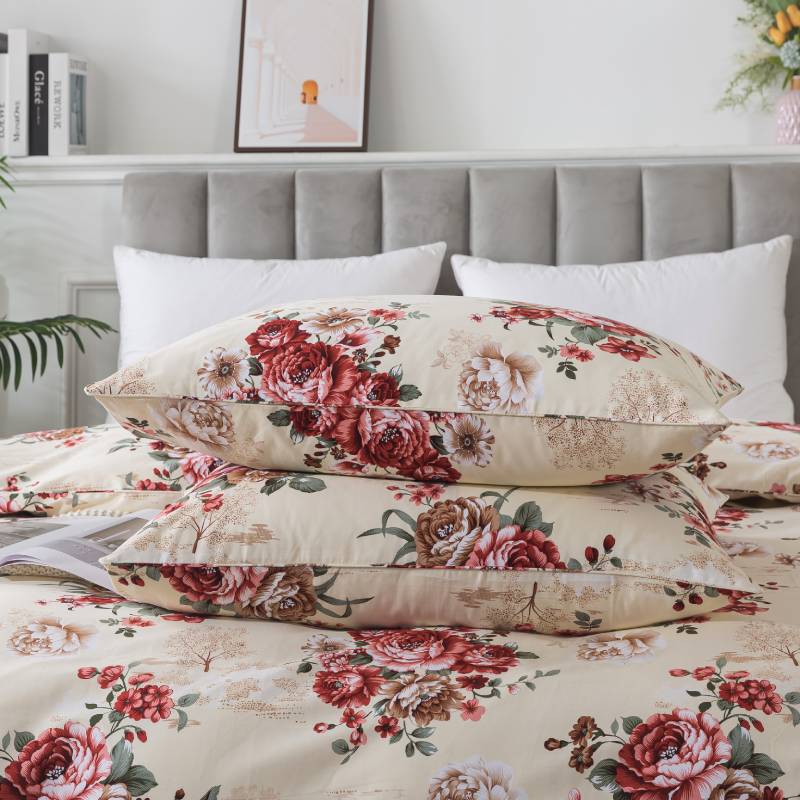
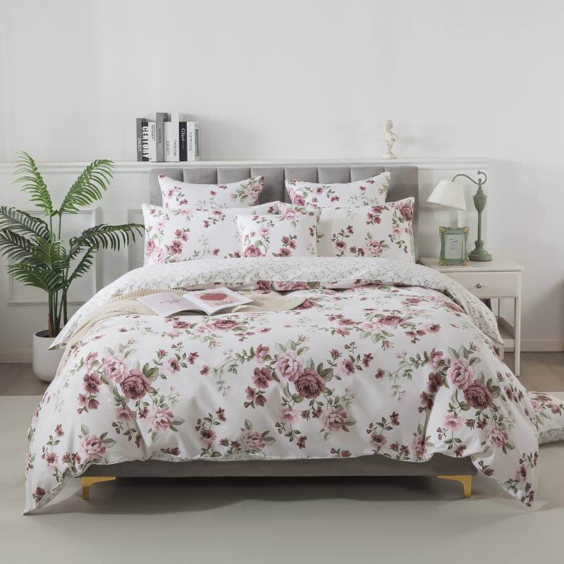
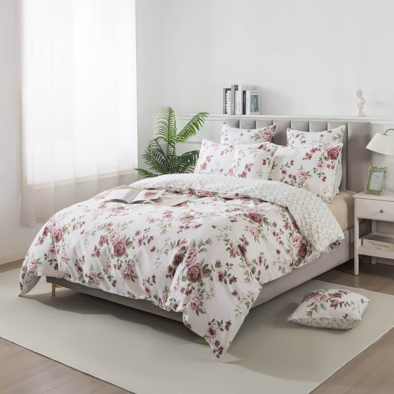
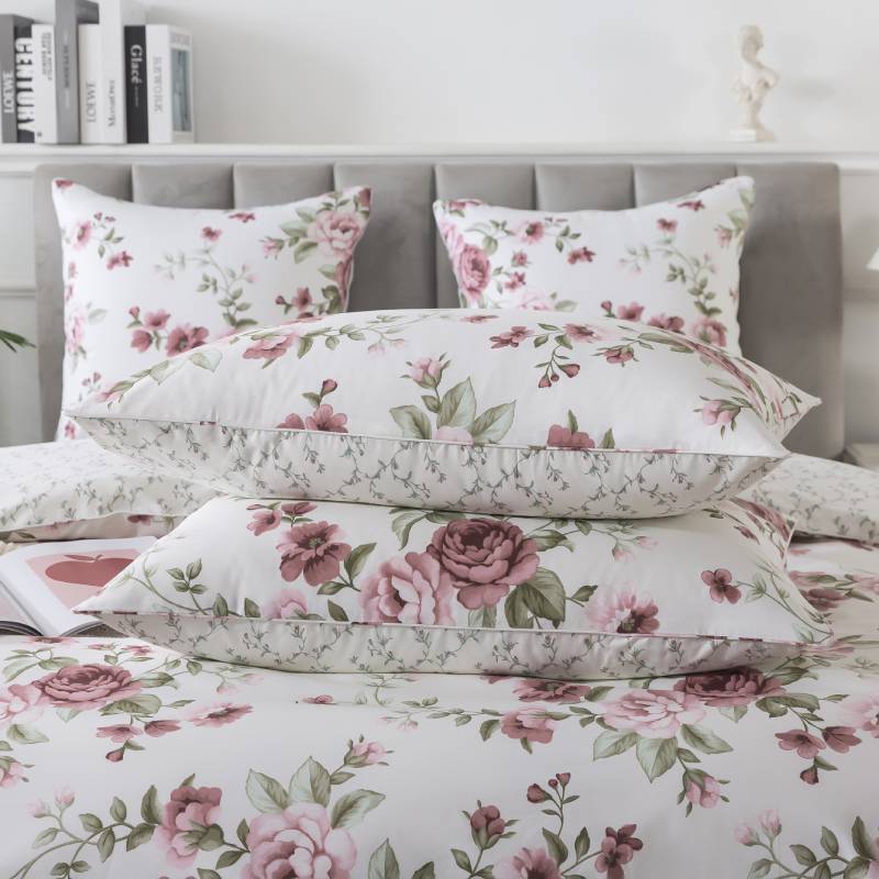
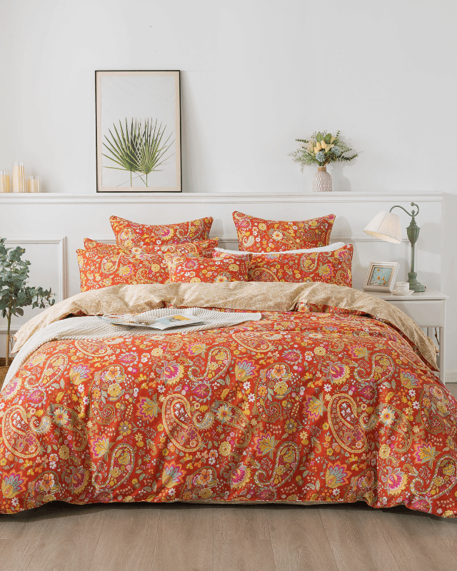
For example, floral patterns with muted tones and open composition can introduce warmth while maintaining calm. The eye moves naturally across the design instead of stopping abruptly at high-contrast edges.
This visual smoothness allows the mind to relax, supporting both physical rest and emotional ease.
The Role of Color in Visual Comfort
Pattern and color are inseparable. Even a simple pattern can cause fatigue if the color palette is too intense.
Gentle patterns typically rely on:
-
Muted, nature-inspired hues
-
Limited color palettes
-
Soft transitions between tones
These color choices reduce visual strain by minimizing sharp changes that force the eye to constantly adjust.
Familiarity and Long-Term Comfort
Visual fatigue often increases over time. Patterns that initially feel exciting may become tiring after weeks or months of daily exposure.
Gentle patterns tend to age well because they do not rely on novelty. Their subtlety allows them to fade into the background of daily life, becoming part of the home rather than a focal point demanding attention.
This familiarity contributes to long-term comfort and satisfaction.
Where Gentle Patterns Make the Biggest Difference
While gentle patterns can be used throughout the home, they are especially impactful in spaces associated with rest and routine:
-
Bedrooms: Bedding and textiles directly influence how the space feels at night
-
Living rooms: Soft patterns reduce mental clutter in shared spaces
-
Reading or relaxation areas: Visual calm supports focus and unwinding
In these environments, gentle patterns act as visual support rather than decoration alone.
Pattern as a Background, Not a Statement
One key difference between stimulating and calming patterns is intent.
Statement patterns aim to be noticed immediately. Gentle patterns are designed to be lived with. They enrich the environment without requiring attention, allowing other elements—light, texture, and personal objects—to take the lead.
This approach aligns with the idea that a home should serve its occupants, not compete for their attention.
Balancing Simplicity and Interest
Reducing visual fatigue does not mean removing pattern entirely. Completely flat or overly minimal spaces can feel sterile or emotionally distant.
Gentle patterns provide just enough visual interest to make a space feel warm and human, while still preserving simplicity. The goal is balance—spaces that feel alive, but never overwhelming.
Final Thoughts
Gentle patterns play a quiet yet powerful role in reducing visual fatigue at home. Through soft contrast, balanced spacing, and thoughtful color choices, they help create environments where the eye can rest and the mind can slow down.
In homes designed for everyday living, visual comfort matters just as much as physical comfort. By choosing patterns that support calm rather than demand attention, we create spaces that truly restore us—day after day.