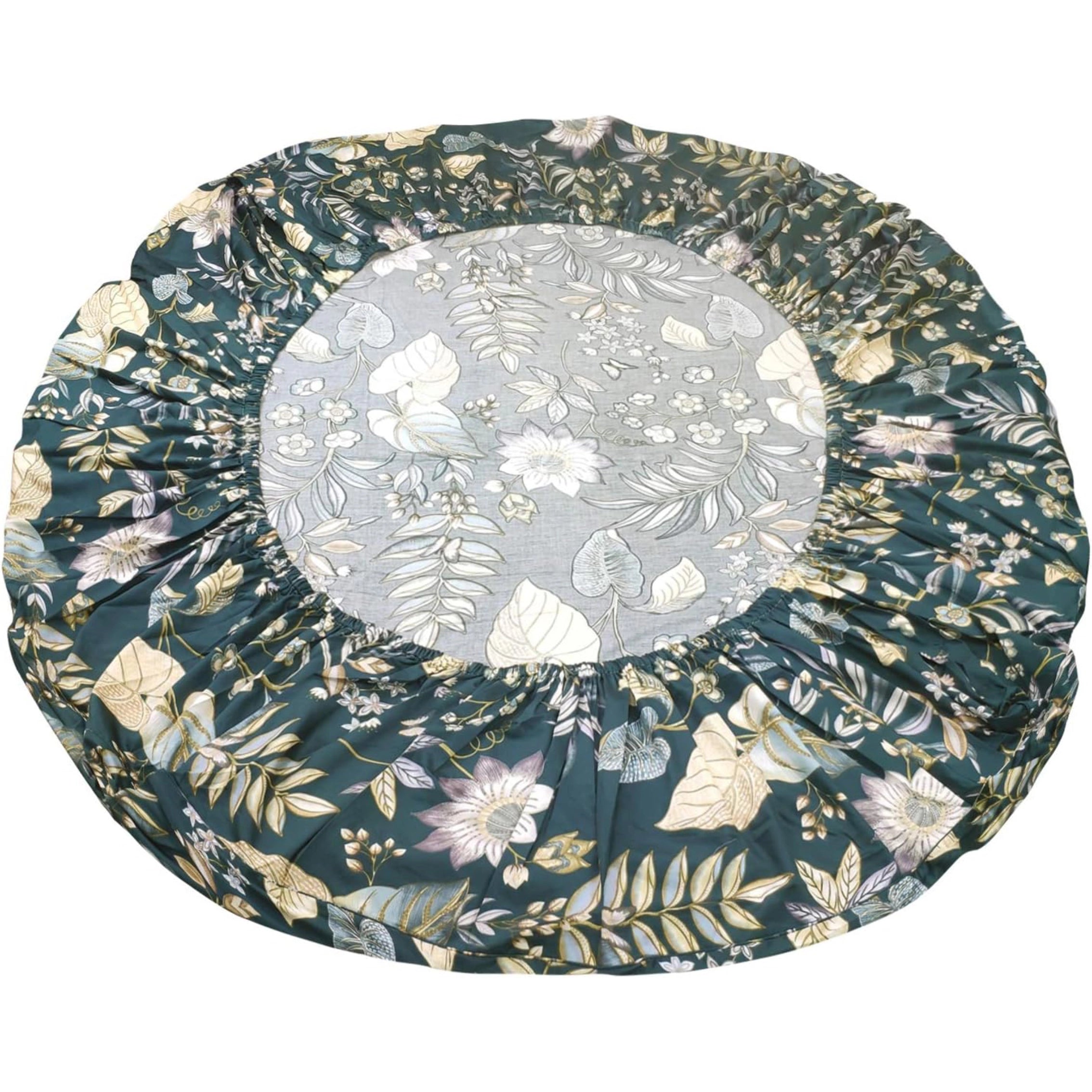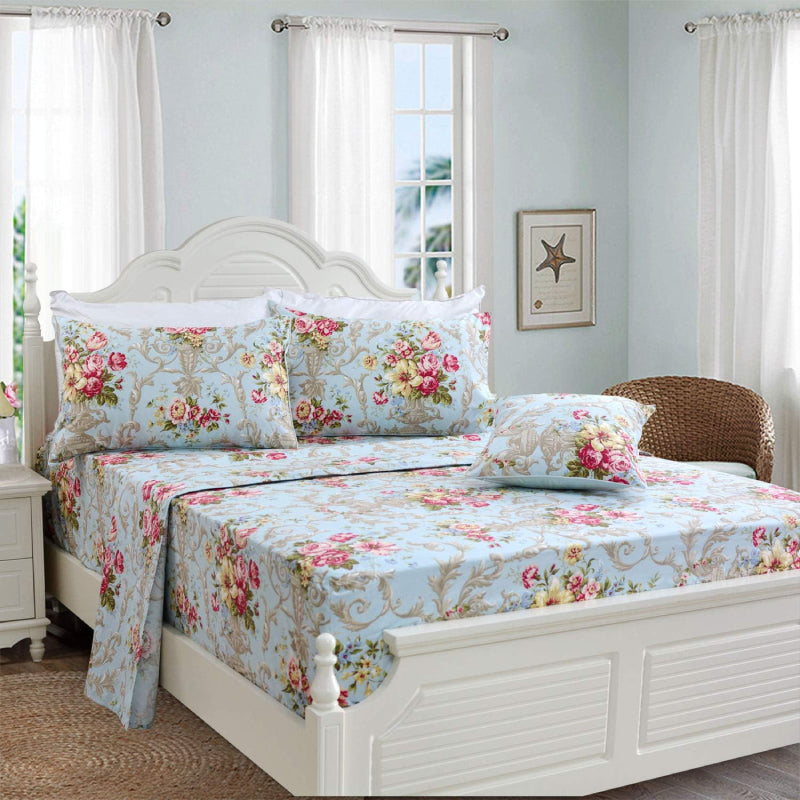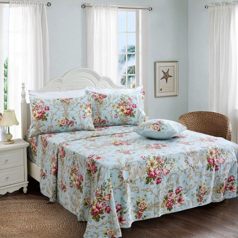


In a market saturated with bold prints, oversized blooms, and high-contrast palettes, understated florals quietly signal something different—refinement. They don’t compete for attention; they earn it. For brands like FADFAY, where floral bedding is central to identity, understanding why subtle florals feel more premium is not just aesthetic—it’s strategic.
1. Visual Restraint Signals Confidence
Premium design often relies on restraint. Loud patterns try to impress immediately, while understated florals unfold gradually. This slower visual experience creates a sense of depth and sophistication.
Muted tones, smaller-scale motifs, and softer transitions between colors reduce visual noise. Instead of overwhelming the eye, they invite closer inspection. This aligns with how luxury is perceived across industries—confidence without excess.
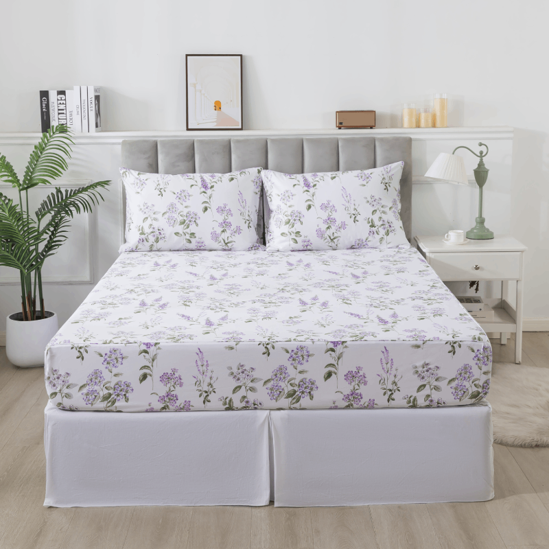
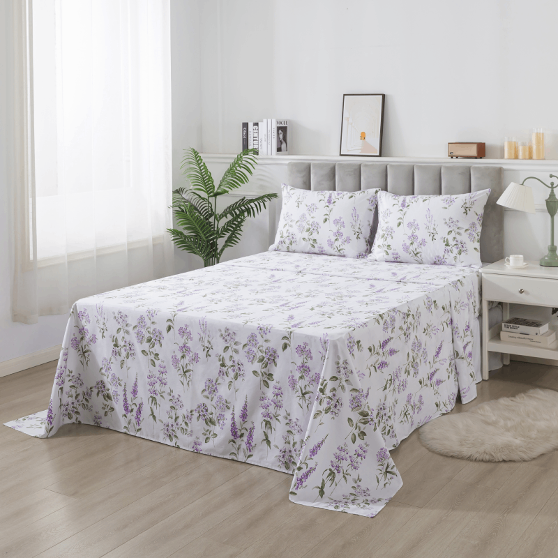
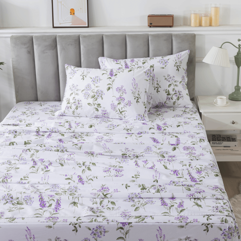
In bedding, this translates to prints that don’t dominate the room but integrate seamlessly into it. The result is a calm, elevated atmosphere rather than a decorative overload.
2. Subtlety Enhances Material Perception
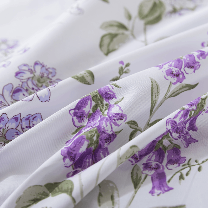
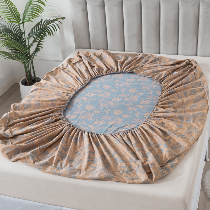
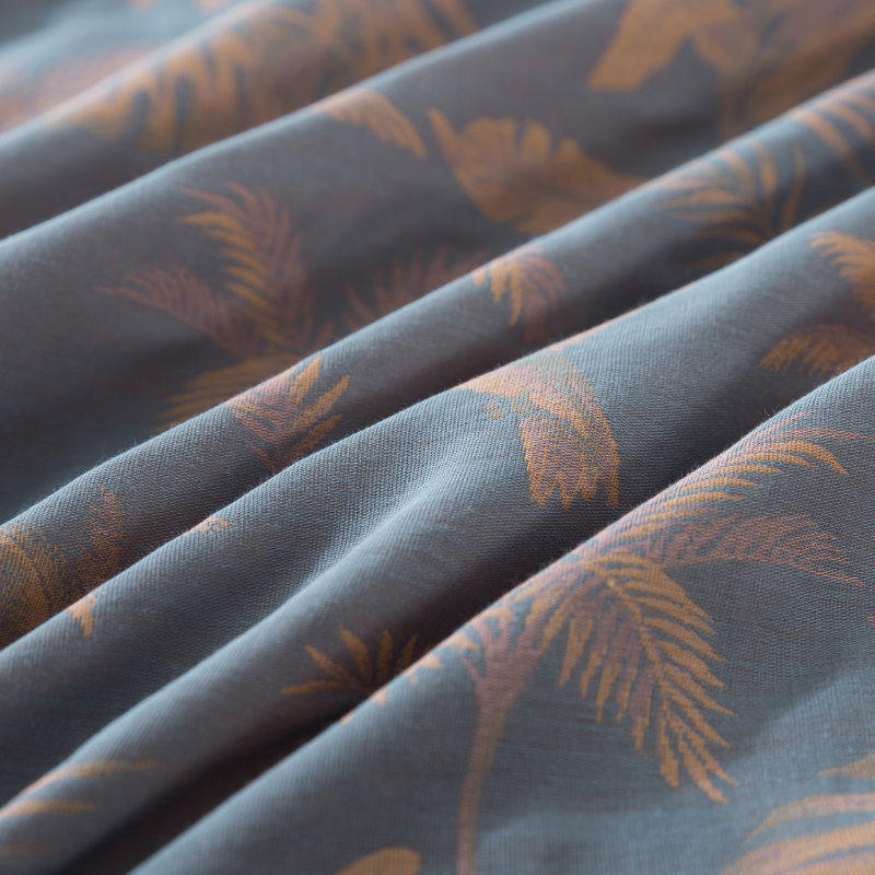
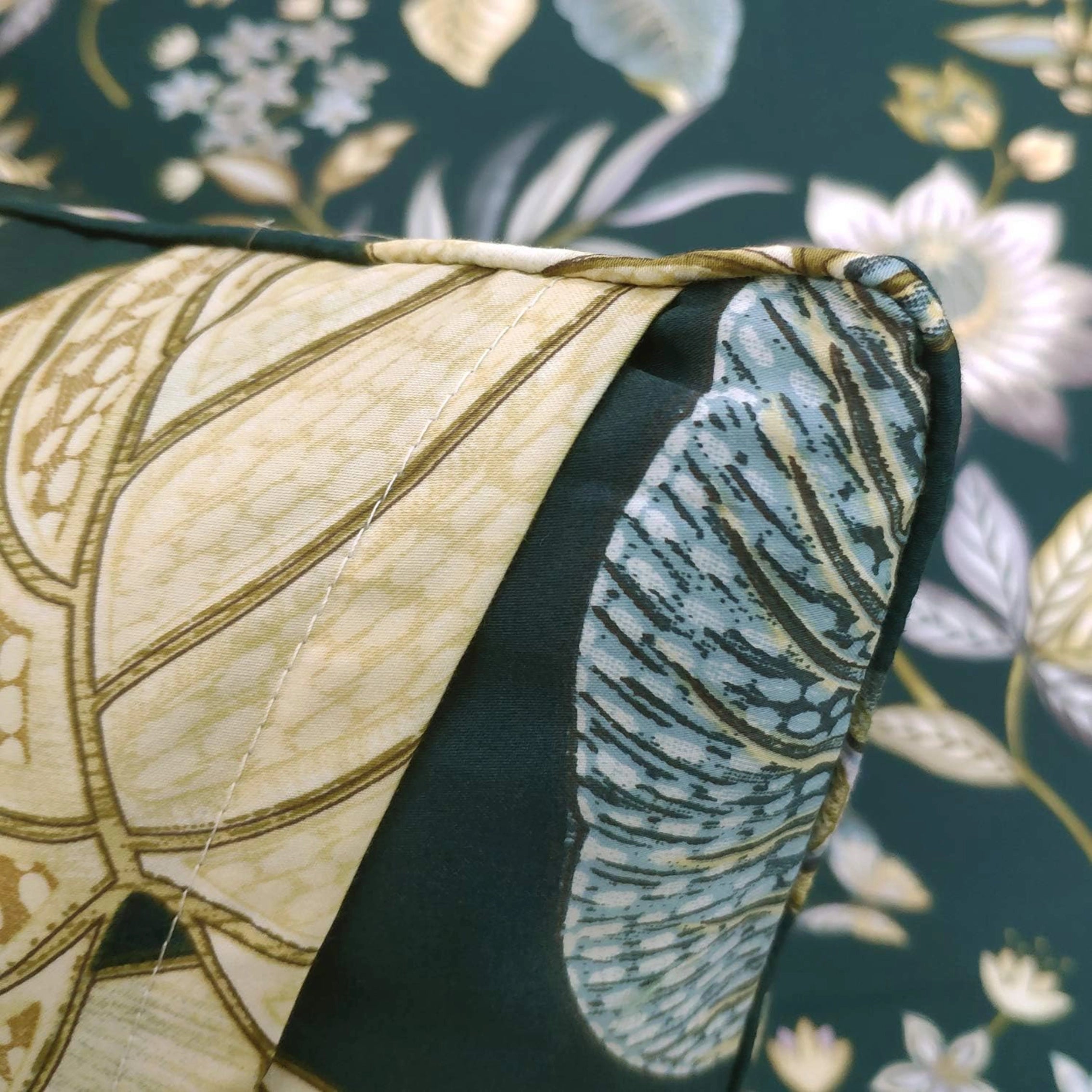
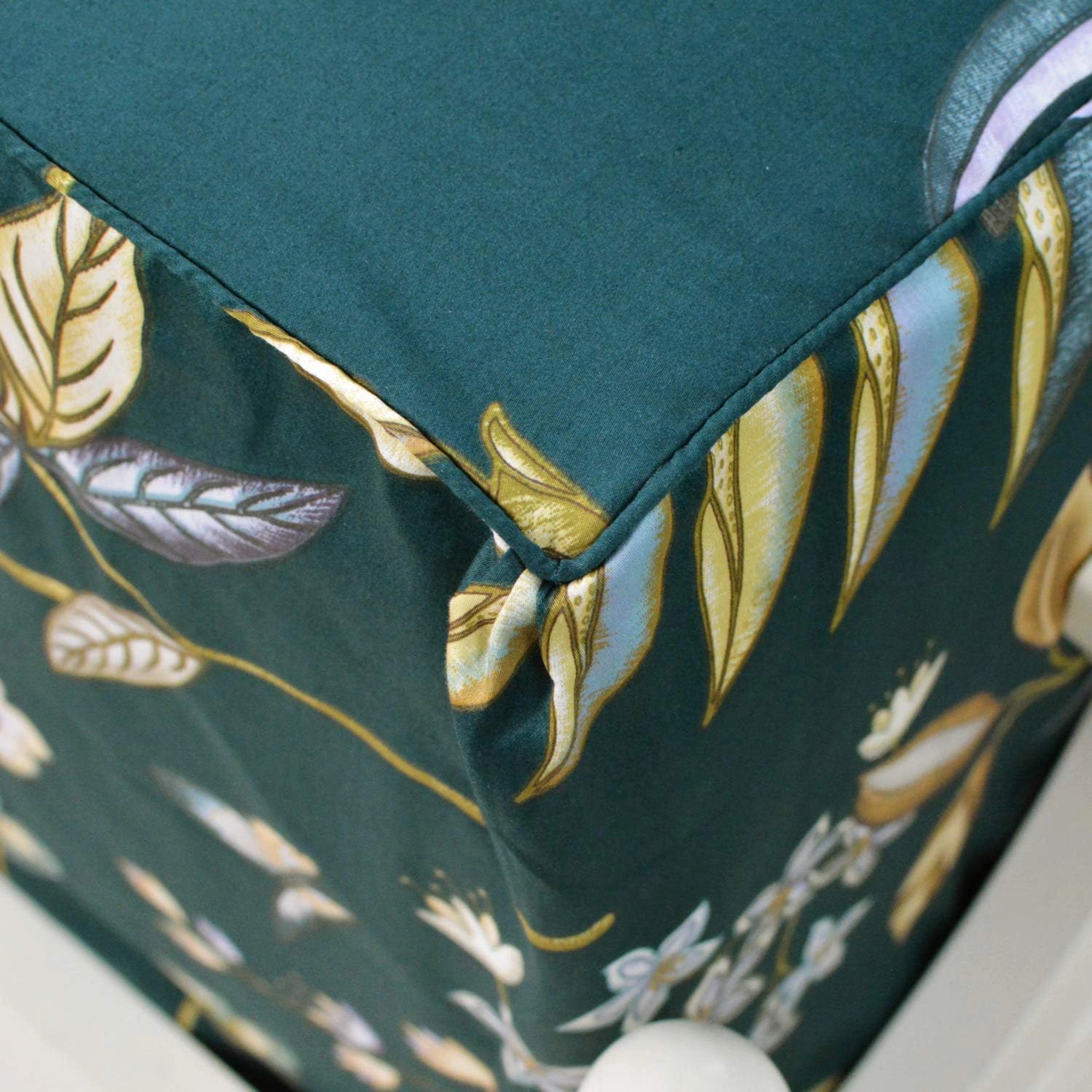
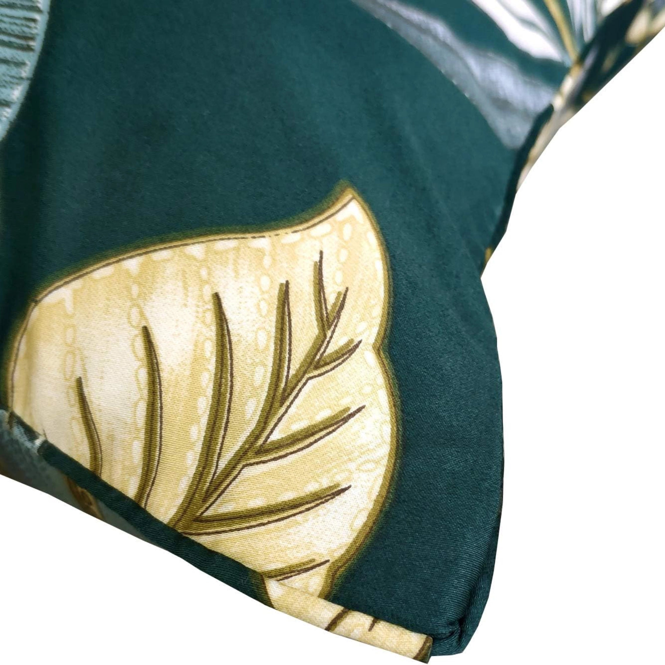
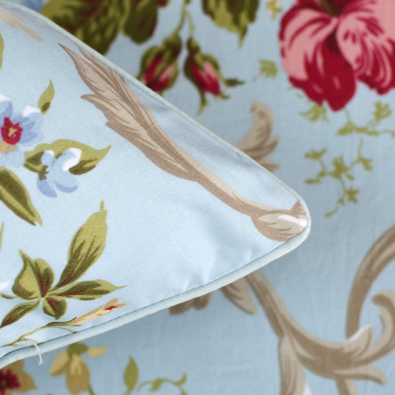
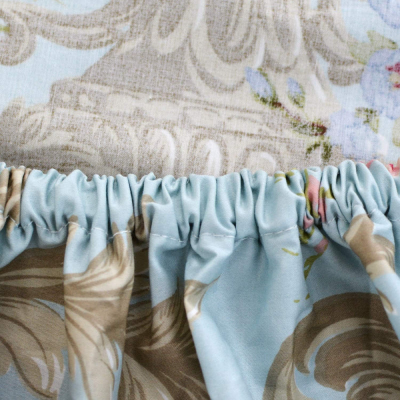
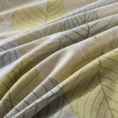
Fabric quality is a key driver of perceived value. However, bold patterns often mask texture, while understated florals allow the material to speak.
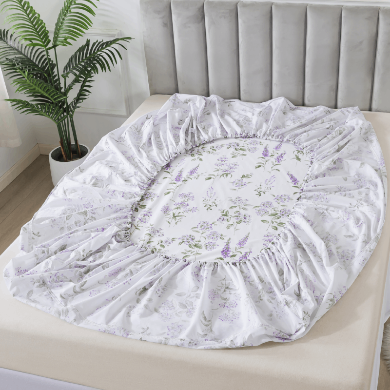
On 100% cotton—especially double gauze—the softness, breathability, and natural drape become more visible when the print isn’t overpowering. Slight wrinkles, gentle folds, and the organic movement of the fabric are not distractions; they are part of the aesthetic.
Understated florals work with the fabric rather than against it. This synergy enhances the perception of craftsmanship and authenticity, both of which are essential to premium positioning.
3. Timelessness Over Trend
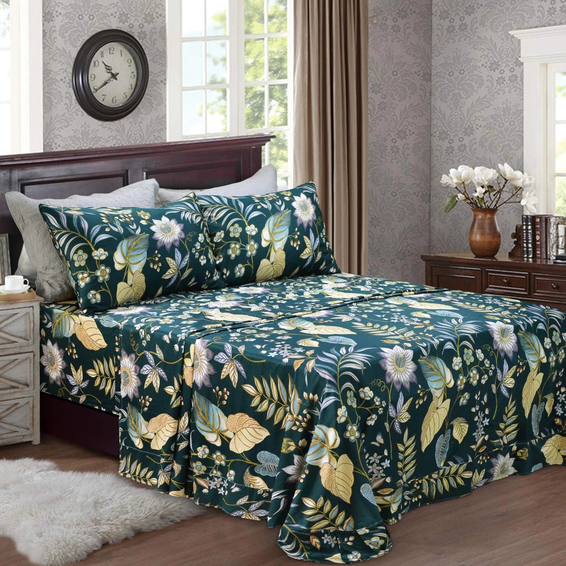
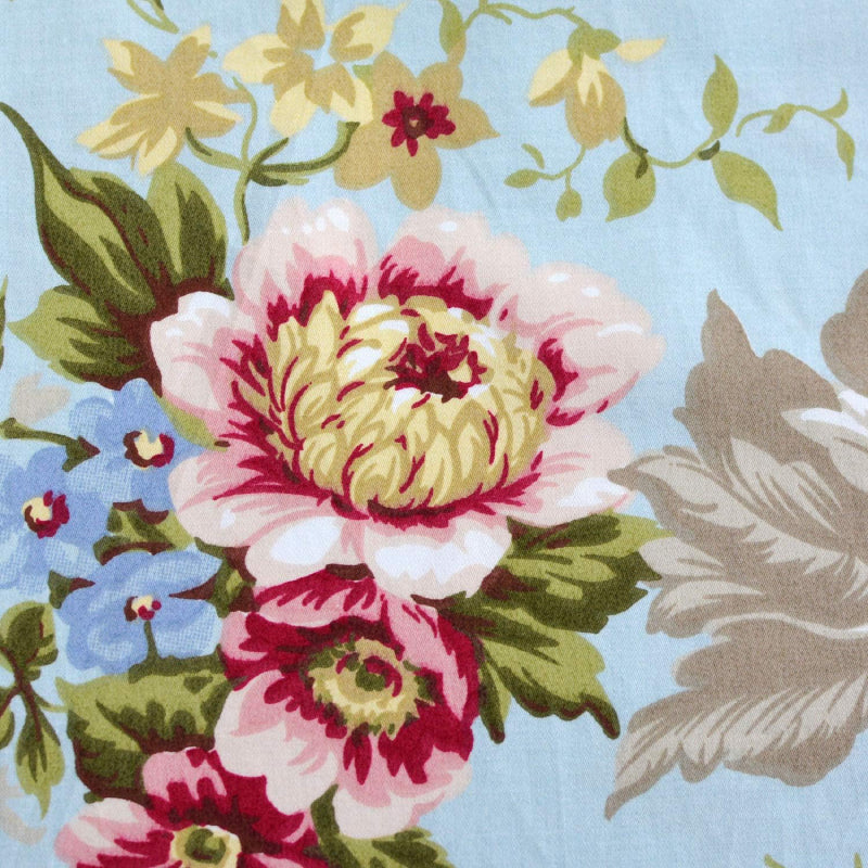
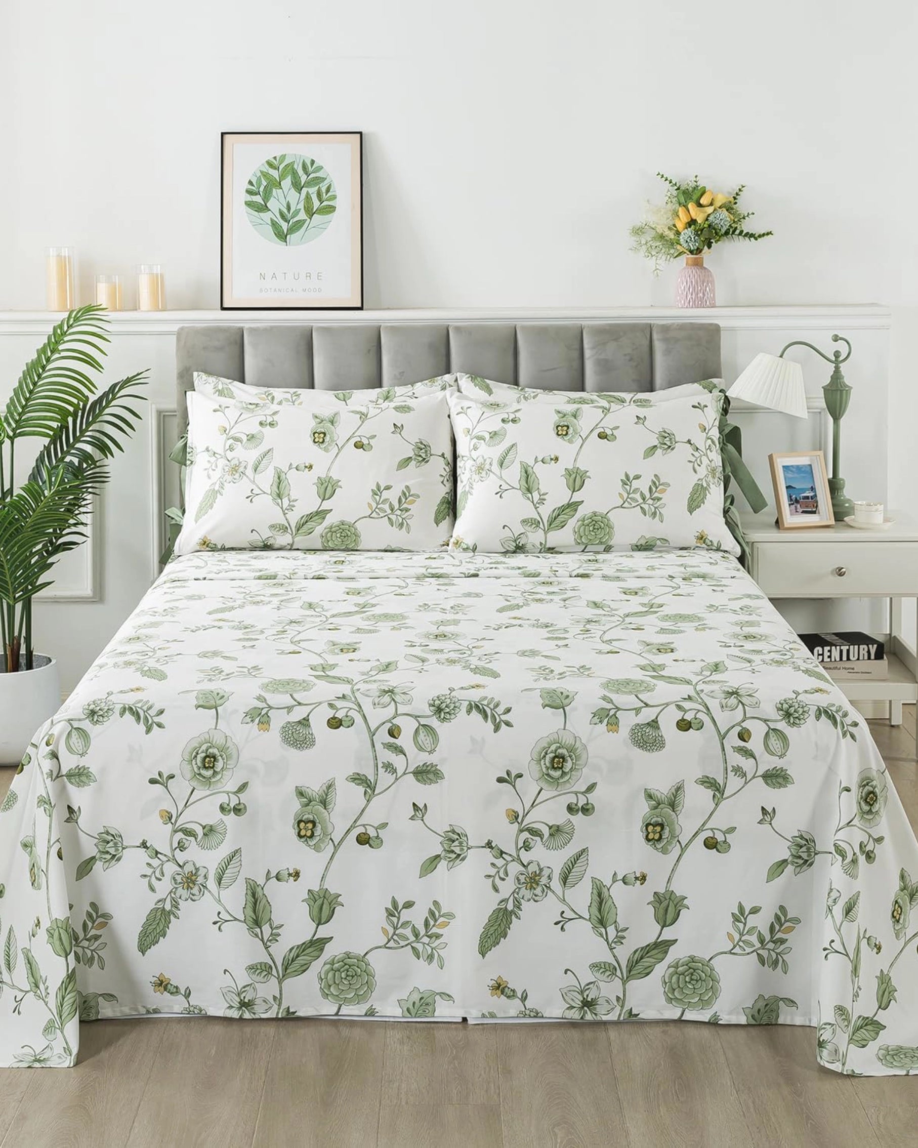
Bold florals are often tied to specific trends—seasonal colors, maximalist phases, or fast-fashion cycles. Understated florals, by contrast, operate in a more timeless design space.
Soft botanical sketches, vintage-inspired patterns, and faded color palettes tend to age gracefully. They don’t feel outdated after one season. This longevity is a core component of premium value: products that remain relevant over time justify a higher price point.
For consumers, this means fewer replacements and a more consistent home aesthetic. For brands, it means stronger product lifecycle performance.

4. Emotional Tone: Calm, Not Stimulating
Color psychology plays a significant role in how products are perceived. High-saturation prints stimulate; low-contrast, muted florals calm.
Bedrooms are inherently restorative spaces. Designs that reduce cognitive load—through gentle patterns and balanced compositions—align better with the function of the space. Understated florals contribute to a sense of quiet luxury: comfort that doesn’t demand attention.
This emotional alignment enhances perceived quality. A product that feels right in its environment is often judged as higher-end, even before its technical specifications are considered.
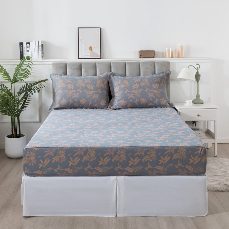
5. Versatility Increases Value
Premium products are expected to adapt. Understated florals offer high versatility across different interior styles:
- Minimalist rooms gain warmth without losing simplicity
- Traditional spaces feel refreshed without disruption
- Modern interiors benefit from a softer, more human touch
Because these patterns don’t clash with other elements—furniture, rugs, wall colors—they extend usability. A single bedding set can work across multiple styling updates, increasing its functional value.
6. Association with Heritage and Craft
Subtle floral designs often draw from historical references: English countryside prints, French toile variations, or hand-drawn botanical illustrations. These associations carry cultural weight.
Consumers subconsciously link these references to craftsmanship, heritage, and slower production methods. Even when produced at scale, the visual language suggests a more artisanal origin.
This perceived connection to tradition reinforces the idea of premium quality, especially when paired with natural materials like cotton.
7. Photography and Presentation Advantage
From a marketing perspective, understated florals perform differently—and often better—in high-end visual contexts.
They photograph with more nuance. Light interacts with them softly, shadows remain visible, and the overall image retains depth. In contrast, bold prints can flatten under lighting or dominate compositions.
For lifestyle imagery—especially scenes involving natural light, pets, or relaxed environments—subtle florals create a cohesive, editorial look. This aligns with the “real life, but refined” positioning that many premium bedding brands aim for.
8. Premium Is About Balance, Not Complexity
A common misconception is that premium design requires complexity. In reality, it requires balance.
Understated florals achieve this through:
- Controlled color palettes
- Harmonized pattern scale
- Integration with fabric texture
- Alignment with environment and function
Nothing feels excessive, yet nothing feels missing. This equilibrium is difficult to execute well, which is precisely why it feels premium when done correctly.
Conclusion
Understated florals don’t rely on immediate impact—they build lasting impression. Through visual restraint, material synergy, emotional alignment, and timeless appeal, they communicate a level of refinement that bold designs often struggle to achieve.
For bedding brands focused on long-term value and elevated positioning, the choice is not just about pattern preference. It’s about what the pattern says—quietly, but convincingly—about quality, comfort, and design intelligence.
In the end, premium isn’t louder. It’s clearer.