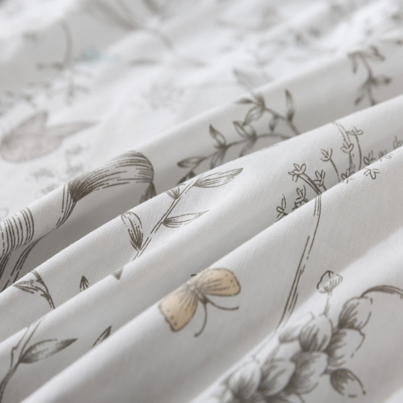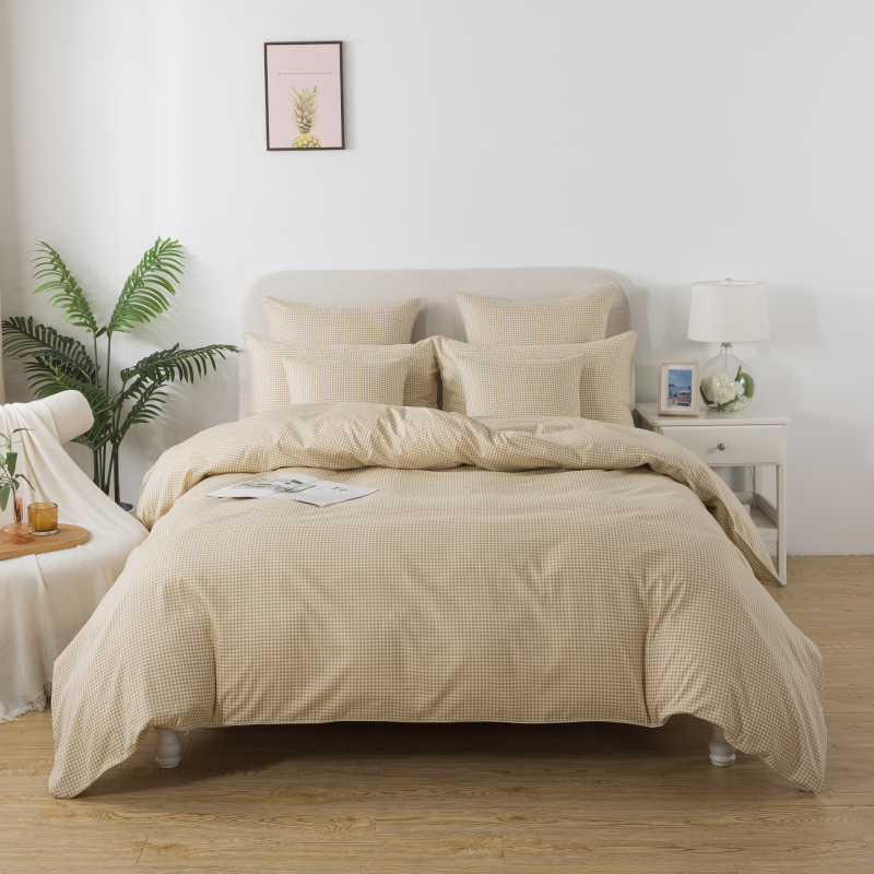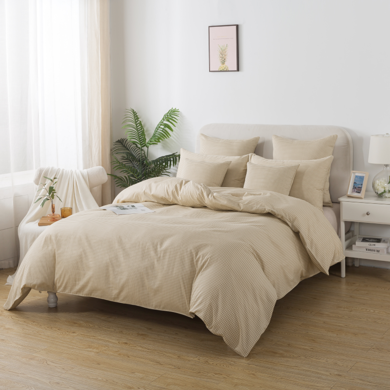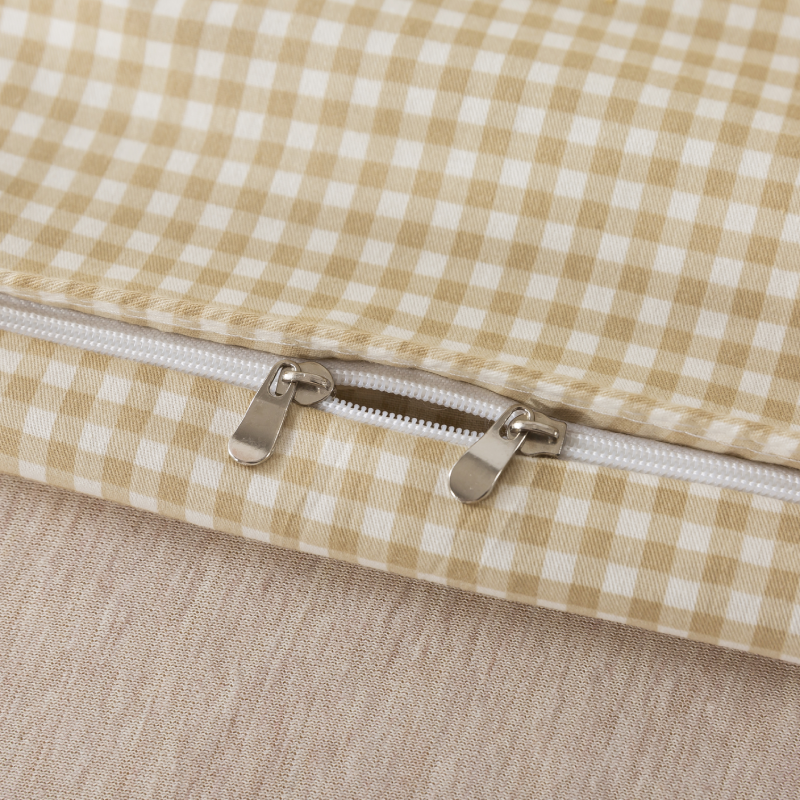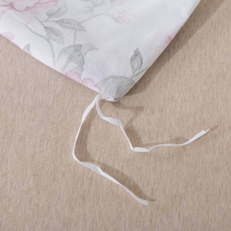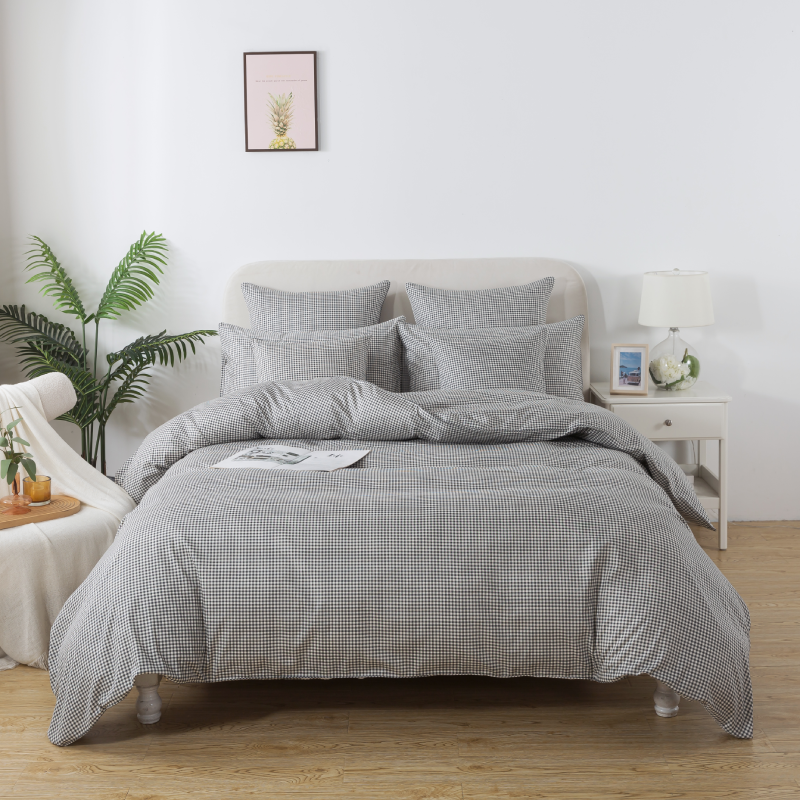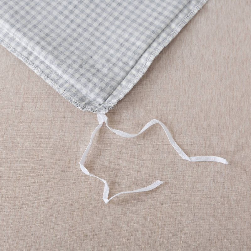
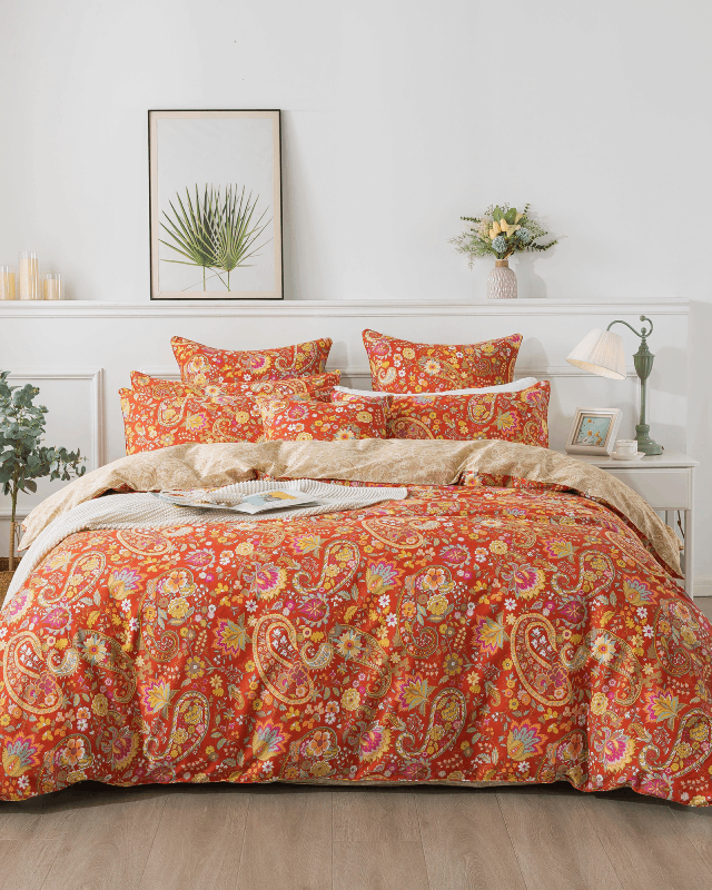
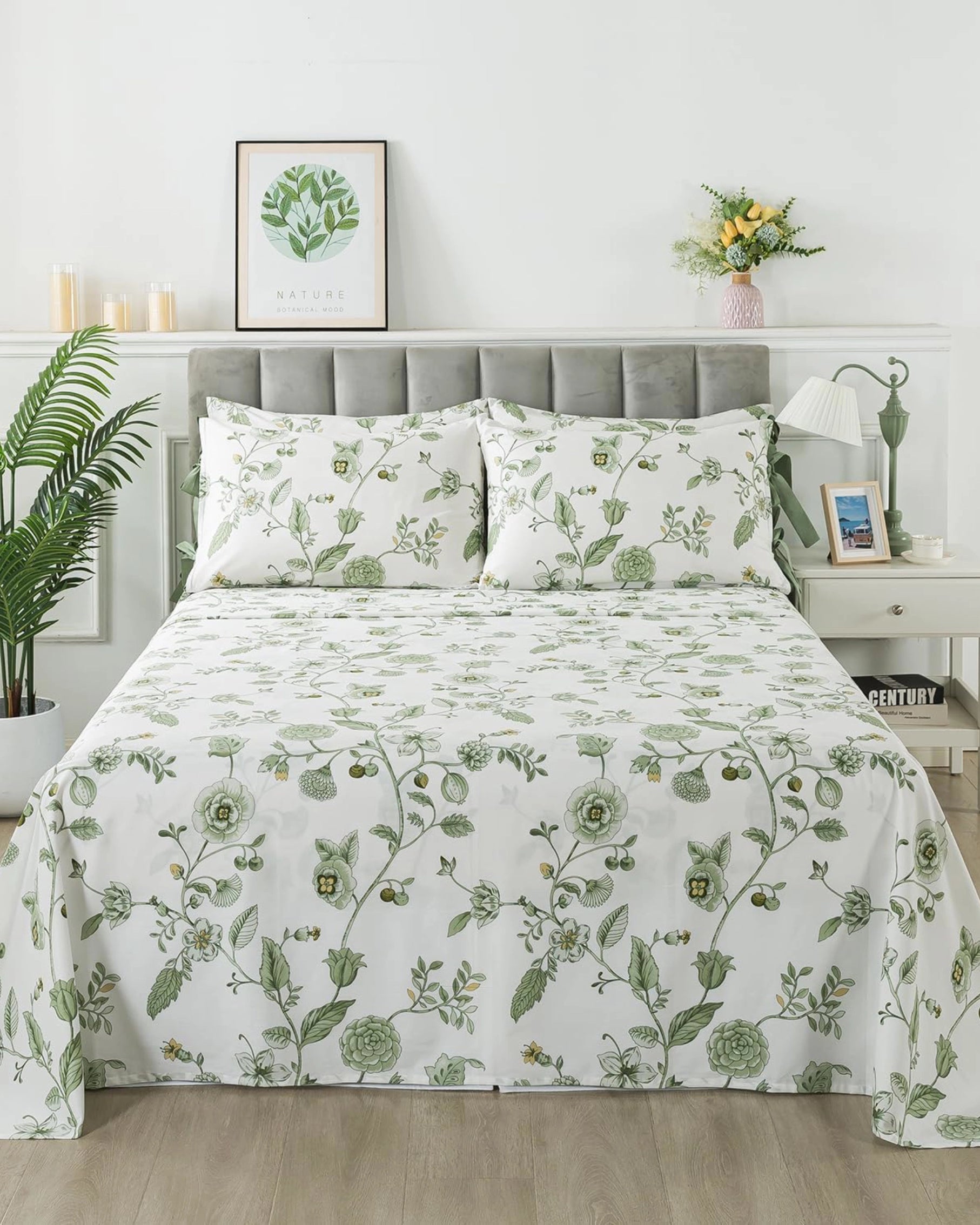


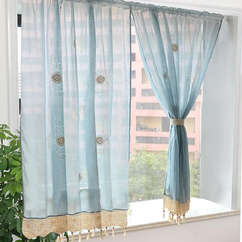
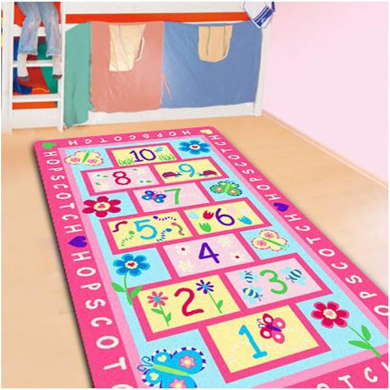

Floral bedding is often chosen for its beautiful blossoms, delicate leaves, and decorative details. However, the flowers are only part of the design. The background color behind the pattern plays an equally important role in determining how the bedding looks, feels, and influences the entire bedroom.
Whether the background is soft white, deep navy, warm beige, or muted green, it affects the visual balance of the floral print and the atmosphere of the space. Understanding this detail can help you select floral bedding that fits both your personal style and your bedroom décor.
It Determines How the Floral Pattern Stands Out
The background color creates contrast between the flowers and the fabric beneath them. A strong contrast makes the floral pattern appear clearer, bolder, and more dramatic.
For example, light-colored flowers placed on a dark background often look vivid and sophisticated. Deep blue, charcoal, or black backgrounds can make pink, white, or gold blossoms appear especially striking. These combinations work well in bedrooms that need a more elegant or dramatic focal point.
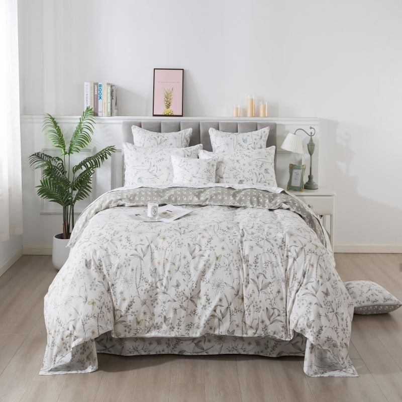
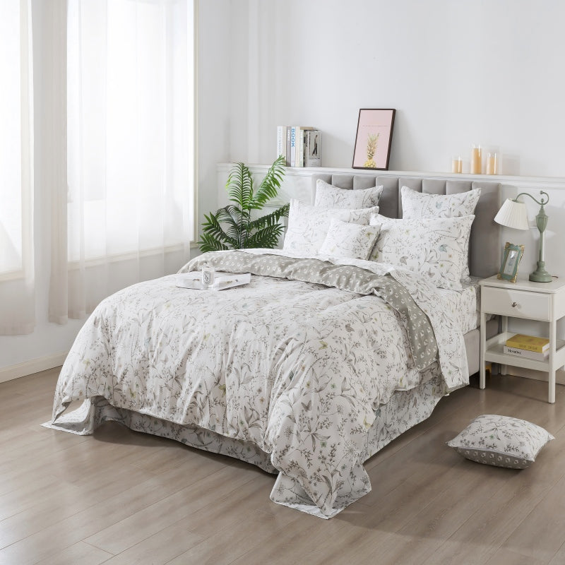
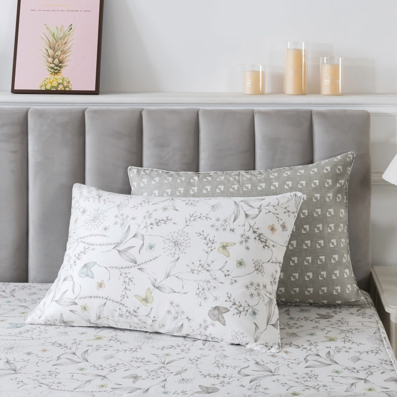
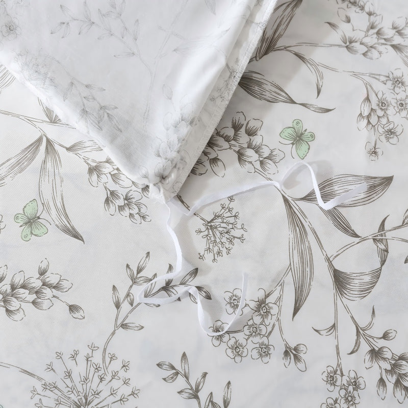
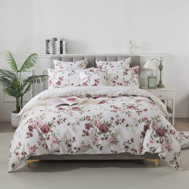
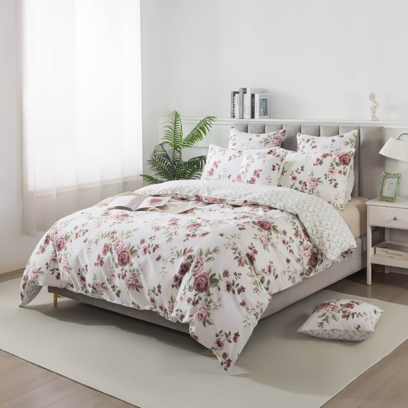
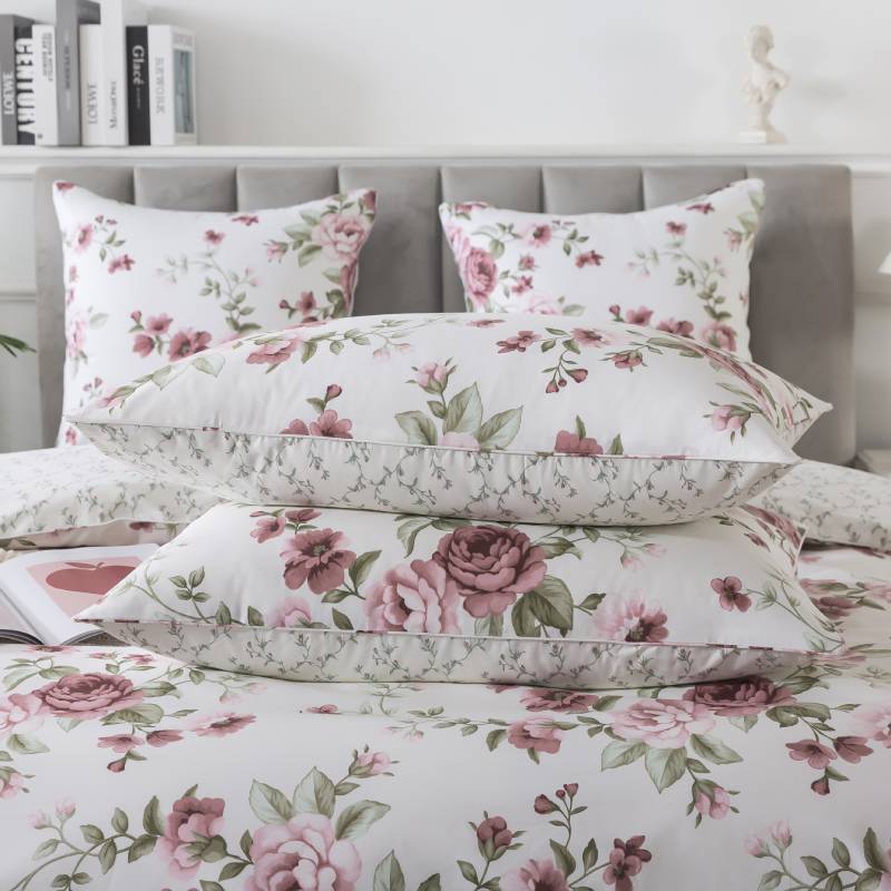
By comparison, flowers printed on cream, white, or pale pastel backgrounds usually create a softer appearance. The pattern may blend more gently into the room, producing a calm and approachable look.
Neither option is better than the other. The right level of contrast depends on whether you want the bedding to become the main visual feature or quietly complement the rest of the room.
It Influences the Mood of the Bedroom
Color has a strong effect on how a room feels. Because bedding covers a large part of the bed, its background color can influence the overall atmosphere of the bedroom.
White and ivory backgrounds often feel fresh, clean, and airy. They are especially suitable for cottage, farmhouse, coastal, and romantic interiors.
Beige, taupe, and warm neutral backgrounds create a cozy and grounded feeling. They can soften colorful floral patterns and make the room feel more relaxed.
Blue backgrounds often bring a peaceful and refreshing quality to the bedroom. Pale blue feels light and tranquil, while navy can make the space feel more refined and intimate.
Green backgrounds connect floral bedding with nature. Sage, olive, and muted botanical greens can create a restful garden-inspired environment.
Darker colors, such as black, burgundy, or deep teal, tend to produce a richer and more dramatic mood. They are ideal for bedrooms with vintage, maximalist, or luxurious styling.

It Changes the Perceived Size of the Pattern
The same floral design can look very different depending on the background color.
On a light background, flowers may appear more open and spacious. The bedding can feel less visually heavy, even when the pattern contains large blossoms. This makes light-background floral bedding a practical choice for small bedrooms or spaces with limited natural light.
A dark background can make the flowers appear more concentrated and intense. Large-scale floral patterns may feel especially bold when placed against a deep color. This effect can add depth and personality to a spacious bedroom, but it may feel overwhelming if the surrounding décor is already highly detailed.
The relationship between the flower size and the background color should therefore be considered together.
It Helps Coordinate the Rest of the Room
The background color often acts as the visual foundation for the bedroom’s color palette. It can guide the selection of curtains, rugs, cushions, wall colors, and decorative accessories.
For a coordinated look, repeat the bedding’s background color in one or two other areas of the room. For example, floral bedding with a sage background could be paired with sage curtains or a small green accent chair.
Another option is to use neutral surroundings and allow the background color to stand out. Bedding with a navy background can become a strong focal point when combined with white walls, natural wood furniture, and simple neutral accessories.
You can also select one of the smaller colors within the floral pattern for additional accents. This creates a layered appearance without making the room feel overly matched.
It Affects Seasonal Styling
Background color can also influence whether floral bedding feels more suitable for a particular season.
Light backgrounds with fresh botanical prints are commonly associated with spring and summer. White, pale yellow, soft blue, and light green can make a room feel brighter and more breathable during warmer months.
Warm beige, rust, olive, and muted gold backgrounds work beautifully for autumn. They create a cozy atmosphere while allowing floral patterns to remain decorative and inviting.
Dark blue, burgundy, forest green, and charcoal backgrounds can feel especially comfortable in winter. When paired with textured throws and layered pillows, they add visual warmth and richness.
However, floral bedding does not need to be limited to one season. The surrounding accessories can easily change how the background color is perceived throughout the year.
It Can Affect Everyday Practicality
Appearance is not the only consideration. The background color may also affect how easily the bedding shows everyday marks, pet hair, or minor stains.
Very light bedding can create a crisp and refreshing look, but it may require more frequent care. Darker or patterned backgrounds can sometimes disguise small marks more effectively. However, extremely dark fabrics may make light-colored lint or pet hair more noticeable.
A medium-toned background with a detailed floral print often provides a practical balance. It maintains visual interest while remaining suitable for regular use.
Choosing the Right Background Color
Before selecting floral bedding, consider the room’s size, lighting, furniture, and existing color palette.
For a bright and airy bedroom, choose a white, cream, or pastel background. For a cozy and natural look, consider warm neutrals or muted greens. For a dramatic statement, select a deep blue, dark green, burgundy, or black background.
Most importantly, think about how you want the bedroom to feel. The background color should support the atmosphere you want to create rather than simply follow a passing trend.
Final Thoughts
In floral bedding, the background color is not an empty space behind the flowers. It shapes the contrast, mood, balance, and versatility of the entire design.
A carefully chosen background can make floral bedding feel delicate, modern, romantic, dramatic, or naturally relaxed. By paying attention to both the flowers and the color surrounding them, you can create a bedroom that feels visually harmonious and comfortable every day.