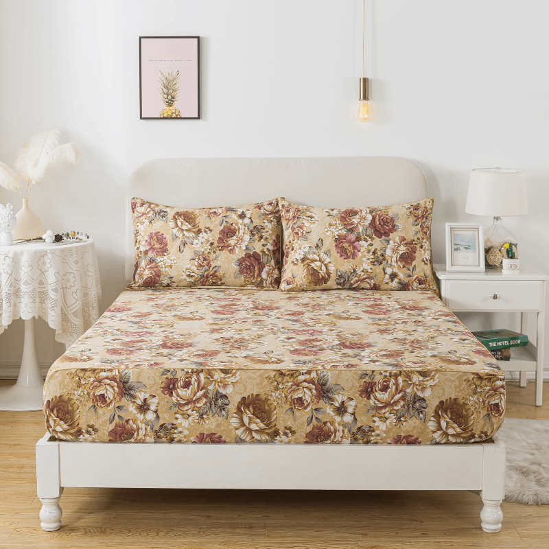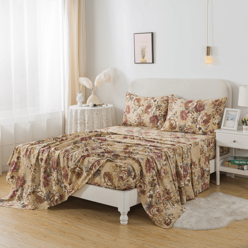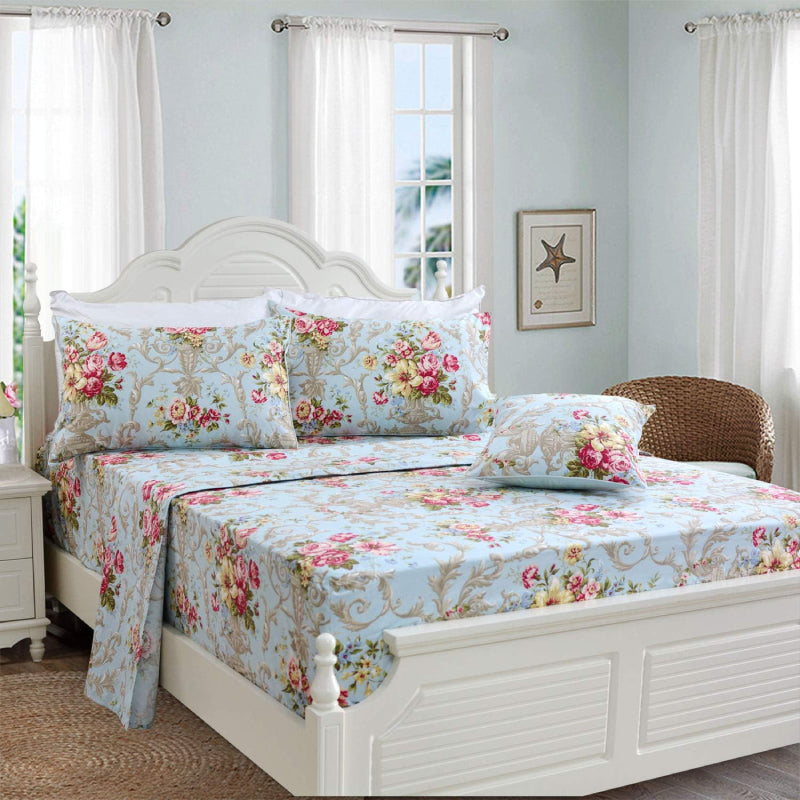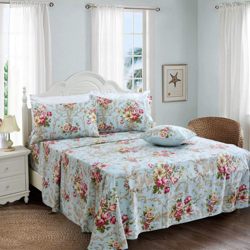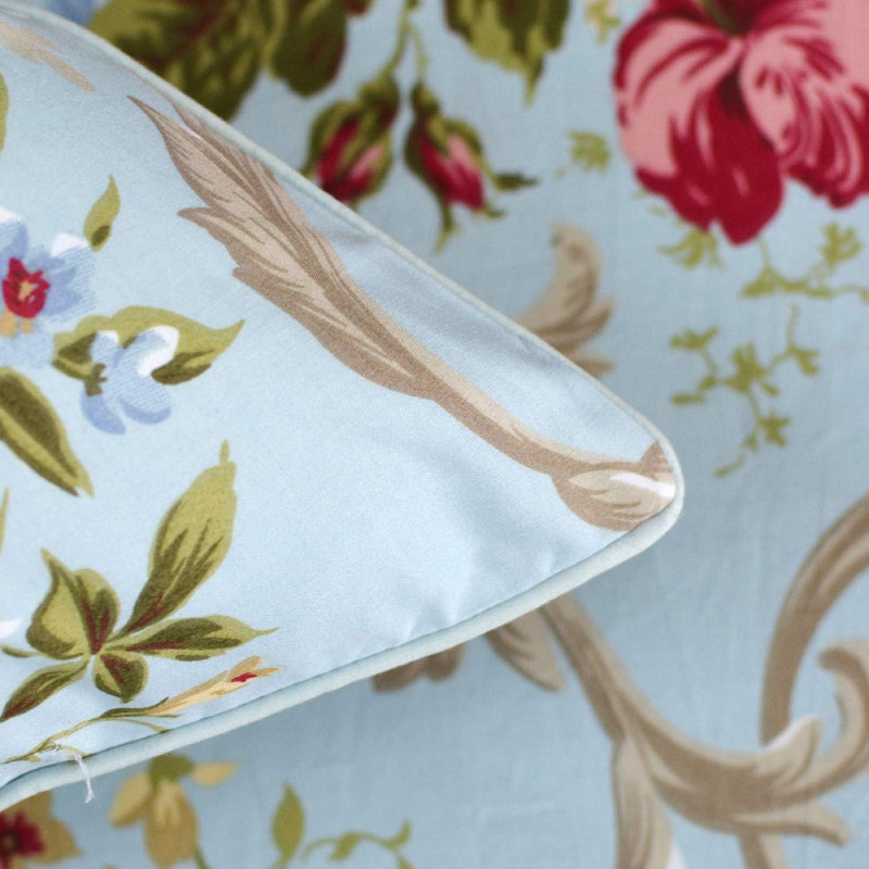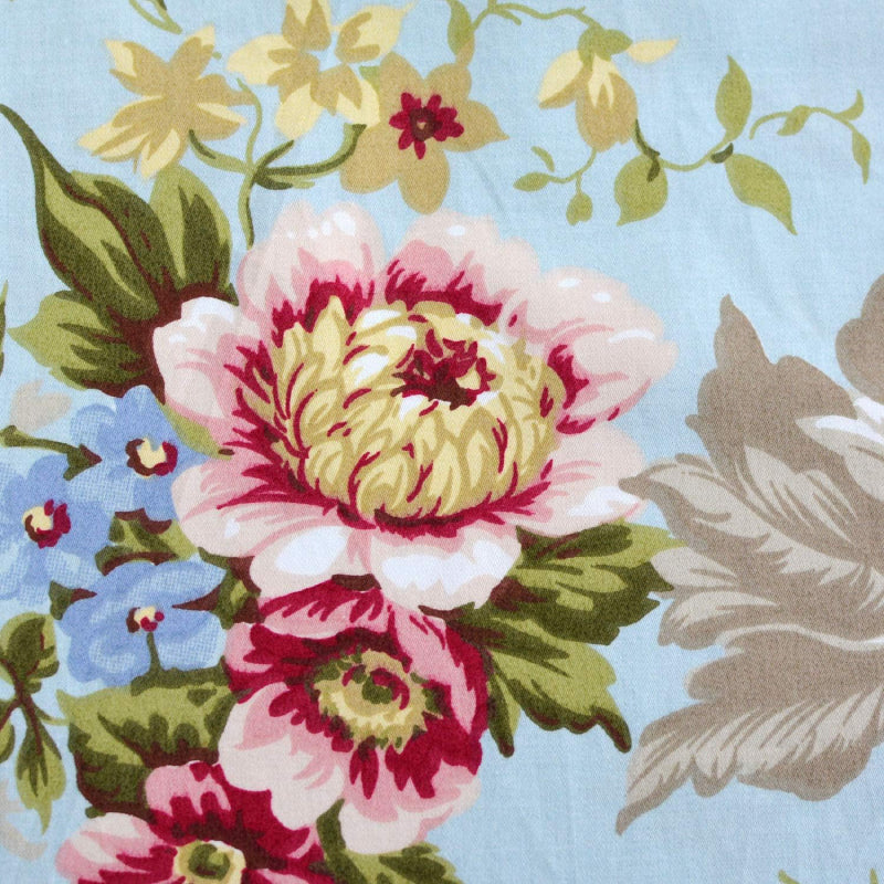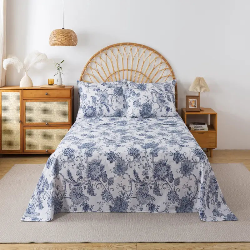



Floral prints are timeless. They can feel romantic, nostalgic, modern, or quietly luxurious. Yet not all florals create the same emotional response. Some feel overwhelming and chaotic. Others feel harmonious and restful.
If you’ve ever looked at one floral bedding set and thought “too busy”, while another felt instantly calming, the difference isn’t accidental. It’s rooted in design fundamentals: scale, spacing, color harmony, contrast control, and visual hierarchy.
Let’s examine why some floral prints feel noisy — and why others feel beautifully balanced.
1. Scale: The Size of the Motif Matters
Scale is the first variable that affects perception.
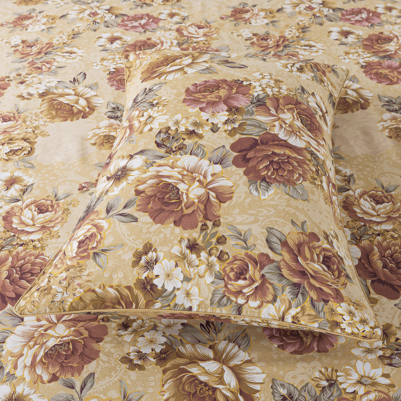
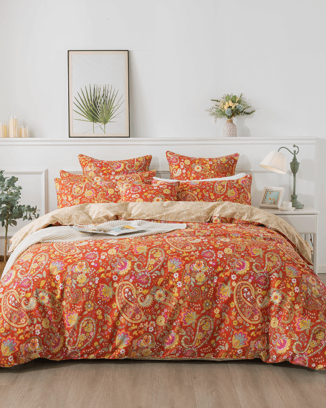
When large blooms are tightly packed together with little separation, the eye has no resting point. Every element competes for attention. The result is visual tension.
Balanced floral prints establish hierarchy:
-
A primary focal bloom
-
Secondary supporting elements
-
Subtle fillers or background leaves
This layered structure guides the eye naturally across the surface rather than overwhelming it.
2. Density and Negative Space
In textile design, negative space is not empty space — it is breathing space.
Noisy florals often:
-
Fill nearly every inch of the fabric
-
Stack motifs with minimal separation
-
Layer multiple patterns without pause
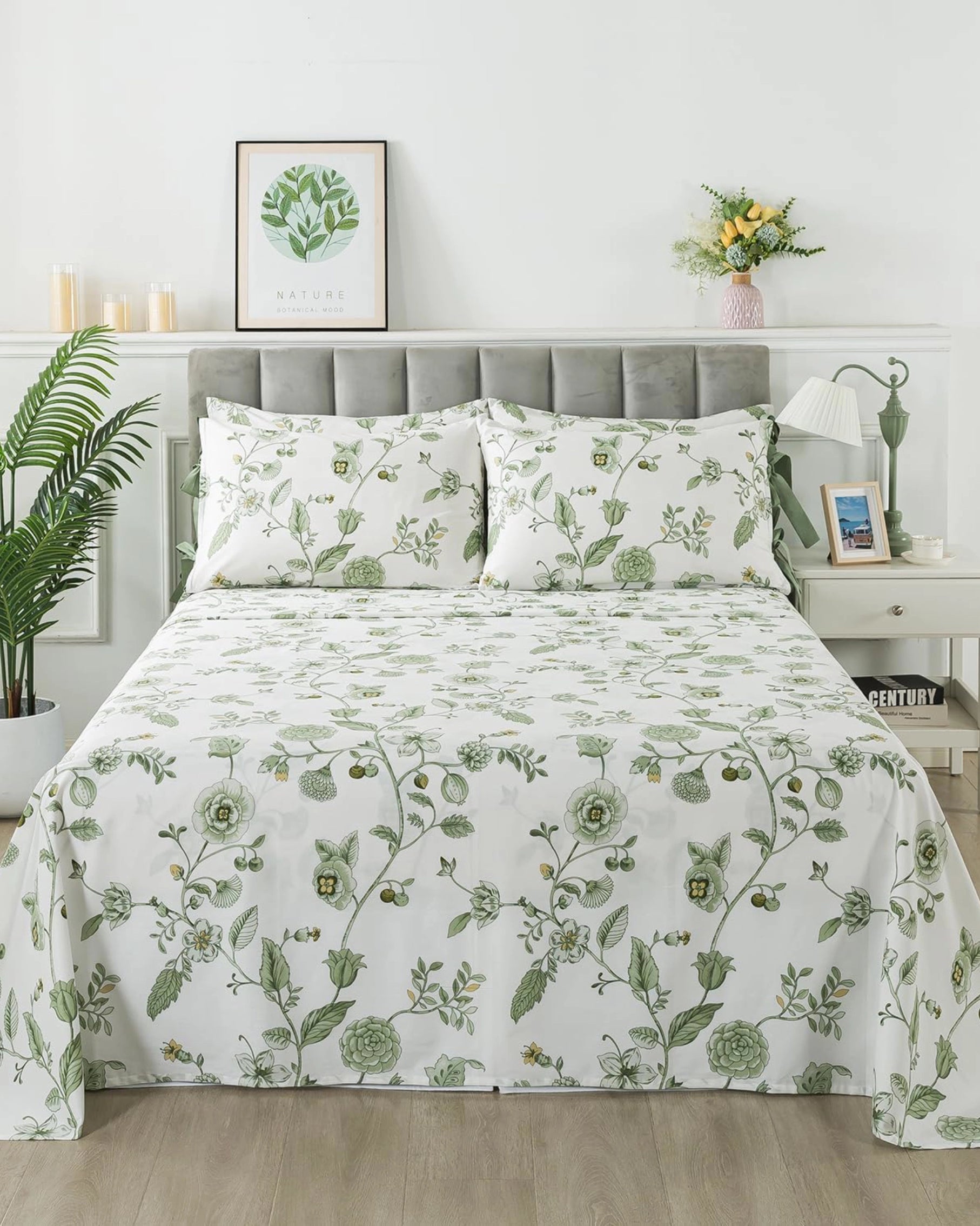
Balanced florals intentionally incorporate open background areas. This allows the pattern to feel lighter and more controlled. Just as silence enhances music, negative space enhances design clarity.
Especially on large surfaces like duvet covers, density must be carefully calibrated. What looks charming on a small swatch can feel overwhelming when expanded across an entire bed.
3. Color Harmony vs. Color Competition
Color determines emotional tone.
Noisy prints typically use:
-
Highly saturated hues
-
Strong contrast combinations
-
Too many unrelated colors in one composition
When multiple bold colors compete, the result can feel stimulating rather than soothing.
Balanced floral prints often rely on:
-
A controlled palette of three to five harmonious tones
-
Muted or softened shades
-
Tonal layering within the same color family
When colors share temperature and undertone, the design feels cohesive. Harmony reduces cognitive strain.
4. Line Weight and Detail Control
Over-detailing is another common source of visual noise.
Thin, intricate outlines layered across complex backgrounds can fragment the design. At a distance, details blur and create visual clutter.
Balanced prints simplify:
-
Petal shapes
-
Leaf structures
-
Outline thickness
Strategic variation in line weight adds depth without chaos. The pattern reads clearly both up close and from across the room.

5. Contrast with the Background
The relationship between motif and base color significantly influences mood.
High contrast combinations — such as bright florals on a dark base — feel dramatic and energetic. While visually striking, they may feel intense in restful environments.
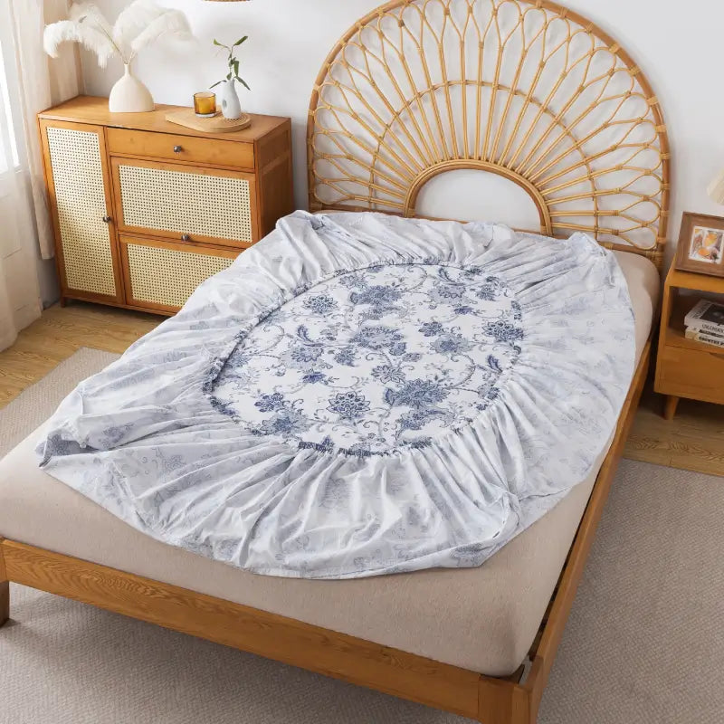
Lower contrast pairings — soft florals on light or muted backgrounds — create visual continuity. Transitions between motif and base feel gradual rather than abrupt.
In bedroom settings, softened contrast often promotes calmness.
6. Scale in Context: Surface Area Changes Everything
A pattern that works beautifully as wallpaper or apparel may feel overpowering on bedding.
Bedding:
-
Covers a large horizontal plane
-
Sits at eye level
-
Is experienced in moments of rest
Designs intended for relaxation require restraint. Balanced floral bedding considers how the print interacts with lighting, furniture, and the emotional tone of the space.
7. Emotional Clarity in Design
Every print communicates a mood.
Noisy florals often lack a singular emotional direction. They may mix vintage roses, tropical leaves, and modern color blocks without a cohesive narrative.
Balanced florals usually express one clear theme:
-
Soft countryside romance
-
Airy spring freshness
-
Gentle vintage nostalgia
-
Minimal botanical elegance
Clarity of intention translates into visual harmony.
8. Fabric Texture Influences Perception
Texture can amplify or soften a print.
On glossy or stiff materials, colors appear sharper and more intense. On breathable cotton or softly washed fabrics, tones diffuse slightly, creating a gentler effect.
Natural fibers tend to soften visual contrast and enhance organic qualities. The same floral pattern can feel dramatically different depending on textile choice.
How to Identify a Balanced Floral Print
When evaluating a floral design, consider:
-
Does your eye move smoothly across the pattern?
-
Is there breathing space between elements?
-
Do the colors feel related and intentional?
-
Would the design still feel calming at night?
-
Does the fabric texture soften the overall impression?
If the answers lean toward calm and cohesion, the print is likely balanced.
Why It Matters
The distinction between noisy and balanced florals ultimately comes down to cognitive load.
Noisy designs demand attention.
Balanced designs support relaxation.
In spaces designed for restoration — especially bedrooms — visual harmony plays a measurable role in comfort. The most successful floral bedding does not overwhelm. It supports the atmosphere quietly.
The difference is subtle, but you feel it every night.