

Layering prints in interior design can transform a room from simple to visually captivating. Yet when done incorrectly, multiple patterns can quickly make a space feel chaotic and overwhelming. The key lies in balance—combining prints in a way that feels intentional, harmonious, and comfortable. Whether you're decorating a bedroom, living space, or reading nook, mastering the subtle art of layering prints can elevate your home while maintaining a calm atmosphere.
Start with a Dominant Print
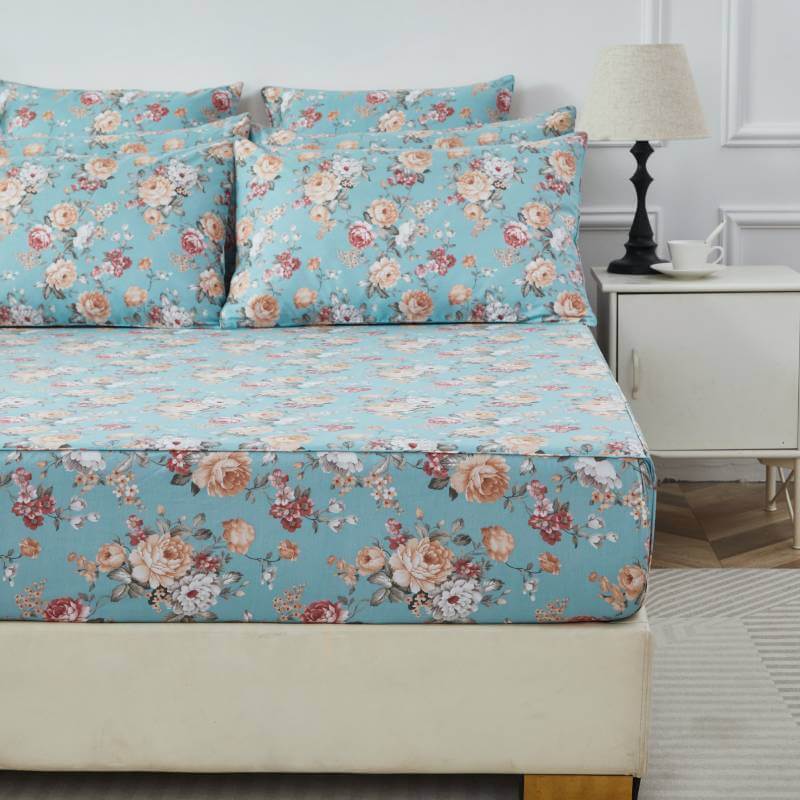
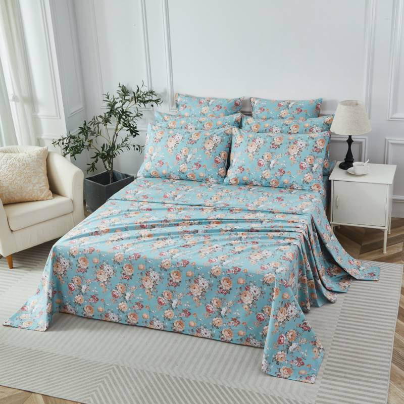
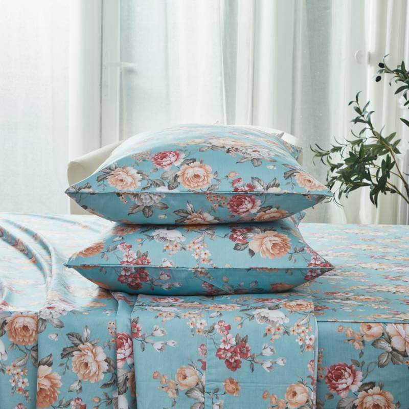
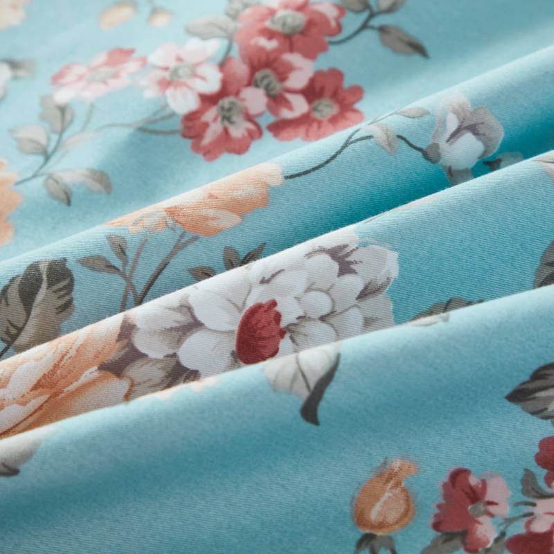
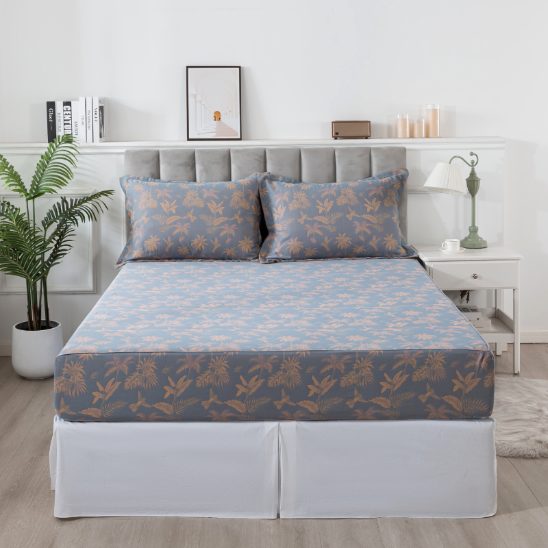
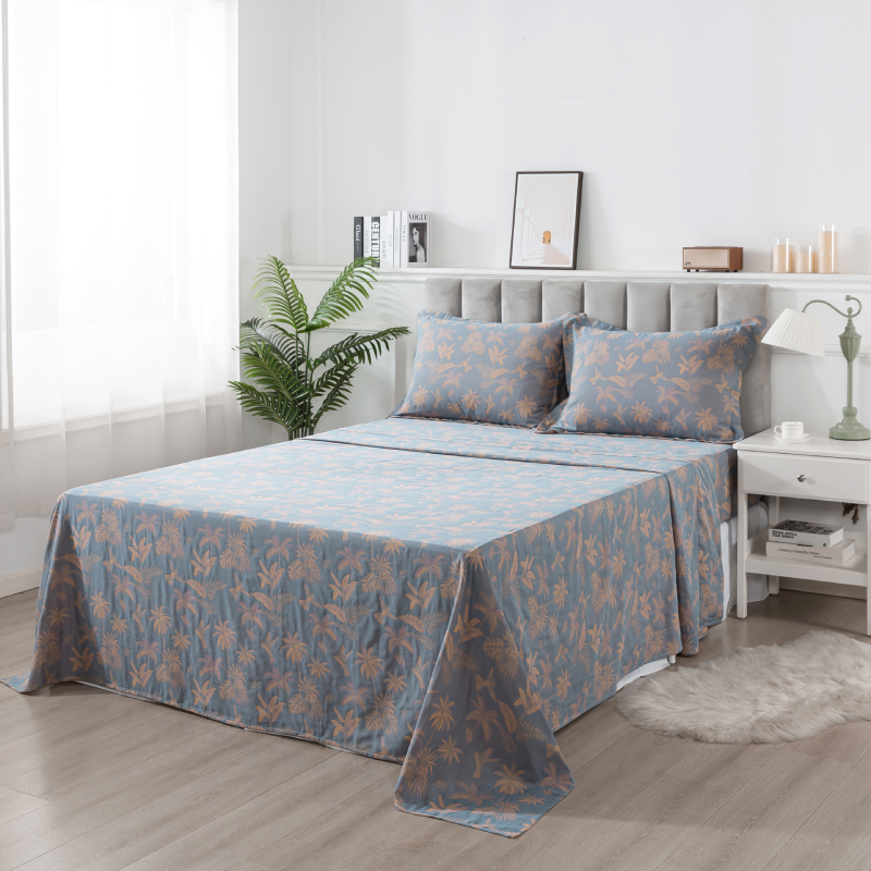
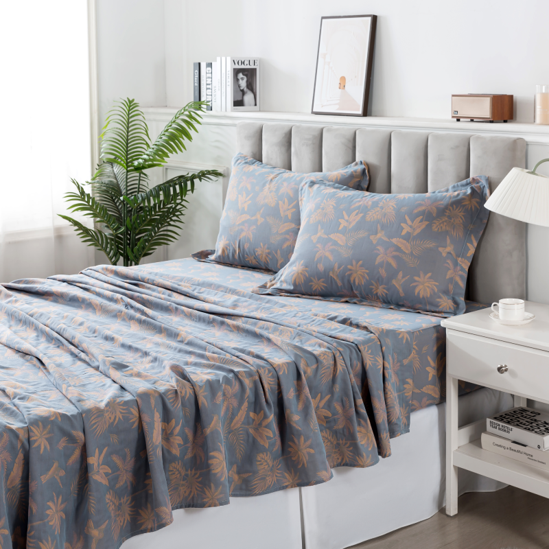
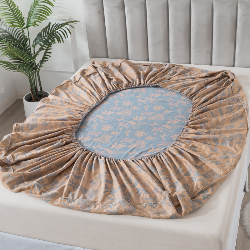
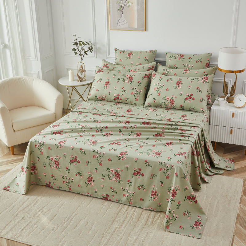
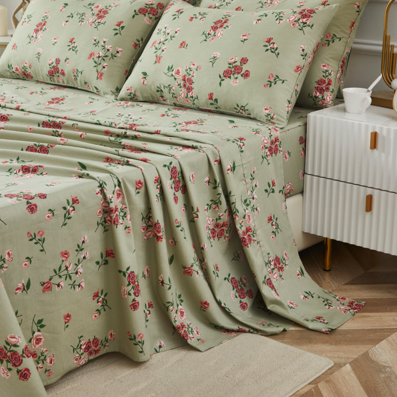
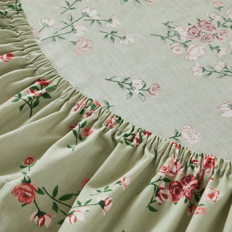
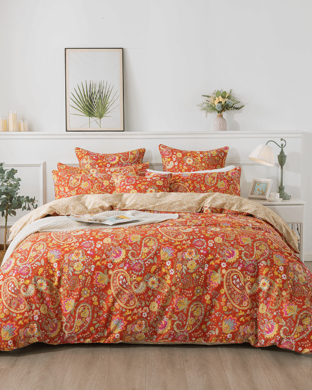
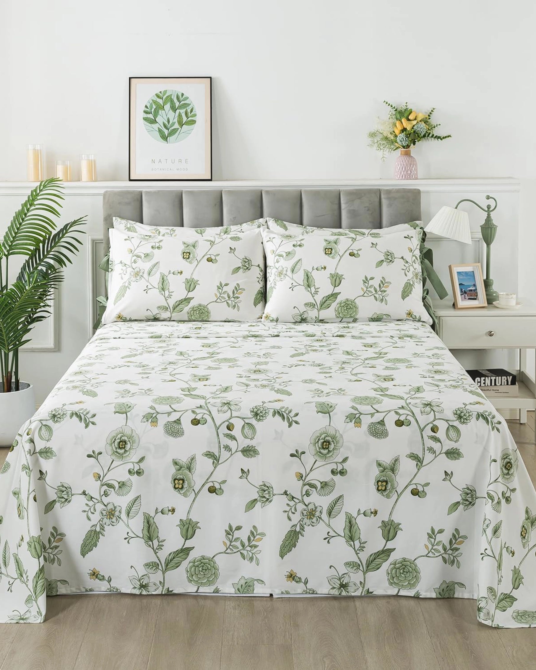
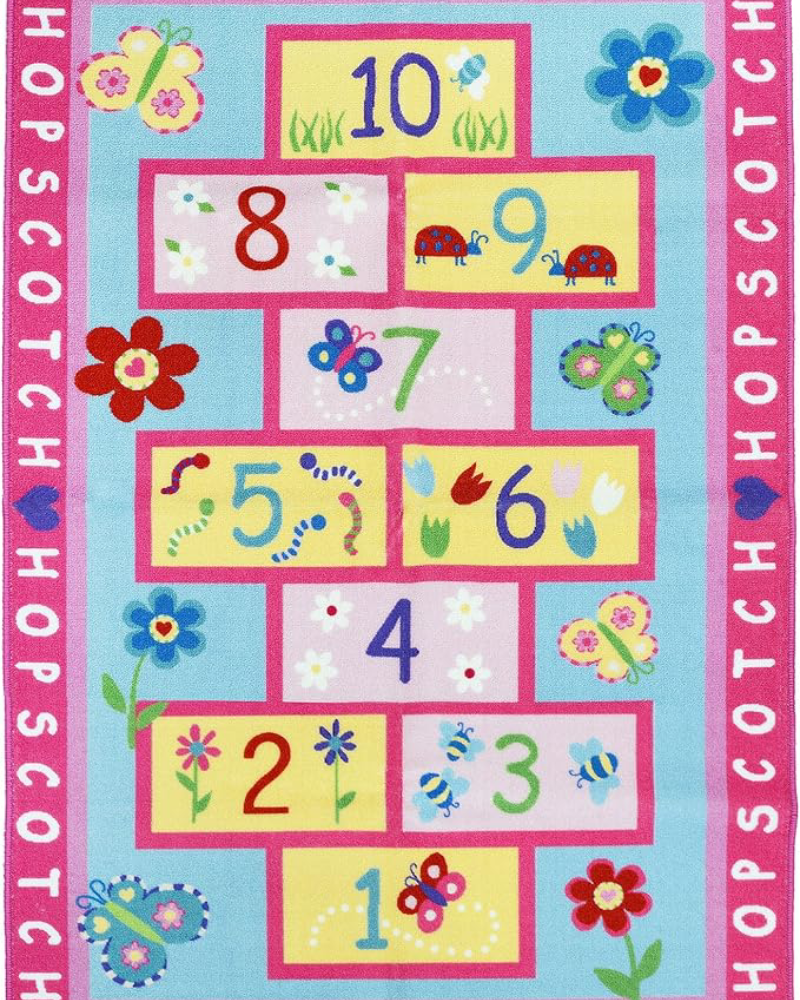
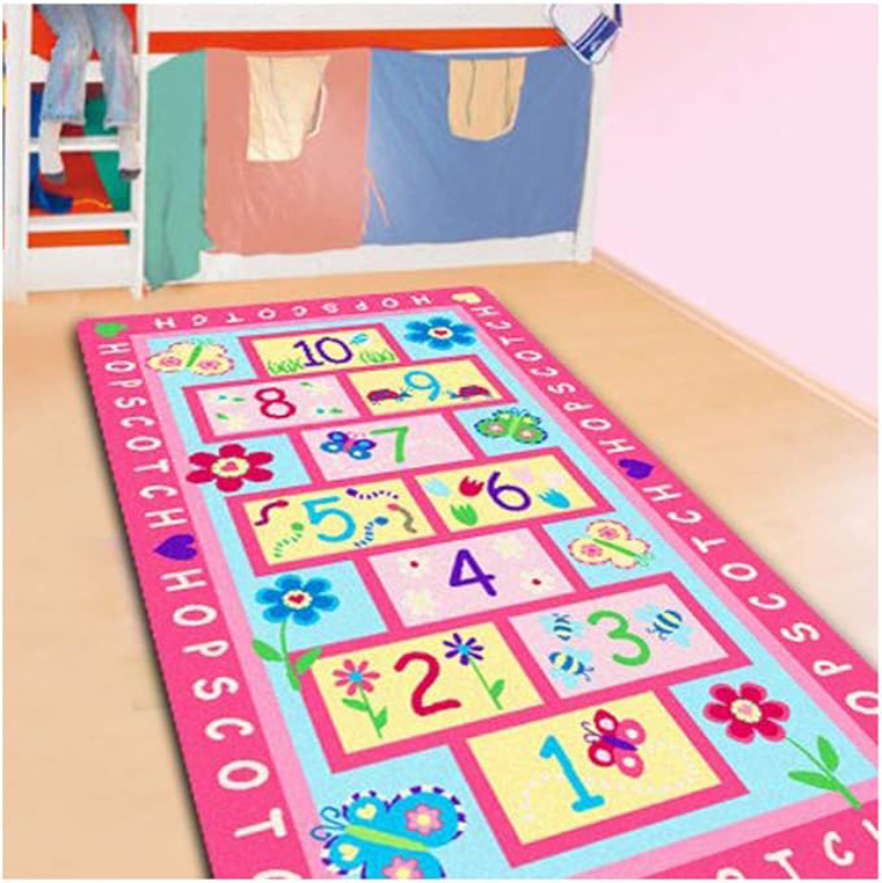
The first step in layering prints successfully is choosing one dominant pattern to anchor the space. This print should be the largest or most visually prominent element in the room. In a bedroom, this is often the bedding—such as a floral duvet or quilt set.
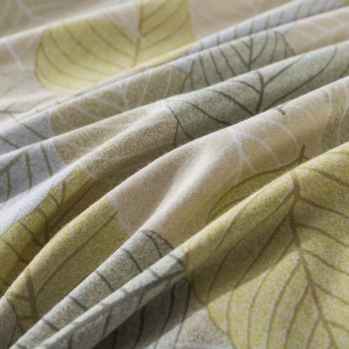
Large-scale floral patterns work particularly well as a focal point because they naturally draw the eye and create a soft, welcoming aesthetic. Once the dominant print is established, all other patterns should complement rather than compete with it.
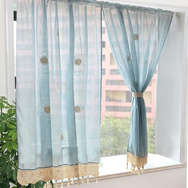
For example, if your bedding features romantic botanical florals, surrounding elements like pillows, curtains, or rugs can incorporate smaller, simpler patterns that echo the colors of the main design.
Vary the Scale of Patterns
One of the most important principles in print layering is scale variation. When patterns are all similar in size, they compete for attention and create visual clutter. Instead, mix patterns of different scales:
-
Large-scale prints: floral bedding, statement wallpaper
-
Medium-scale prints: patterned throws or accent pillows
-
Small-scale prints: subtle stripes, dots, or textured fabrics
This hierarchy allows the eye to move comfortably across the room. Large patterns establish character, medium patterns support them, and smaller patterns add texture without overwhelming the space.
Stick to a Cohesive Color Palette
Color harmony is essential when layering multiple prints. Even if the patterns differ significantly, they will feel cohesive if they share a similar color palette.
A helpful approach is to choose two or three primary colors and repeat them throughout the room. For instance, a soft bedroom palette might include:
-
Cream or warm white
-
Dusty rose or soft pink
-
Sage green or muted blue
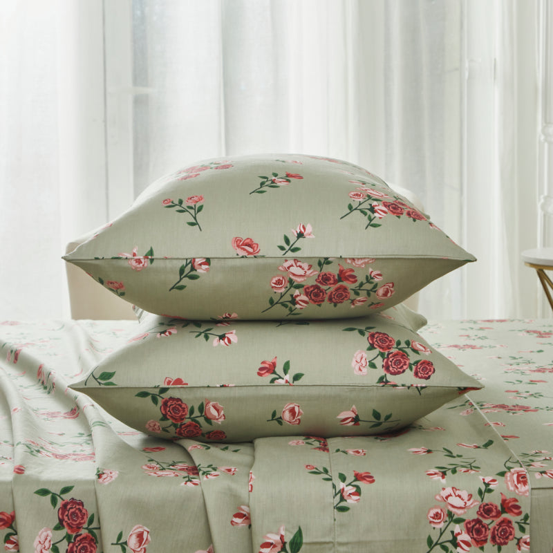
By repeating these colors across bedding, cushions, throws, and decorative accents, the prints naturally feel connected.
Neutral backgrounds—such as ivory bedding or light wood furniture—also help balance busier patterns and prevent the room from feeling crowded.

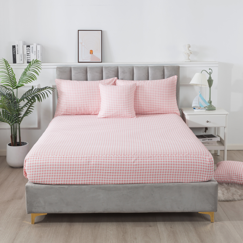
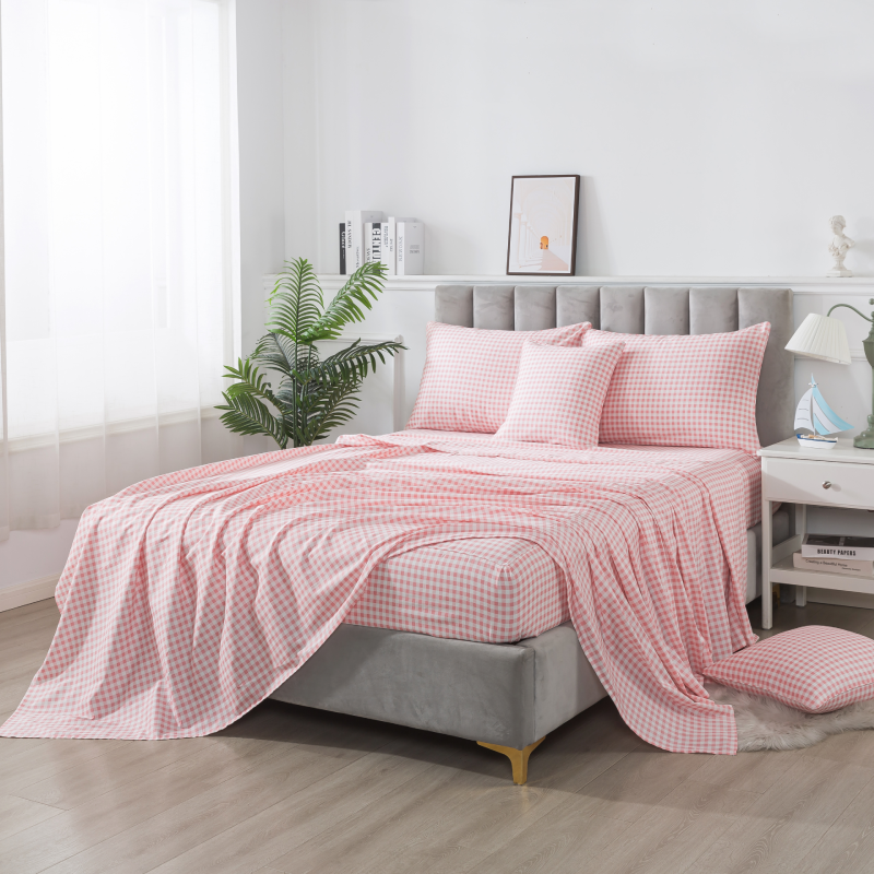
Combine Different Pattern Types
Another effective technique is mixing different categories of patterns rather than repeating the same type. For example:
-
Florals
-
Stripes
-
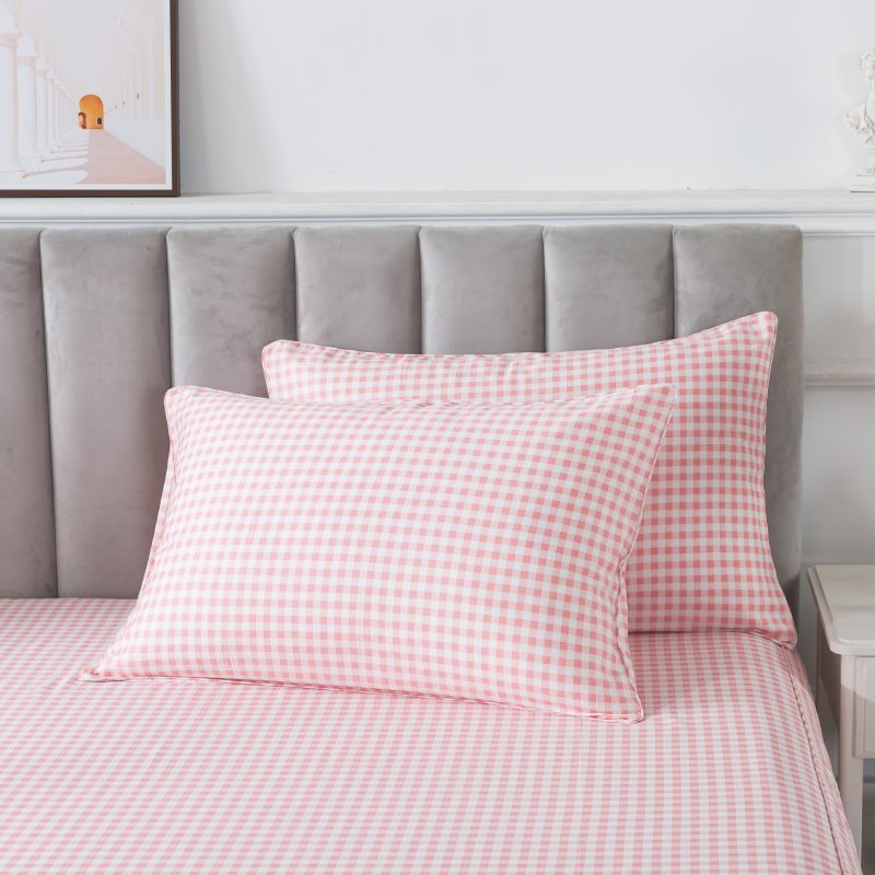
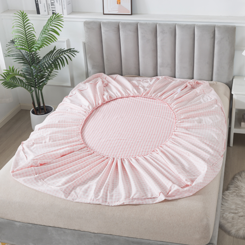
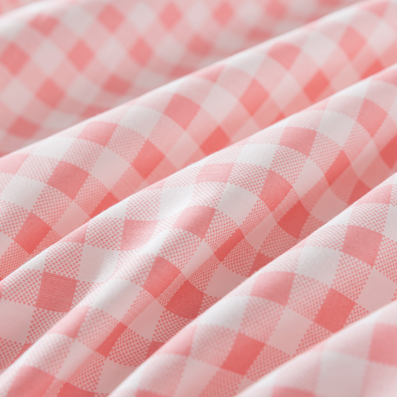
Checks or gingham
-
Subtle geometric prints
Florals tend to feel organic and flowing, while stripes and checks introduce structure. Pairing these together creates contrast and visual interest without overwhelming the room.
For instance, a floral quilt can be beautifully balanced with striped pillowcases or a lightly patterned rug. The variation in pattern style helps each element stand out while still contributing to the overall design.
Use Solid Colors to Create Breathing Space
A room filled entirely with patterns can feel busy, no matter how carefully they are chosen. Solid colors act as visual breathing space, allowing the prints to shine without competing.
In bedding arrangements, solid sheets or pillow shams can frame patterned quilts or duvets. In living spaces, neutral sofas or curtains can calm a patterned rug or decorative cushions.
These quiet elements act like pauses in music—they make the more expressive moments feel even more intentional.
Let Texture Support the Patterns
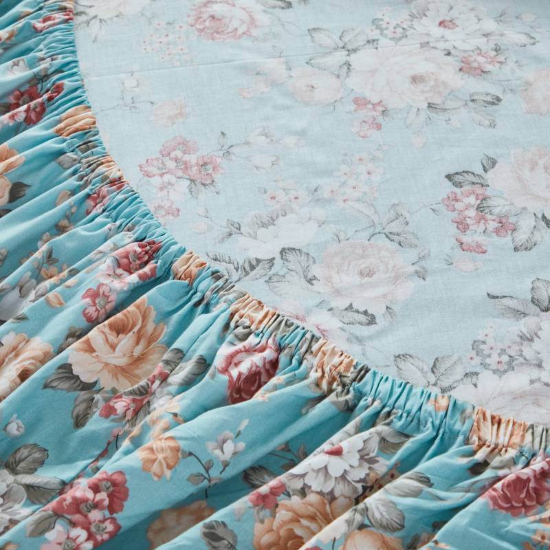
Texture can be just as important as pattern when building a layered space. Materials such as cotton, linen, knit throws, and tufted fabrics introduce depth without adding visual noise.
Soft natural fabrics are particularly effective because they maintain a relaxed, lived-in feel. Cotton bedding, for example, allows floral prints to feel cozy and breathable rather than overly decorative.
By combining textures—smooth sheets, quilted blankets, and woven throws—you add richness to the room while keeping the overall design balanced.
Keep the Room's Purpose in Mind
Finally, always consider how the room is meant to feel. Bedrooms should remain restful, while living rooms can handle slightly more visual energy.
If the goal is a calming bedroom retreat, keep patterns gentle and colors soft. Let the prints feel romantic and natural rather than bold and high contrast. A floral bedding set layered with subtle stripes or small botanical accents can create a tranquil atmosphere that feels inviting rather than overwhelming.
Final Thoughts
Layering prints is less about strict rules and more about thoughtful composition. By starting with a dominant pattern, varying scale, maintaining a cohesive color palette, and balancing prints with solids and texture, you can create a space that feels both expressive and harmonious.
When done well, layered prints bring warmth, personality, and depth to a room. Instead of overwhelming the space, they tell a visual story—one that feels comfortable, welcoming, and beautifully lived in.