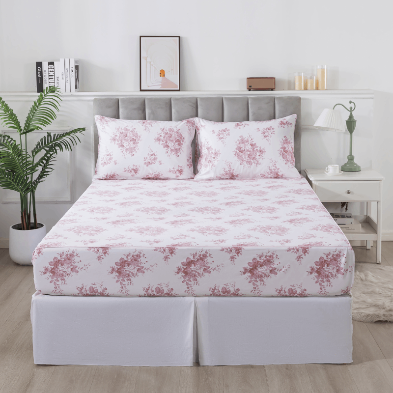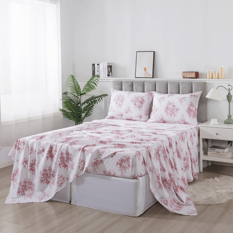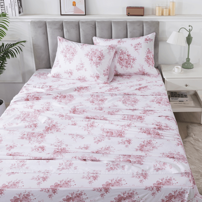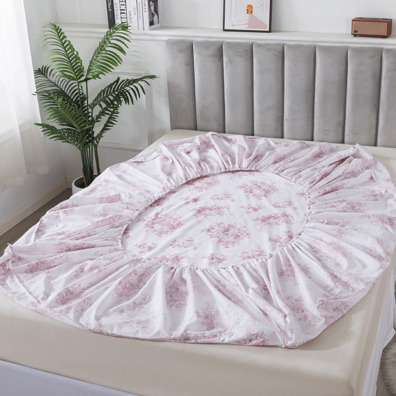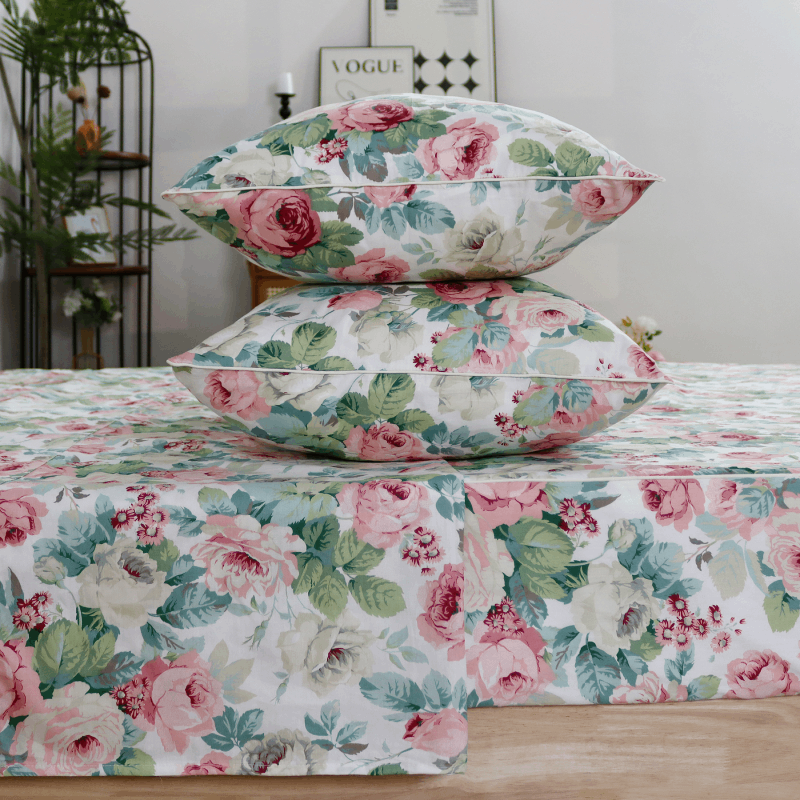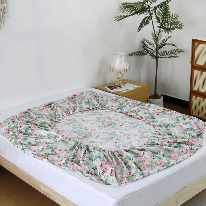
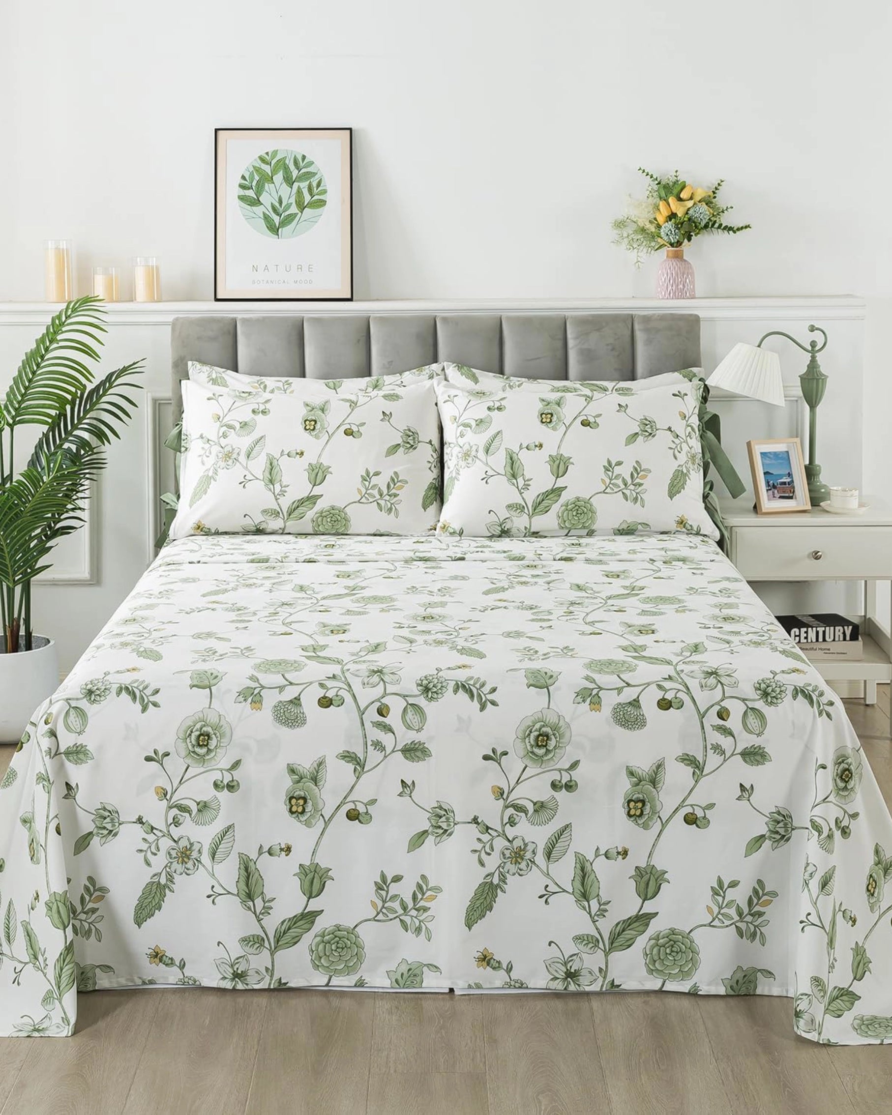


Floral bedding has long been associated with romance and decoration. But when done without intention, it can quickly feel overwhelming—too busy, too sweet, or visually tiring. The difference between floral bedding that feels timeless and floral bedding that feels dated often comes down to one quiet design principle: contrast.
Not loud contrast. Not dramatic opposites.
But soft, thoughtful contrast that creates balance.
Why Contrast Matters in Floral Design
In interior textiles, contrast helps the eye rest. It creates rhythm, structure, and clarity—especially in patterns as expressive as florals.
Without contrast, floral prints can blur together:
-
Colors melt into one another
-
Shapes lose definition
-
The bed feels more like decoration than a place to rest
With the right contrast, florals gain dimension. They feel intentional rather than decorative, lived-in rather than styled.

Soft Contrast vs. High Contrast
When people hear “contrast,” they often think of sharp differences: black and white, bold outlines, strong saturation. But floral bedding benefits far more from soft contrast.
Soft contrast might appear as:
-
Muted florals on a calm, neutral base
-
Gentle variation between background and pattern tones
-
Subtle differences in scale rather than color intensity
This kind of contrast doesn’t demand attention. It supports comfort.
Color Contrast: Calm Is the Foundation
In well-balanced floral bedding, contrast begins with the background.
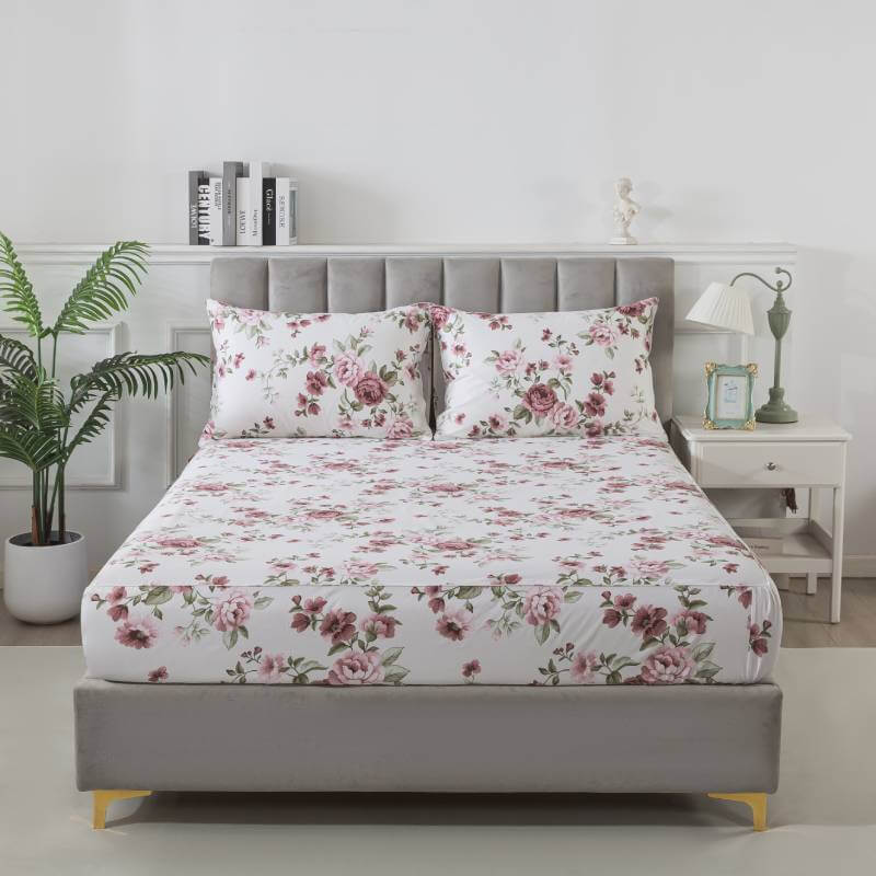
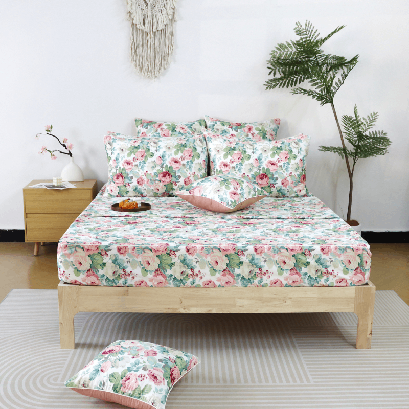
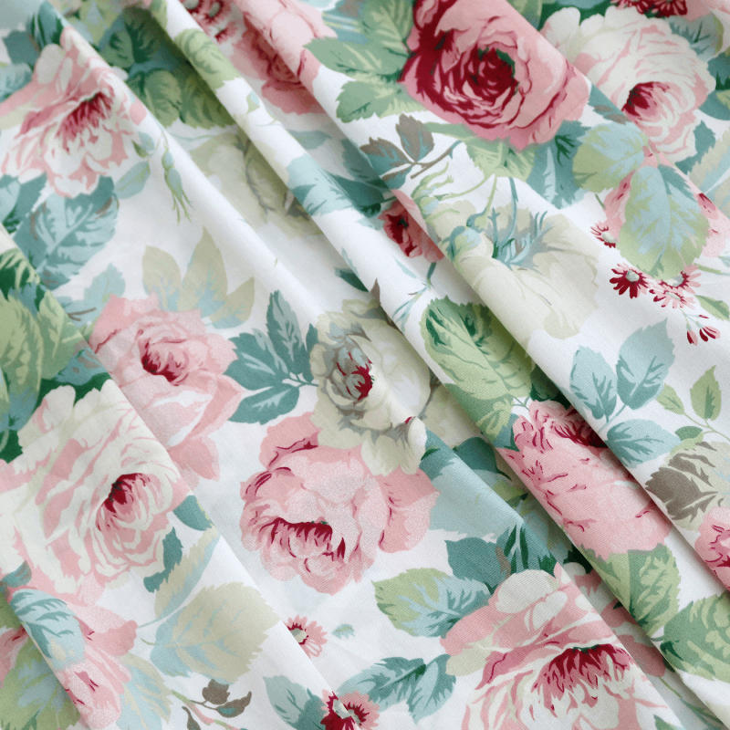
A quiet base color—such as warm ivory, washed beige, pale sage, or soft gray—gives florals space to breathe. Against this foundation, patterns can exist without overwhelming the room.
Instead of pairing florals with stark white or deep black, softer pairings allow the eye to move naturally across the surface. The result is a bed that feels composed, not crowded.
Pattern Contrast: Let the Eye Pause
Contrast isn’t only about color. It’s also about density.
Effective floral bedding often balances:
-
Areas of detailed pattern
-
Areas of visual rest
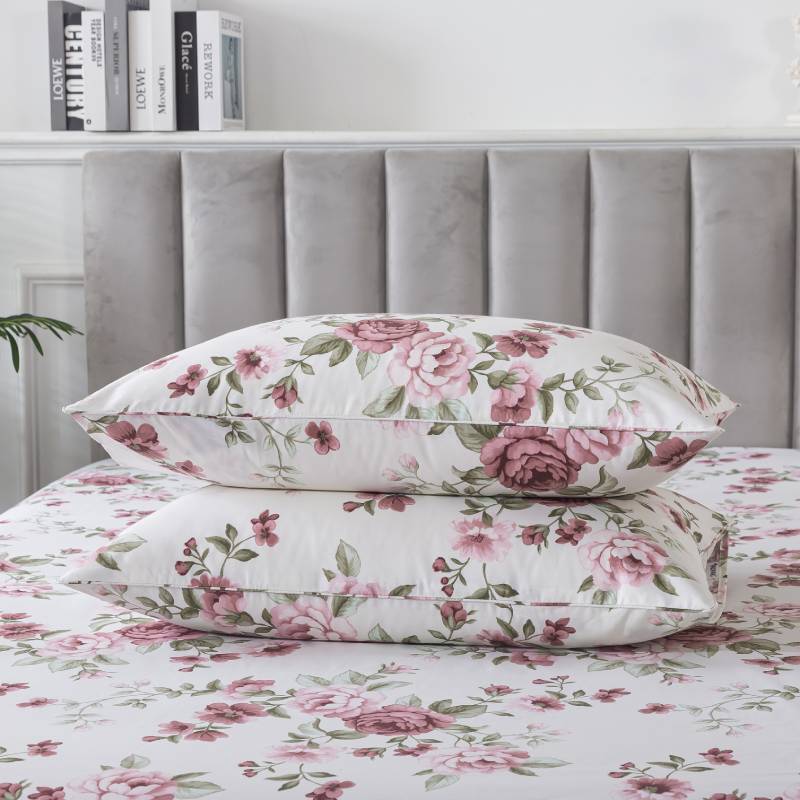
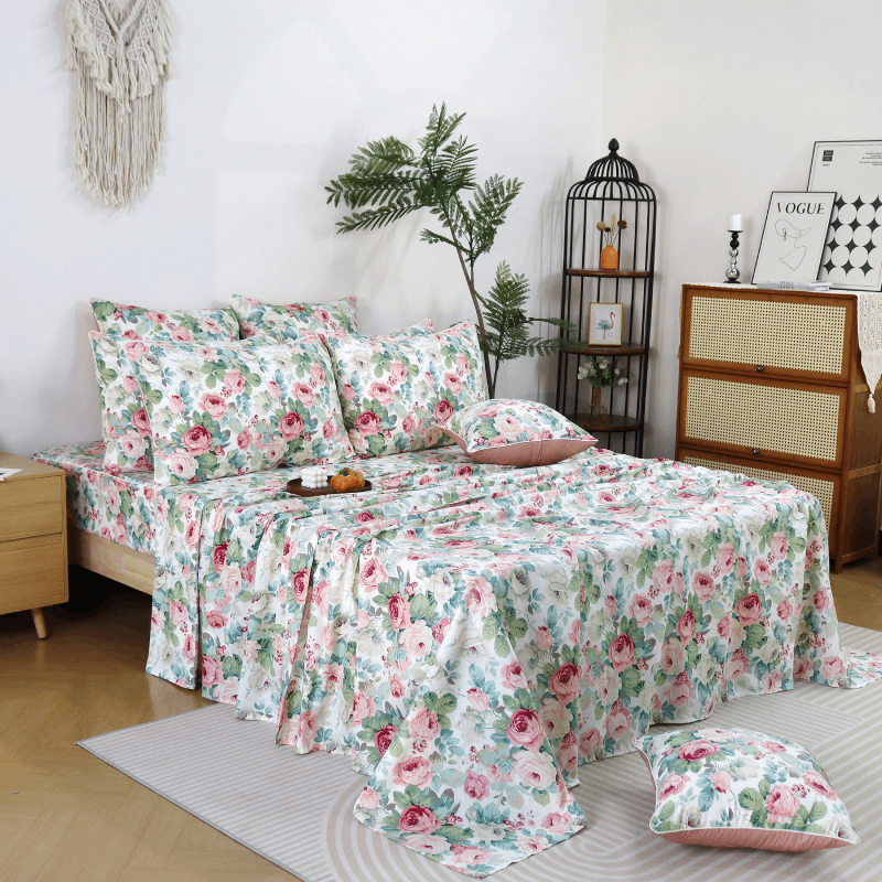
This might mean spacing florals apart, softening edges, or using negative space within the print itself. When every inch competes for attention, the design feels restless. When there is room to pause, the bedding feels calm and intentional.
Texture as a Quiet Form of Contrast
One of the most overlooked contrasts in bedding design is texture.
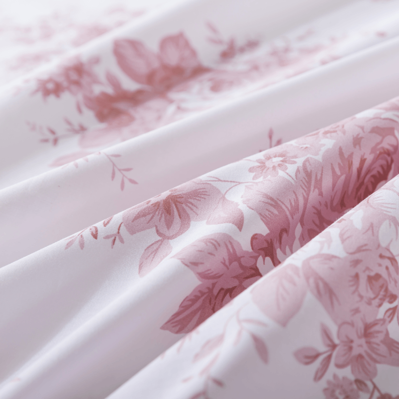
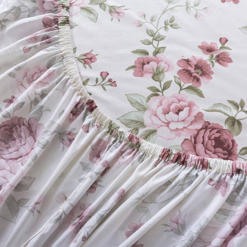
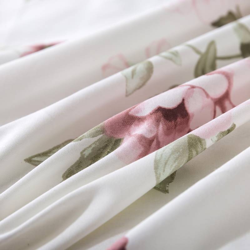
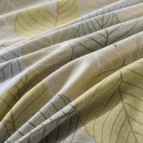
Natural cotton fabrics—especially those with a slightly relaxed weave—add softness that balances the visual complexity of florals. Gentle wrinkles, breathable structure, and a matte surface all help ground the pattern.
The result is bedding that doesn’t feel precious. It feels usable. Comfortable. Real.
Contrast and Everyday Living
Floral bedding isn’t just about how it looks when freshly made.
Good contrast supports real life:
-
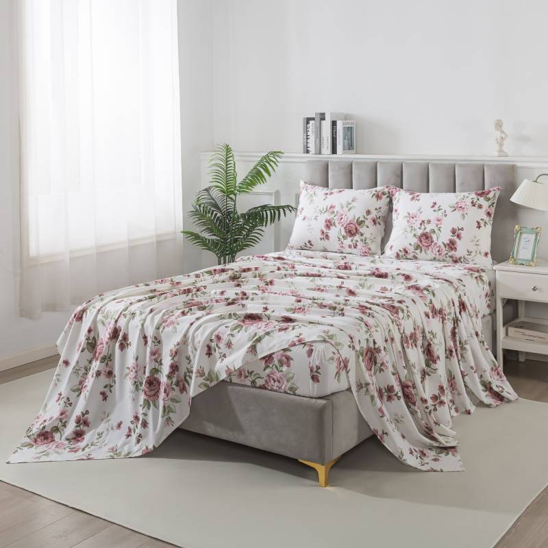
Bedding that still looks beautiful when naturally wrinkled
-
Patterns that don’t show wear easily
-
Designs that feel comforting morning and night
Soft contrast ensures that florals remain gentle companions in daily routines, not something you feel the need to “protect.”
Balance Over Decoration
The most successful floral bedding doesn’t try to impress at first glance. It settles into the room. It grows familiar. It supports rest.
Contrast—when used thoughtfully—turns florals from decoration into atmosphere. From something you notice into something you live with.
In the end, beauty in bedding isn’t about standing out.
It’s about feeling right.
Soft. Balanced. Beautiful.