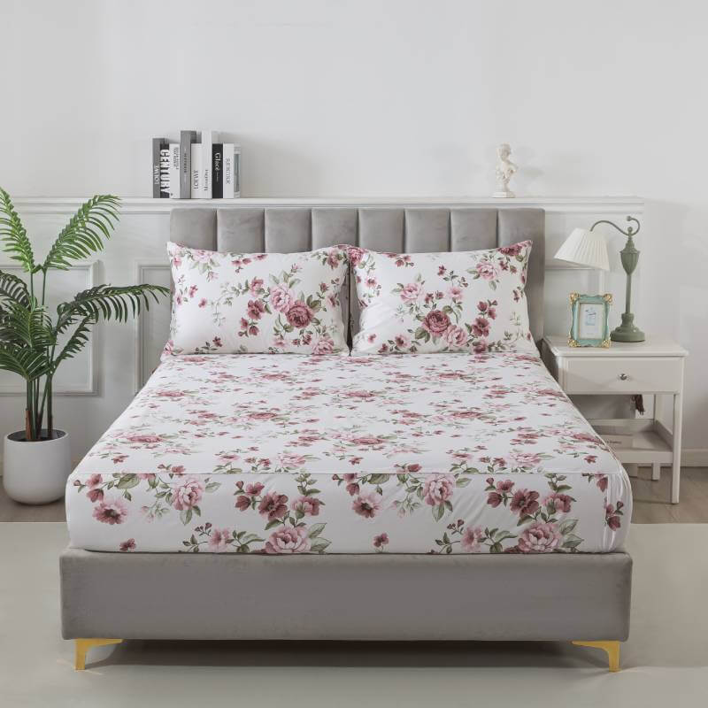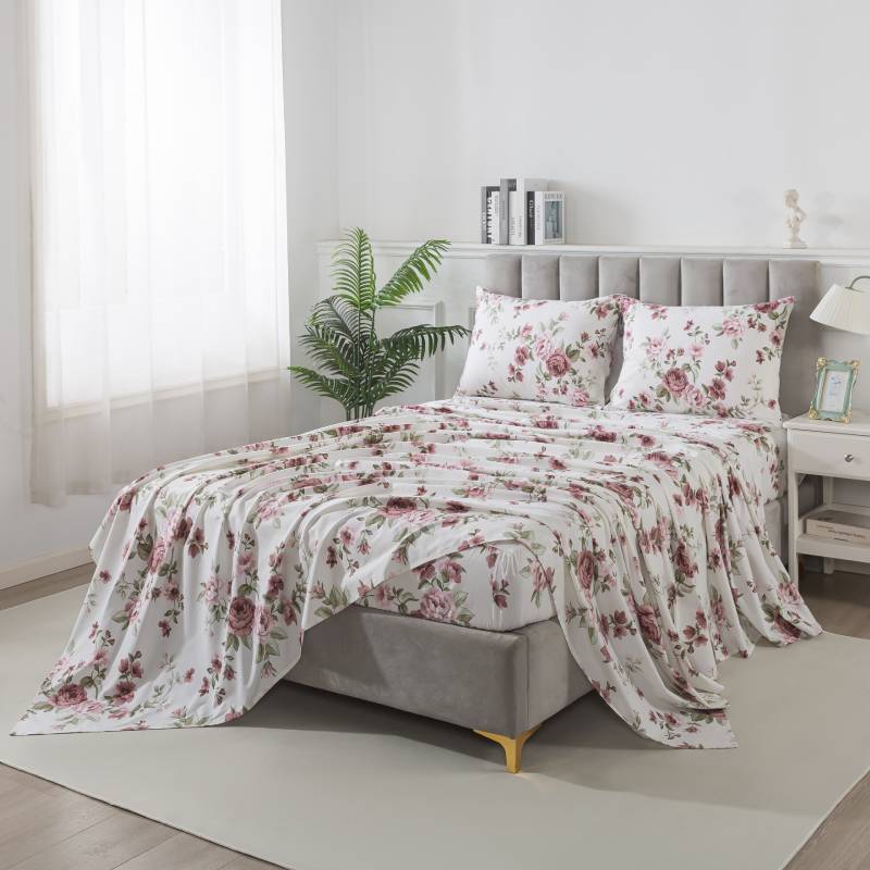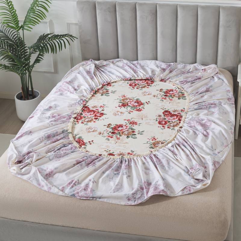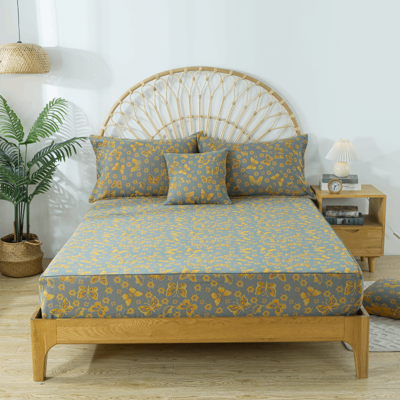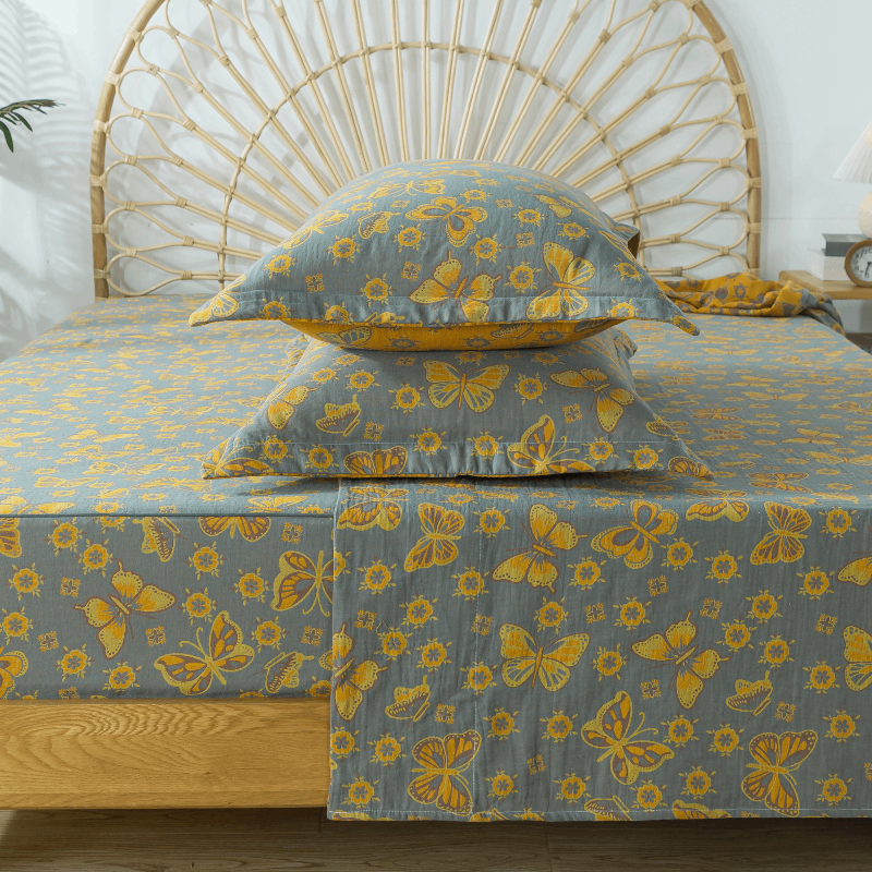


Floral bedding can make a bedroom feel soft, elegant, and full of personality—but only when used thoughtfully. While florals are versatile, the wrong scale, color pairing, or styling approach can quickly overwhelm a space or make it feel outdated.
The good news? Most floral bedding mistakes are easy to avoid once you know what to look for. Below are the most common issues people encounter, and simple ways to correct them for a balanced, beautiful bedroom.
1. Choosing Prints That Are Too Busy for the Space
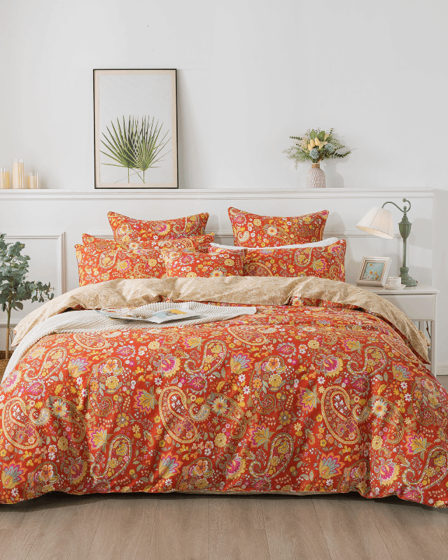
One of the biggest mistakes with floral bedding is selecting a print that feels too crowded for the room. Busy florals can become overwhelming, especially in small or dimly lit bedrooms.
How to avoid it:
-
Look for prints with breathing room and negative space.
-
Choose softer or less saturated colors to keep the design calm.
-
In smaller rooms, medium or large-scale florals tend to look more modern and balanced.
If you love detailed patterns, pair them with solid pillows or a simple throw to prevent visual overload.
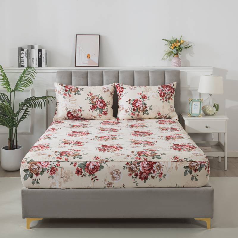
2. Using the Wrong Scale for the Room Size
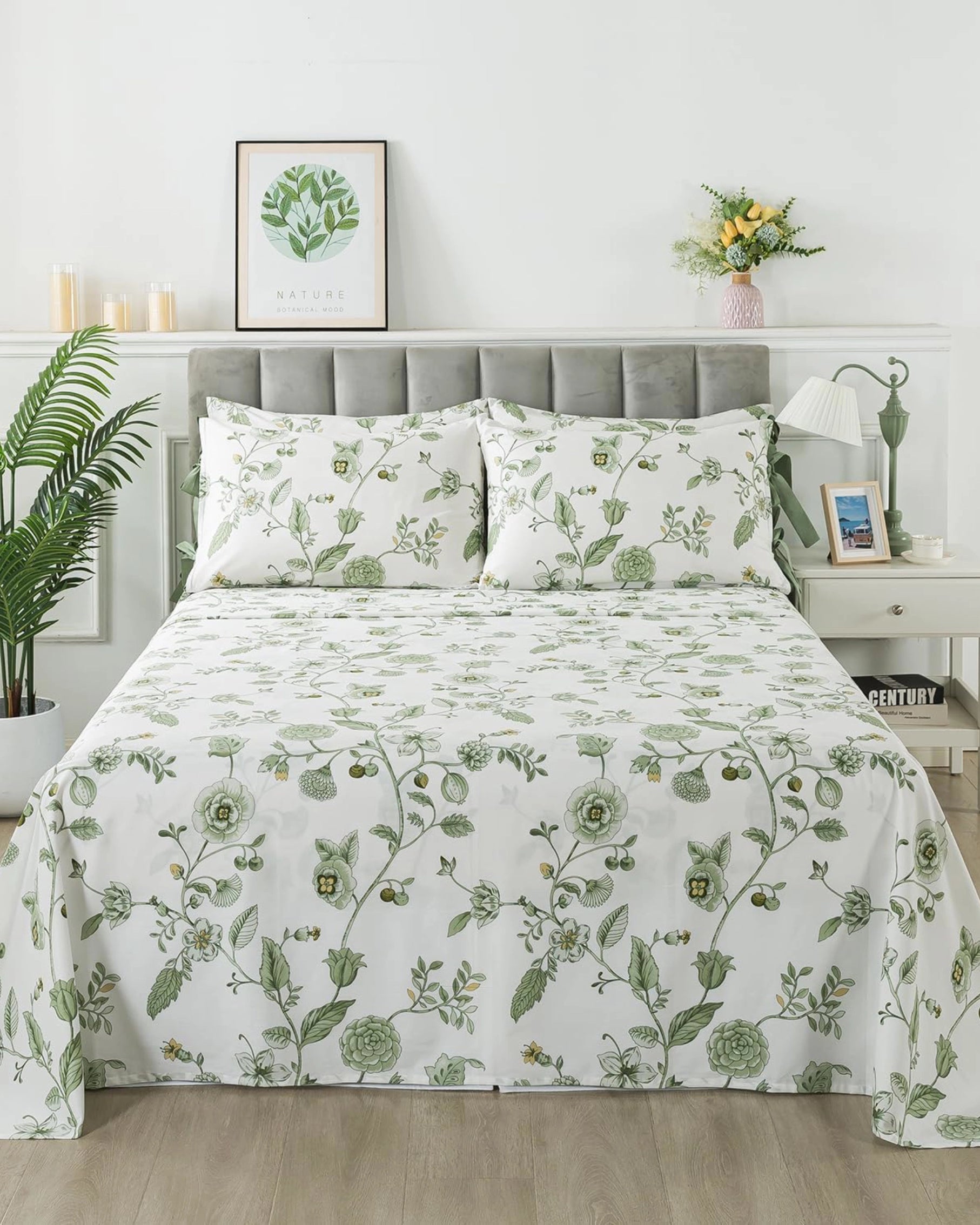
Floral scale dramatically affects how bedding feels. Too small a print can look old-fashioned or noisy, while too large a print can overpower the room.
How to choose the right scale:
-
Small rooms: Medium-scale florals offer balance without clutter.
-
Large rooms: Large-scale prints feel airy and intentional.
-
Minimalist interiors: Larger, simpler florals blend best with clean décor.
The key is proportionality—printing size should complement, not compete with, the space.
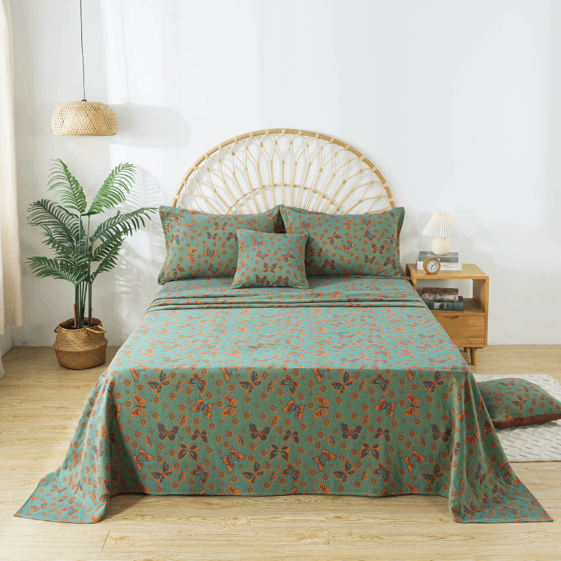
3. Clashing or Overly Saturated Colors
Another common mistake is choosing floral bedding with colors that conflict with existing furniture, wall tones, or lighting. Too many saturated hues can feel chaotic rather than refreshing.
How to avoid it:
-
Stick with 2–3 dominant colors in your floral pattern.
-
Choose muted, nature-inspired tones that are easier to coordinate.
-
Consider your wall color first—bedding should harmonize, not fight it.
If your room has strong accent colors, opt for subtle florals that support, rather than compete with, the palette.

4. Overmixing Patterns Without a Plan
Pattern mixing can be beautiful—but only with intention. Many people mix multiple floral prints or combine florals with stripes or geometrics without considering scale or color harmony.
How to mix patterns successfully:
-
Keep one pattern the “hero” (usually the duvet cover).
-
Mix patterns only when they share a unified color palette.
-
Vary scale: pair a large floral with a subtle micro-pattern or solid.
When in doubt, simplify. A single well-designed floral often makes the strongest impact.
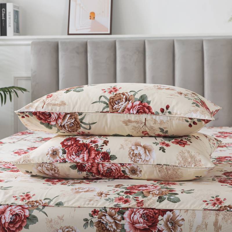
5. Adding Too Many Decorative Elements
Ruffles, lace, embroidery, and layered accessories can all be lovely—but too many at once can make the bed look heavy or outdated.
How to avoid clutter:
-
Choose one decorative element to highlight (e.g., piping or quilting).
-
Use clean-edged shams or sheets to modernize traditional florals.
-
Keep throw pillows minimal—two to four is plenty.
A refined floral print needs room to shine.
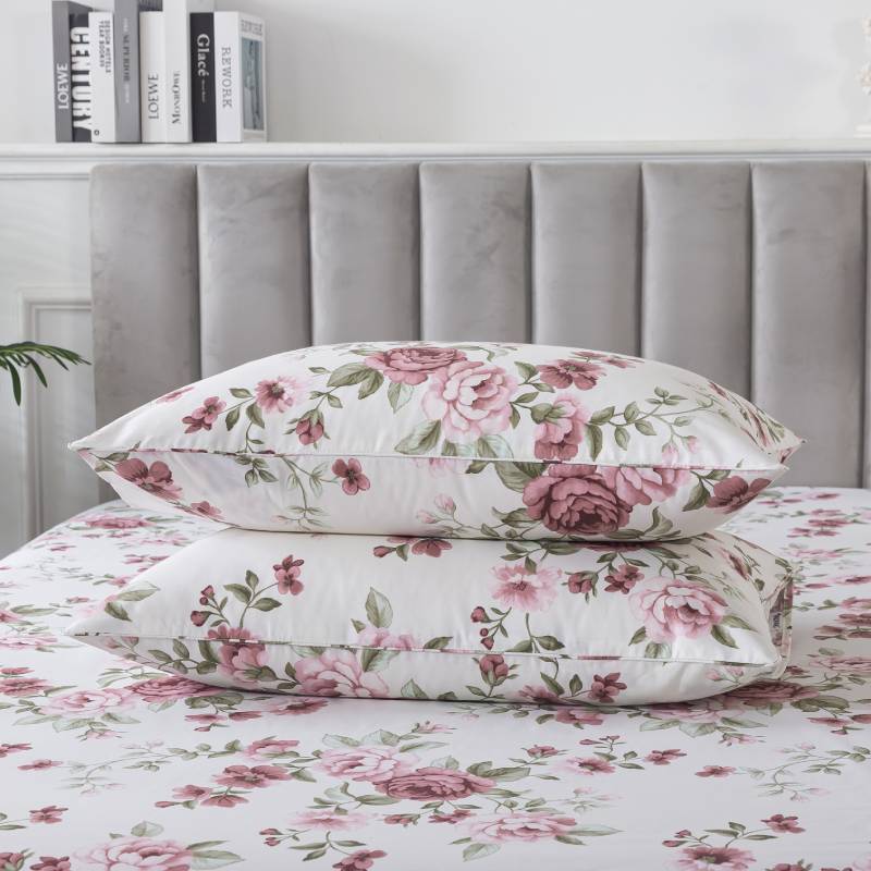
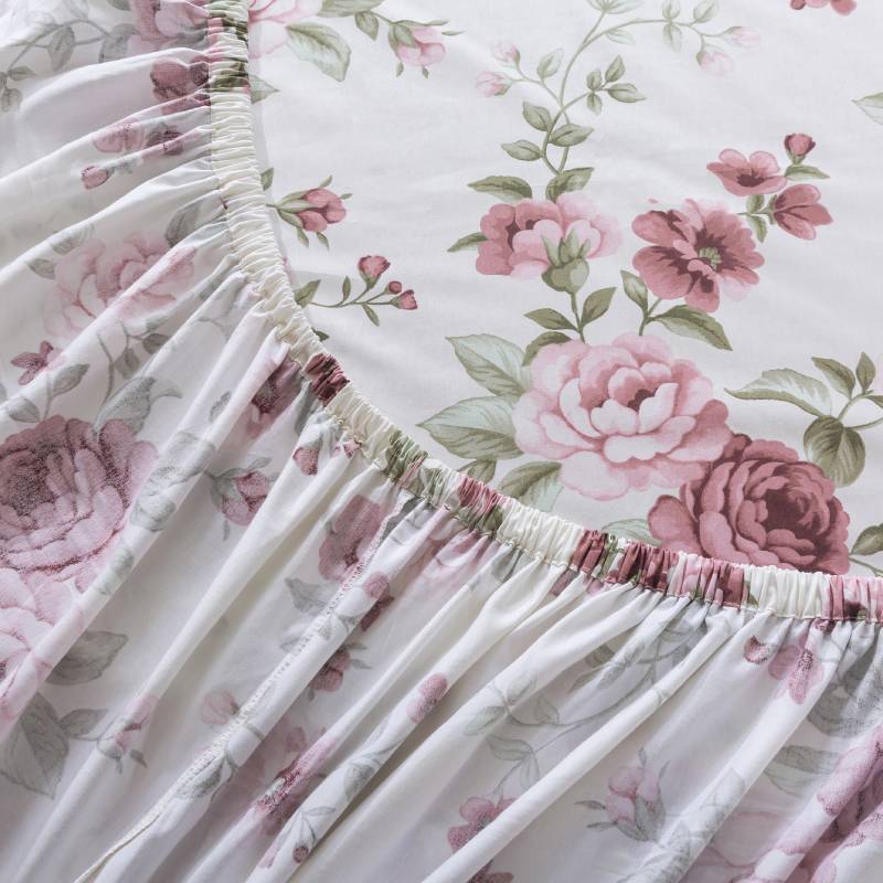
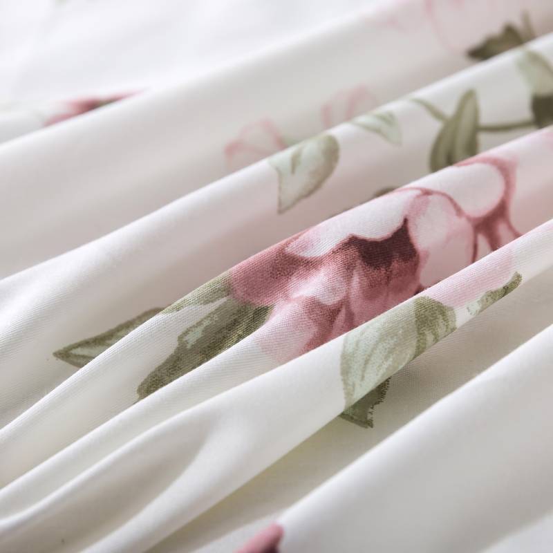
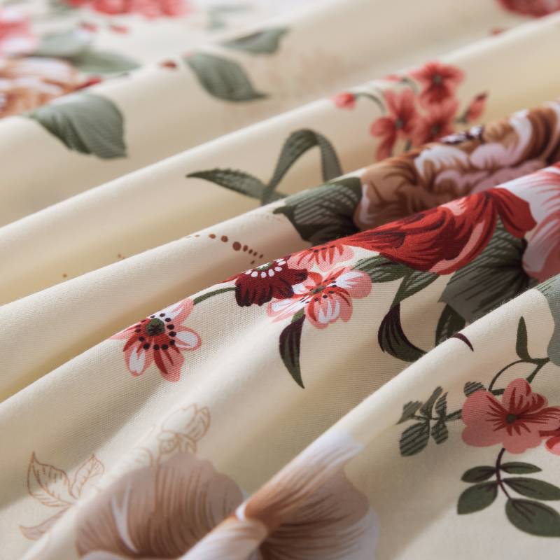
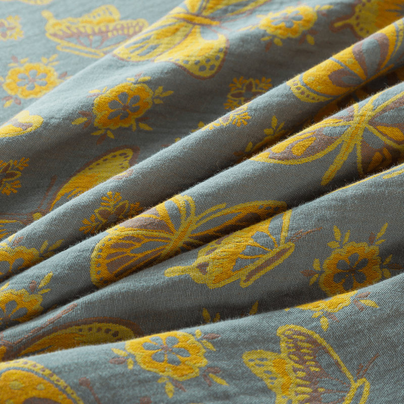
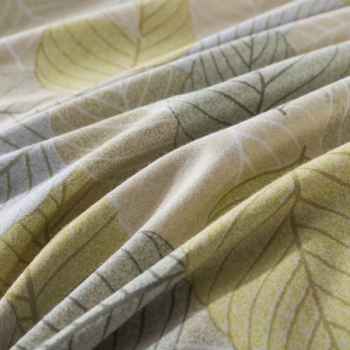
6. Ignoring Fabric Texture and Quality
Even the prettiest print can fall flat if the fabric feels rough, stiff, or low quality. Comfort is part of the aesthetic—if it doesn’t feel good, it won’t look good on the bed.
What to look for:
-
Soft, breathable cotton or washed cotton
-
Durable stitching and smooth seams
-
Fabrics that drape naturally rather than stiffly
Texture enhances the visual softness of florals and elevates the entire room.
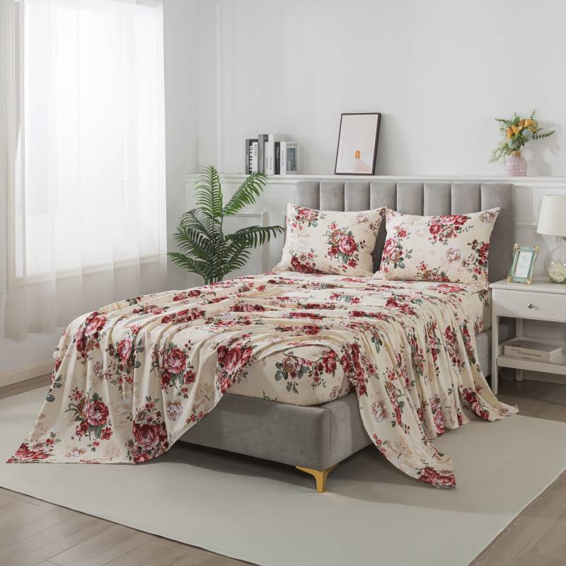
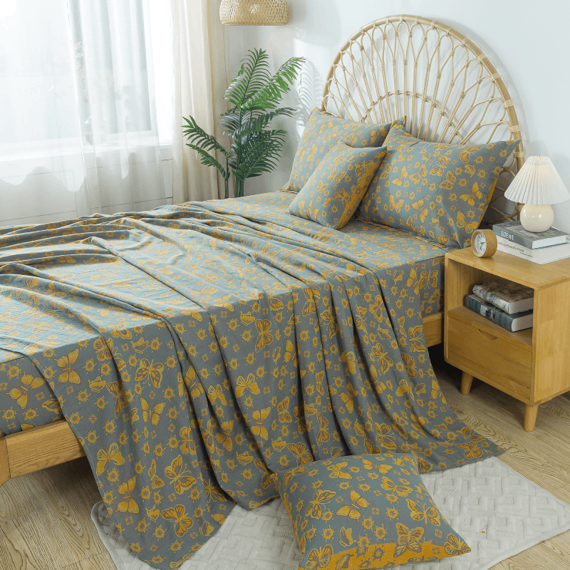
7. Forgetting to Balance Florals With Solids
A full floral look can be beautiful, but without solid colors to balance the palette, the eye has nowhere to rest. This is one of the easiest mistakes to fix.
How to create balance:
-
Incorporate solid sheets, a neutral throw, or simple pillowcases.
-
Use solids that match a color already present in the floral print.
-
Choose natural materials like cotton or linen for softness and cohesion.
The goal is visual harmony—not pattern overload.
8. Choosing Florals That Don’t Fit Your Personal Style
Many people select floral bedding based on trends instead of personal taste. As a result, they end up with prints that don’t feel like “them.”
How to avoid this:
Ask yourself:
-
Do I want soft and romantic?
-
Clean and modern?
-
Vintage-inspired?
-
Bold and artistic?
There is a floral for every personality, but intentional selection is key.
Final Thoughts
Floral bedding is timeless, versatile, and full of personality. When chosen thoughtfully, it elevates a bedroom with softness, harmony, and warmth. By avoiding common mistakes—such as mismatched scales, overly busy patterns, or clashing colors—you can enjoy florals that feel balanced, modern, and genuinely comforting.
Whether you prefer delicate botanical prints or bold blooms, the right floral bedding can transform your space into a sanctuary. The secret is choosing florals that complement both your décor and your lifestyle—and letting beauty and comfort work together naturally.