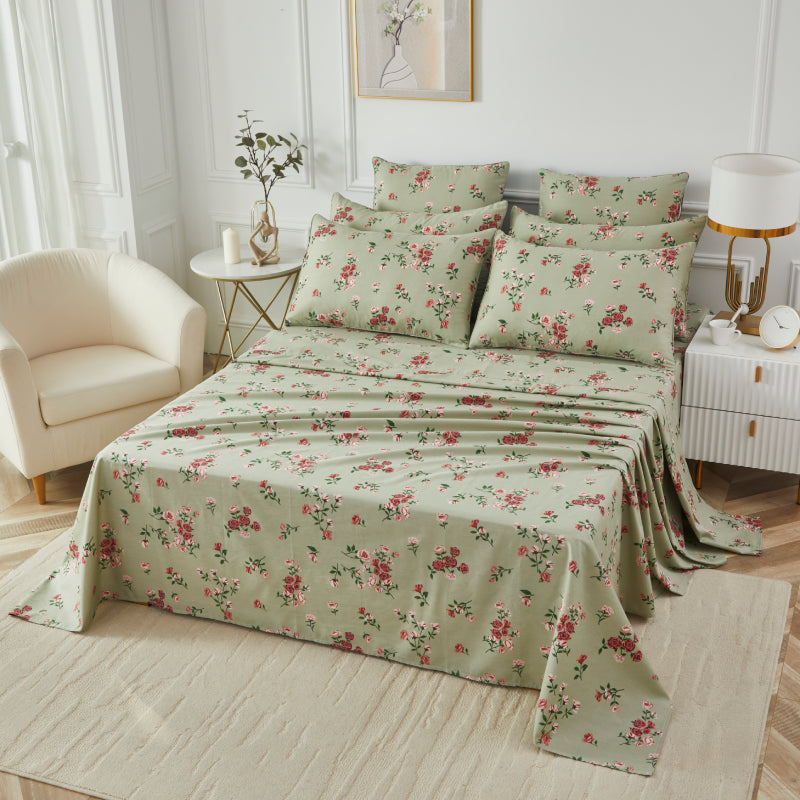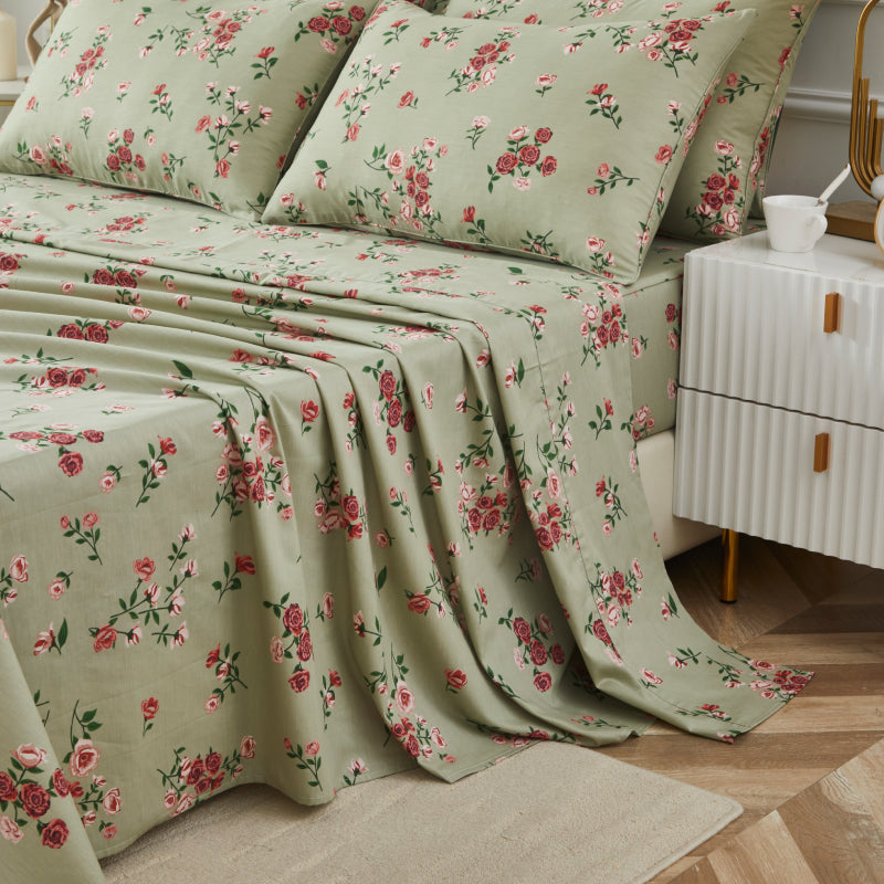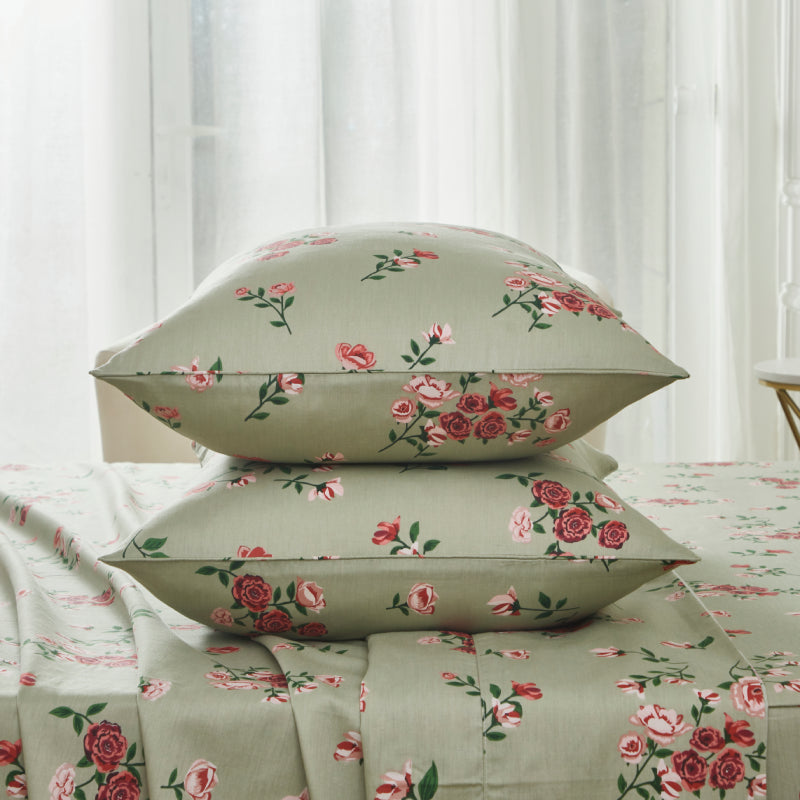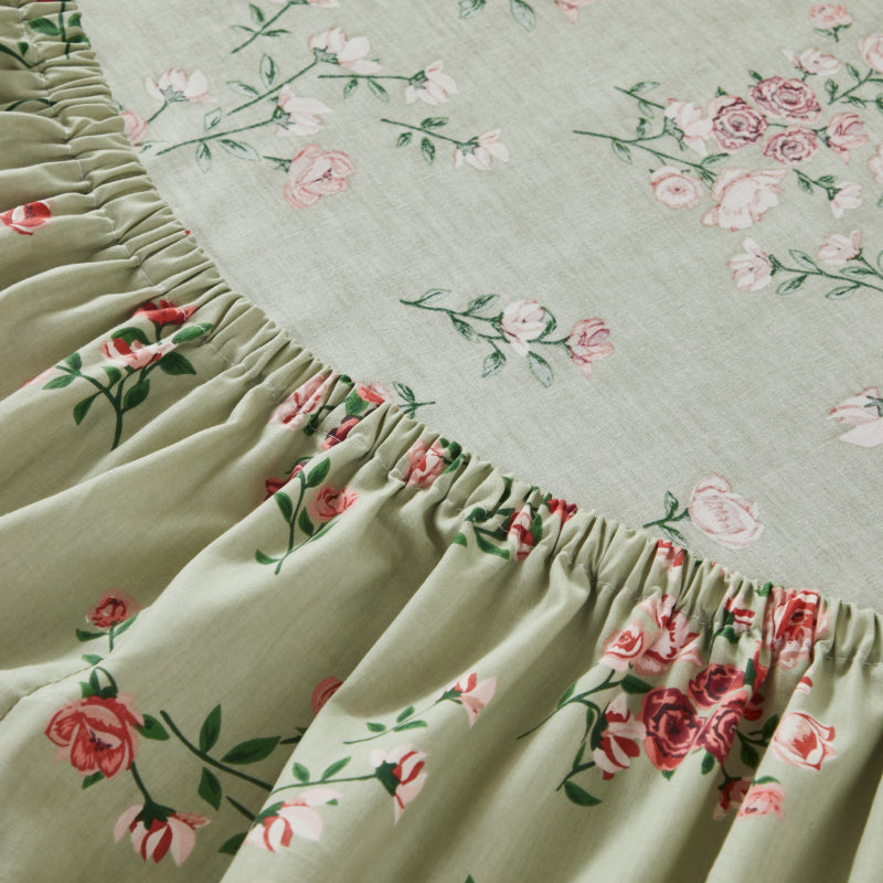


In interior design, bold prints are often treated as either a centerpiece or a risk. They command attention, inject personality, and define a space—but without careful balance, they can overwhelm. The key is not to mute boldness, but to frame it. When paired with quiet surroundings, bold prints transform from chaotic statements into refined focal points.
This balance is especially relevant in bedroom design, where comfort and visual harmony must coexist. Whether you're styling floral bedding, patterned rugs, or statement upholstery, mastering contrast is what elevates a room from visually busy to intentionally curated.
1. Let Bold Prints Lead—But Not Dominate
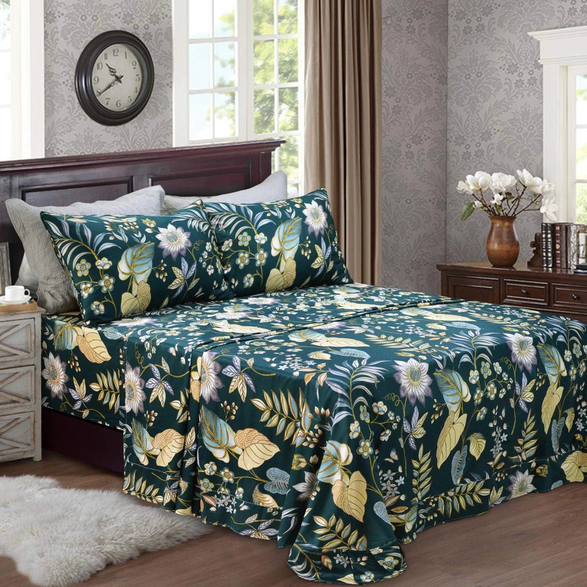
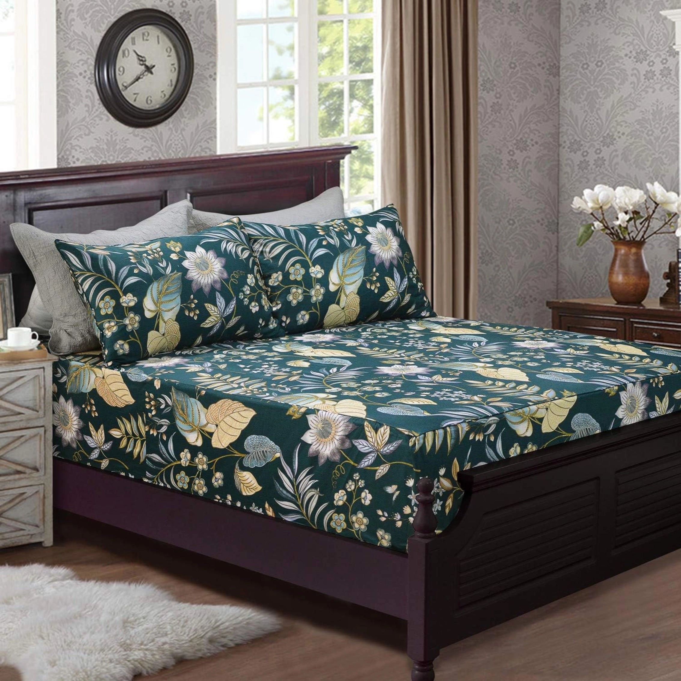
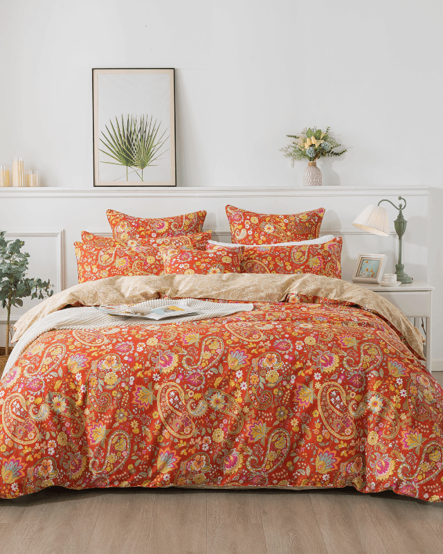
A bold print should act as the visual anchor of a space. In a bedroom, this often means the bedding. A large-scale floral duvet, for example, naturally draws the eye and sets the tone.
However, restraint is critical. Once a dominant print is established, other elements should recede. Avoid layering multiple competing patterns of equal intensity. Instead, allow the bold piece to “breathe” by surrounding it with quieter textures and tones.
Execution principle:
- One dominant print
- Supporting elements = neutral, tonal, or subtly textured
This hierarchy prevents visual noise and creates a structured aesthetic.
2. Use Negative Space as a Design Tool
Quiet surroundings are not empty—they are intentional. Negative space (areas free from heavy pattern or color) gives the eye a place to rest, which enhances the impact of bold elements.
In practical terms:
- Solid-colored walls (soft white, warm beige, muted gray)
- Minimalist furniture with clean lines
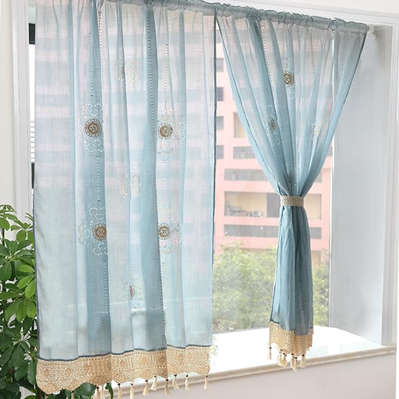
- Unpatterned curtains or rugs
These elements act as a buffer, allowing bold prints to stand out without overwhelming the room.
A common mistake is underestimating how much “quiet” is needed. In most cases, at least 60–70% of the visual field should remain calm when working with strong prints.

3. Control the Color Palette
Bold prints often contain multiple colors. Without control, these colors can spread unpredictably across the room.
To maintain cohesion:
- Extract 1–2 secondary colors from the print
- Repeat them subtly in accents (pillows, throws, decor)
- Keep the rest of the palette neutral
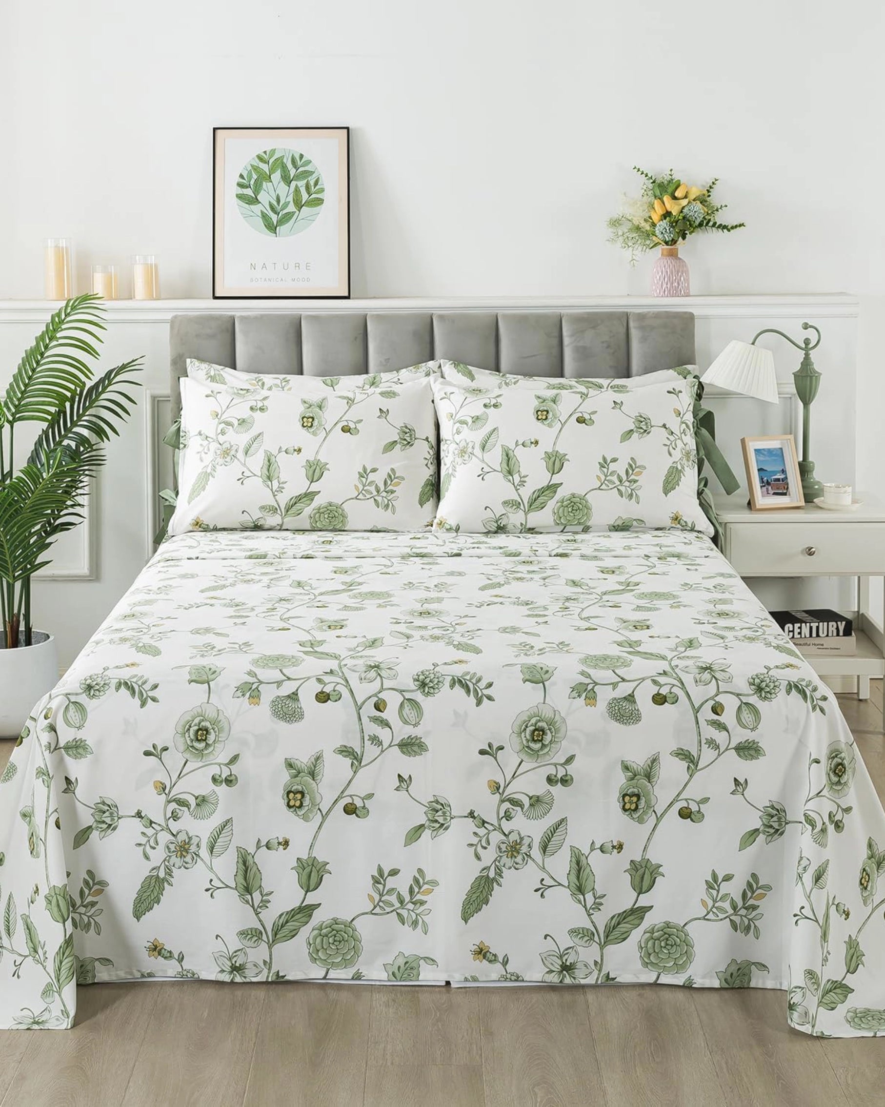
For example, if your bedding features botanical greens and soft blush tones, echo those hues in small, controlled doses—never at the same intensity or scale.
This creates a visual dialogue rather than competition.
4. Balance Scale and Texture
Not all contrast comes from color or pattern—scale and texture play equally important roles.
If your main print is large and expressive:
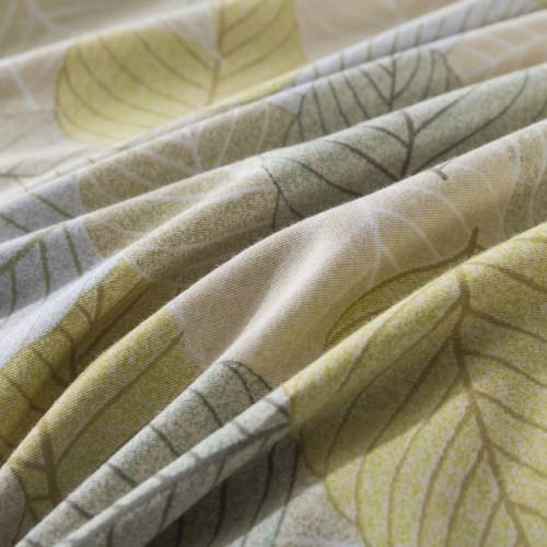
- Pair it with fine, understated textures (e.g., double gauze cotton, linen)
- Avoid additional large-scale patterns nearby
If layering is necessary, vary the scale:
- Large print (duvet)
- Small or micro-pattern (accent pillow)
- Solid or textured neutral (sheet, curtain)
This layered approach adds depth without clutter.
5. Anchor the Space with Subtle Foundations
Grounding elements—like rugs, flooring, or large furniture—should remain visually stable.
A neutral rug, for instance, can anchor a room featuring bold bedding. If the rug also has a pattern, it should be low-contrast and understated.
Similarly:
- Wood tones (light oak, walnut) add warmth without distraction
- Upholstered headboards in solid fabrics provide structure
These foundational pieces prevent the space from feeling fragmented.
6. Consider Lighting and Atmosphere
Lighting significantly affects how bold prints are perceived. Harsh lighting can exaggerate contrast, making patterns feel more intense than intended.
To soften the overall effect:
- Use diffused natural light where possible
- Incorporate warm ambient lighting (table lamps, wall sconces)
- Avoid overly cool or clinical lighting temperatures
Soft lighting enhances the comfort factor and integrates bold prints into a cohesive atmosphere.
7. Design for Real Life, Not Just Visual Impact
A well-balanced space should function as comfortably as it looks. This is particularly important for bedrooms, where tactile experience matters as much as visual design.
Materials like breathable cotton or double gauze fabrics not only soften the look but also contribute to everyday usability. Slight natural wrinkles, for instance, can enhance the relaxed, lived-in aesthetic—complementing bold prints rather than competing with them.
This approach aligns design with reality: a space that feels effortless, not staged.
Conclusion
Balancing bold prints with quiet surroundings is less about limiting creativity and more about directing it. Bold elements bring identity and energy; quiet elements provide clarity and structure.
When executed well, the result is a space that feels both expressive and calm—a visual statement that doesn’t overwhelm, but invites.
In the end, the goal isn’t to tone things down. It’s to create contrast with intention—so every bold detail feels exactly where it belongs.